1astropi
Since there has been a lot of discussion about bindings, I thought why not have a thread to discuss it right here! I'll start off - in my mind an attractive binding is an integral part of fine press.
Two examples to discuss since they have already been mentioned a few times, and in my mind both books are ostensibly similar in numerous ways --
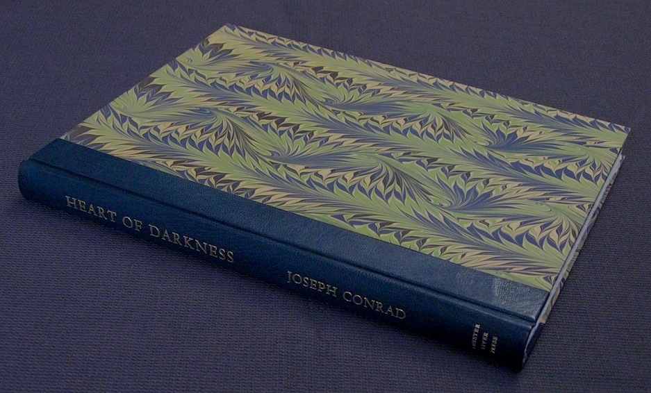
First, the Deep Woods Press Heart of Darkness - one of the most beautiful fine press books I have ever seen. Of all the amazing qualities this edition possess, the binding is just so-so. I very much like the quarter-bound leather, but not the rest of the binding. First, I do not believe the marbling is hand-marbled. Secondly, and more critically, it looks blase. What makes the book amazing is the letterpress quality and the illustrations, NOT the binding. To be clear, the binding is not particularly unsightly, just plain and uninspired in what is otherwise a masterpiece of modern fine press.
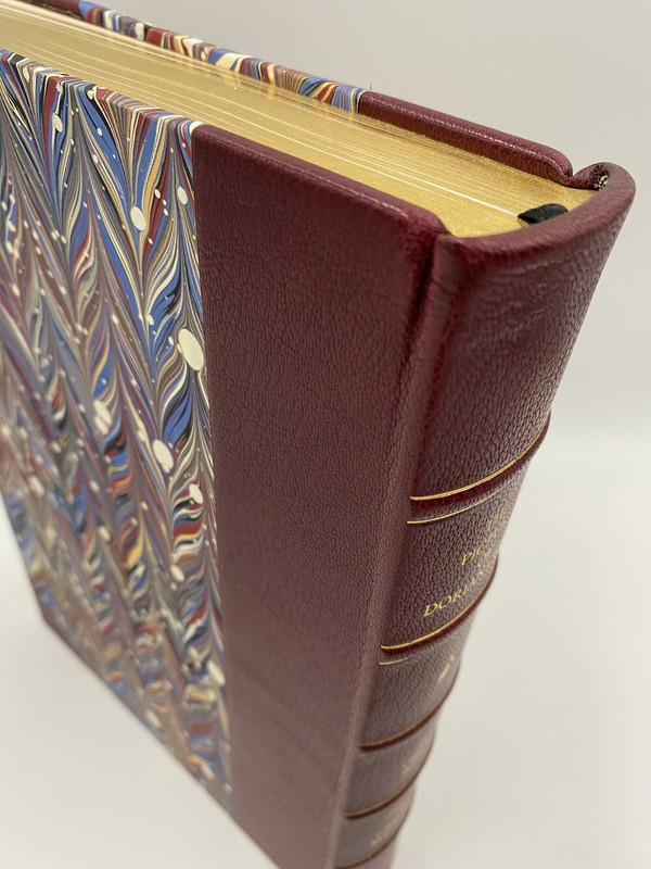
Lyra's Dorian Gray
While I have not beheld the book in person, I know this is going to be a beauty. The beautiful goatskin leather will feel pleasing to the touch, but more important is the overall esthetic. And, the color is lively and blends perfectly with the marbled binding. The corner bindings and silver marker ribbon along with the raised bands and gold stamping are beautiful finishes to what in my mind is the epitome of classic fine press.
Two examples to discuss since they have already been mentioned a few times, and in my mind both books are ostensibly similar in numerous ways --
First, the Deep Woods Press Heart of Darkness - one of the most beautiful fine press books I have ever seen. Of all the amazing qualities this edition possess, the binding is just so-so. I very much like the quarter-bound leather, but not the rest of the binding. First, I do not believe the marbling is hand-marbled. Secondly, and more critically, it looks blase. What makes the book amazing is the letterpress quality and the illustrations, NOT the binding. To be clear, the binding is not particularly unsightly, just plain and uninspired in what is otherwise a masterpiece of modern fine press.

Lyra's Dorian Gray
While I have not beheld the book in person, I know this is going to be a beauty. The beautiful goatskin leather will feel pleasing to the touch, but more important is the overall esthetic. And, the color is lively and blends perfectly with the marbled binding. The corner bindings and silver marker ribbon along with the raised bands and gold stamping are beautiful finishes to what in my mind is the epitome of classic fine press.

2punkzip
>1 astropi: Doesn't your example, given the high desirability of the Chester River Heart of Darkness reflected in secondary market prices and limited availability, actually show that bindings are not that important?
4LBShoreBook
>1 astropi: That Heart of Darkness is beautiful and I would love to have it on my shelves. The Lyra's spine looks like the bound legal opinions from my law school days and the marbled boards look to me like multiple ice cream flavors that melted and swirled together. Beauty is in the eye of the beholder but the first one is far more attractive IMO. I do agree with you that binding is an important part of the equation when deciding which fine press books to buy. As an aside I am glad to see the huge interest in the Lyra edition - if we all loved the same thing life would be boring indeed.
5grifgon
My two cents: I don't particularly love half-leather bindings, as I know many do. Modern half-leather bindings are a callback to the days when half-leather was simply a standard binding choice – leather being cheaper than bookcloth or decorative paper. They can be spectacular, but I don't like that they are considered by many to be on their face "finer" than non-leather bindings.
My favorite binding of a recent private press book is "The Travels of Sir John Mandeville" from Foolscap Press. Being a paper binding, I'm sure there are many that will perceive it as being less "fine" than the half-leather bindings shared above. Actually, it's far finer! There is a ton of skill in binding "Mandeville," which uses actual structural bands (unlike the decorative bands on basically every modern half-leather) and which must be engineered to allow for flexibility from inherently less flexible materials. The precision with which the paper cover must be cut, folded, affixed, and cased rivals or exceeds that of a leather binding, (which is very forgiving). Further, to just compare material costs: A 4'' by 10'' strip of Morocco and two 6'' by 10'' cuts of marbled paper are actually far less expensive than the single large sheet of specially made Cave which Mandeville uses.
In short: Half-leather bindings are wonderful, but leather is not ipso facto finer than other materials, nor do leather bindings necessarily require more skill than non-leather bindings.
6NathanOv
>2 punkzip: I'd guess for many collectors that it's not that binding does or doesn't matter - there's just different levels of priority.
For me, contents (including illustrations and quality of paper & printing) are much more important, but an unattractive or low quality binding can still be a deal breaker, or on the flipside a really artful binding definitely catches my attention.
It's only when you get into more unique bindings that drastically impact the reading experience, such as Foolscap's Story of The Fishermen for one example that the binding might become the most important feature to me personally, and that's not even a particularly good example because the highlight of that volume is still the illustration.
7grifgon
(I think both of the bindings shown above are very well done. Not a knock against them at all, just raging against the Cult of Leather 🤘🤘. And my favorite "run" of any private press was Thornwillow's Prague books – all of them half-leather.)
8paulm16
I’m not sure if I will be taken serious on this one but I do think it’s a genuine question.
Two of my three children are ardent vegans and I admire their tenacity. General living including eating is fairly straightforward these days but finding serious mountain boots and a quality suit are more challenging.
Late last year I asked a number of producers exhibiting at the Ludlow Book Fair if they had considered the possibility of lost market share due to using leather and unanimously I was considered a heretic, albeit in good spirit.
Easy for most of you to laugh, but these days I have to temper any excitement for must have books before I have checked on the materials used, including papers, glues and inks.
9terebinth
>5 grifgon:
I've never heard that there was a time when leather was a less expensive binding option: when was that? My impression is that cloth bindings as a standard offering became popular fairly early in the 19th century, as an alternative to books being bought in plain boards for binding to the purchaser's choice, most often in leather. Certainly by the early 20th century series such as Everyman's Library and Oxford's World's Classics were offered in alternative bindings, with cloth as the standard form and other options at 1.5x - 3x the price.
I've never heard that there was a time when leather was a less expensive binding option: when was that? My impression is that cloth bindings as a standard offering became popular fairly early in the 19th century, as an alternative to books being bought in plain boards for binding to the purchaser's choice, most often in leather. Certainly by the early 20th century series such as Everyman's Library and Oxford's World's Classics were offered in alternative bindings, with cloth as the standard form and other options at 1.5x - 3x the price.
10NathanOv
>8 paulm16: I think those are legitimate concerns, and I've definitely had similar questions cross my mind around sustainability and ethical sourcing!
Where I've personally landed is that most fine press publishers have such low limitations to have a minimal impact, and the high-quality nature of most of their materials ensure their ethical sourcing.
I can definitely see it being a bummer to have committed to cutting out animal products only to have them widely used in books though, and hadn't even considered glues and inks. I don't know of any particular press that's made a commitment to that level, and could see doing so being quite difficult.
11grifgon
>8 paulm16: I've seen a dozen inquiries from collectors asking if they can switch the leather in their binding to faux-leather for ethical reasons!
>9 terebinth: Pre-19th century! I'm sure your understanding is correct post-industrialization. If you were in Basel in 1518 and wanted to take your recently purchased "Utopia" to be bound, leather would have been the standard option. Bindings in other materials existed (for example, silk or human skin or gold) but leather would have been the most affordable straightforward option. And many of our leather binding "styles" are based in this time, before industrialization made bookcloth and other such materials cheap.
>9 terebinth: Pre-19th century! I'm sure your understanding is correct post-industrialization. If you were in Basel in 1518 and wanted to take your recently purchased "Utopia" to be bound, leather would have been the standard option. Bindings in other materials existed (for example, silk or human skin or gold) but leather would have been the most affordable straightforward option. And many of our leather binding "styles" are based in this time, before industrialization made bookcloth and other such materials cheap.
12lilithcat
>8 paulm16:, >10 NathanOv:
The entire process of bookbinding involves a lot of animal products. In addition to those mentioned, there's glair for gilding, bone folders, beeswax, silk thread for headbands, etc.
It's not that alternatives don't exist, just that there are so many parts of the process that require them. And then, of course, where fine binding is concerned, the archival nature of those alternatives need to be considered, as well as how they interact. How well, for instance, does vegan "leather" take gilding and tooling?
Lots of questions to ask.
13kdweber
I like the quarter leather Chester River binding for Heart of Darkness. Number one, I like quarter, half, and full leather bindings and think the partial bindings work well with marbled paper as well as paste paper. To me, the binding paper used makes me think of jungle foliage and gets me in the mood for reading the book even before cracking the cover. On the other hand, the primary reason I bought this book was for the story, fine letterpress work, and great illustrations.
14astropi
>2 punkzip: I think you make a very valid point, and I would say chief among importance to fine-press consumers is still the written word. Consider dlphcoracl comment (on the Lyra thread) https://www.librarything.com/topic/335923#7735160
I actually used the money saved on Dorian Gray to purchase a superb book from Labyrinth Editions - the deluxe edition of Between Two Wars by Kenneth Rexroth (1982) and it is far superior to Dorian Gray in every way imaginable.
The book he is referring to is absolutely beautiful. However, I do not find the binding more beautiful than Lyra's Gray. You can see a picture here (I found it on the web)
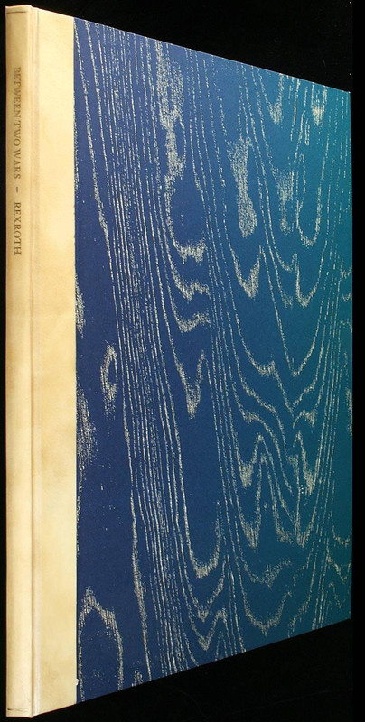
That said, how many people would pay $1000 (or more) for the book? It's a beautiful book of poetry, but like many such books it is short. On the other hand, Gray is a novel (or novella) and thus much more attractive to me. Don't get me wrong, I LOVE poetry and fine-press poetry. However, that is one thing I have found easy to find is fine-press poetry. Fine press Wilde, not so much. So, at the end of the day, I do appreciate not just the beautify and craftsmanship of the binding, printing, art, etc. but also the fact that you are getting a full-fledged novel here!
>4 LBShoreBook: well said :)
For the record, I don't think leather binding necessarily makes a book "better" or worse. In fact, some may remember that the Folio Society Limited Edition The Call of Cthulhu & Other Weird Stories was produced using "eco-simulated leather" which I believe (correct me if I'm wrong) 100% polyurethane. I know that when that was announced there was pushback from the FS devotees... but to be fair, there is ALWAYS some criticism/pushback from those folk :)
In the end, it did sell out and is now pricey on the secondary market, so I think it shows that fake leather will still sell well. If push came to shove, I probably still prefer genuine leather, primarily because I don't know how enduring 100% polyurethane is? Will it start cracking after 10 years? 20 years? Some things to consider.
15mnmcdwl
For me, half leather bindings like the above are nice and all, but something I won't often pay for a premium above a half-cloth standard version. This is in contrast to a premium for better paper, which always attracts my attention. For the above examples, while both are beautiful. I think the marbling of Heart of Darkness better matches the content of the book than the marbling for Dorian Gray does. To be honest, one of the things I think Thornwillow Press does particularly well is matching the pastepaper boards of their half-leathers to the content of the book.
16SDB2012
>14 astropi: The FS Call of Cthulhu is one of my favorite FS publications. I have the LE. I know it's not fine press but the overall production seems perfect for the content. I was surprised at the amount of complaints about the eco-simulated leather.
17abysswalker
First things, I assumed this topic was going to be about the threads binders use to sew books, so I didn't bother to click on it for a while. A nice surprise when I finally did!
>1 astropi: "I do not believe the marbling is hand-marbled."
That is a strange assumption to make. It also seems to be wrong:
Source: https://www.deepwoodpress.com/hod.html
(Cockerell marble papers are certainly hand-marbled.)
Personally, I like the standard Heart of Darkness binding, though I could probably find other bindings I like more. (Anyone want to sell me a copy so I can make this a judgment based on evidence?)
>1 astropi: "I do not believe the marbling is hand-marbled."
That is a strange assumption to make. It also seems to be wrong:
Standard Edition: Quarter bound in blue Harmatan goat with Cockerell marble over boards in a slipcase.
Source: https://www.deepwoodpress.com/hod.html
(Cockerell marble papers are certainly hand-marbled.)
Personally, I like the standard Heart of Darkness binding, though I could probably find other bindings I like more. (Anyone want to sell me a copy so I can make this a judgment based on evidence?)
18astropi
>17 abysswalker: thanks for checking... honestly I was always under the impression it wasn't hand-marbled but apparently I am mistaken :)
I think there are quite a few looking for copies of that masterpiece, good luck to all!
I think there are quite a few looking for copies of that masterpiece, good luck to all!
19ultrarightist
I love the marbled papers on the standard state of Heart of Darkness, and like others think their design and color scheme are apropos to the story.
The aspect of the marbling on the covers of the numbered state of the Lyra Dorian edition that I dislike is the white circles. It looks like white paint has been splattered on them. I would like the marbled papers sans the white circles, or if they used the marbled papers that serve as the endpapers in the lettered state.
The aspect of the marbling on the covers of the numbered state of the Lyra Dorian edition that I dislike is the white circles. It looks like white paint has been splattered on them. I would like the marbled papers sans the white circles, or if they used the marbled papers that serve as the endpapers in the lettered state.
20wcarter
My perfect book binding is half goatskin leather with hand marbled boards. This would apply to almost any book. Looks superb.
22jroger1
If the experienced members of this forum can’t tell the difference between hand and printed marbling, does it really matter? :-)
23astropi
>22 jroger1: to be fair, I had not looked at the book for a few years ;)
And... I have to say the marbling does look *better* than I remember. Perhaps I was a bit rash in calling it "so-so" it's really pretty good - BUT, still not as appealing as Lyra's Gray, or for the record not as appealing as Lyra's Stardust. My opinion of course!
And... I have to say the marbling does look *better* than I remember. Perhaps I was a bit rash in calling it "so-so" it's really pretty good - BUT, still not as appealing as Lyra's Gray, or for the record not as appealing as Lyra's Stardust. My opinion of course!
24abysswalker
>22 jroger1: "If the experienced members of this forum can’t tell the difference between hand and printed marbling, does it really matter?"
I think it matters, yes. And, also to be fair, looking at a medium resolution jpg (or whatever) on a computer screen is a rather different experience than handling a physical object. I am sure that exceptions are possible, but generally digital printed "marbled" papers are pretty sad in person.
I think it matters, yes. And, also to be fair, looking at a medium resolution jpg (or whatever) on a computer screen is a rather different experience than handling a physical object. I am sure that exceptions are possible, but generally digital printed "marbled" papers are pretty sad in person.
25ultrarightist
I wonder if the marbled papers on Heart of Darkness are genuine Cockerel papers from the Cockerel bindery or if they copy/imitate a Cockerel pattern. The latter in no way means that the paper is not hand marbled.
----
The contents of the world-renowned Cockerell Bindery are to be sold by auction on Tuesday March 27th, 1990, at Phillips Auctioneers in St. Ives, Cambridgeshire, not far from its former home in Grantchester. It is the most important book bindery to be sold this century, and comprises working tools, equipment and materials that were used by the Cockerells, father and son, in the conservation and binding of many of the nation's finest books and manuscripts.
For almost a century the name of Cockerell has represented a tradition that started under the influence of William Morris and the Arts and Crafts movement and continued until the death of Sydney Cockerell (known as Sandy) two years ago.
Sandy Cockerell has been described as a latter-day Leonardo, for he had not only the dexterity of a fine craftsman, but also the curiosity of a scientist and the engineering skill to find innovative solutions to technical problems. The contents of his bindery reflect these skills, for side by side with the great antique presses of polished wood and metal and the hand tools inherited from his father stand the tools he designed and made himself. Most famous of these is his pneumatic ram. Made using the system that works the flaps on the wings of aircraft, it provided him the extra strength necessary to impress designs into vellum hard covers.
Also in the sale are some of the materials from the bindery, most notably many sheets of the marbled paper for which Cockerell developed a worldwide reputation. Many were experimental sheets that were not included in the Cockerell pattern book, though there are enough of each design to allow then to be used as end papers. They range from the striking simplicity of monochrome to brilliant kaleidoscopic designs in countless colors, some on handmade paper, others on cartridge.
26punkzip
Some specific bindings in my library which match the content well IMO:
LEC Hiroshima - stark black aniline leather, Jacob Lawrence's silkscreens really stand out relative to this starkness, a very inspired design given the content
Arion Press Emily Dickinson Sampler - quarter leather with embroidered cloth - fits in the interior art and the time period
Suntup 1984 - paste paper - Suntup can be rightly criticized for a focus on flashy bindings (but this makes sense for them as large portion of their fanbase does not seem to care about paper or letterpress), however, this is IMO an inspired design and with the acrylic slipcase fits the book very well
Non-letterpress
Folio Society Madame Bovary LE - printed silk - just a gorgeous binding with a great hand feel, painting fits the book well
27realto
>5 grifgon: A good point, but fine presses seem to universally give the impression in their tiers that leather is finer or more desirable, whether true or not.
>26 punkzip: Personally, I don't care for the emphasis on bindings "matching their time period". I found the Arion Press Dickinson binding rather unappealing actually. Though I don't think there's any doubt that the idea was executed very well.
I'm sure the question of whether "Heart of Darkness" uses genuine marbled paper must have been answered somewhere. It would be surprising if it were a digital reproduction, but perhaps there's a good reason if so.
28abysswalker
>7 grifgon: regarding the cult of leather, my sense is that the prestige level norms come from the following facts:
1. High quality binding grade goat or bookcalf leather is indeed more expensive than most alternatives (>5 grifgon: I'm surprised Cave paper is more expensive actually, but I believe you, and even if so my guess is that is an outlier).
2. The binding skill and specialty tools needed to work leather bindings (especially if hand-tooling) are rarer and harder to cultivate than the skills and tools needed to execute other kinds of bindings (again on average; I am sure one can locate some exceptions involving complicated stitching or whatever). Even labor saving tools such as stamps or embossing wheels which historically led to efficient production using assembly lines (and thus cheaper leatherbound books) require owning the tools and practice. The same thing is not (as) true for decorating other styles of binding.
3. Doing a leather binding carefully versus contemporary mass production makes a huge difference given even a cursory examination in person (just compare the poor detailing quality of a standard issue Easton Press leather binding to a competently executed midlevel leather binding). I see some people both on LibraryThing and on Facebook criticizing the design of the recent Folio Society Ulysses LE as looking like a volume from Easton Press (as if Easton has a trademark on any monocolor decorated full leather binding). That Ulysses LE is not for me, but I guarantee that nobody holding a book like that bound in quality calf in person would mistake it for anything like a baseline Easton product. This is the "shelfie" effect: the appeal of a book design rising and falling based on a few digital images rather than interacting with the object itself.
So from that perspective the prestige seems warranted.
But leather (even decent quality leather) is also prone to drying out, cracking, fading, and so forth, if not carefully cared for, so it's not necessarily more durable. I don't venture much into antiquarian waters, but this is true even limiting consideration to 20th century and after (which captures probably 90%+ of the private press movement output).
I don't have any problem with synthetic materials if they are chosen for reasons that serve the book designer's vision, as I believe was the case with the Call of Cthulhu LE, given the feel was supposed to evoke the flesh of a Lovecraftian abomination. Now, if they could have done it in full eelskin stitched together Frankenstein-style (like the LEC Flounder quarter binding material), that would have been glorious. I am not, however, so interested in a material pretending to be leather, especially if the material hasn't proved itself to archival standards as >12 lilithcat: notes. If you want a leather binding, use leather. If you want to use something else, find the spirit of that material and figure out how to express it. As grifgon points out, there are lots of other options. I have some very fine books bound in full or half cloth (a few would probably count as some of my favorite bindings).
29grifgon
>28 abysswalker: Great points all!
The note about the rarity of tools is VERY apt. Last I checked, I couldn't find a pair of band nippers (the most basic leatherworking tool) for under $200.
Should clarify just one thing in my earlier comment — Cave is more expensive than *some* fine book leathers (and I'd venture to say the average fine book leather). There are of course book leathers that are more expensive than Cave. Shooting from the hip here, but Harmattan is probably less expensive, while Hewitt is probably more expensive, to take two examples.
Leather = Love it
Leather being considered finer than other materials prima facie = Don't love it
30ultrarightist
The patterned cloth used in many Allen Press books is beautiful and befits their fine press books. They used Venetian Fortuny fabrics for many of their volumes, which I have no doubt were expensive.
I do wonder why the Allen Press never bound any of their books in leather (to my knowledge). It seems strange, given the press's longevity. The one Allen Press volume in particular I think should have been bound in leather (full morocco with gold tooling) is Poeticon Astronomicon.
I do wonder why the Allen Press never bound any of their books in leather (to my knowledge). It seems strange, given the press's longevity. The one Allen Press volume in particular I think should have been bound in leather (full morocco with gold tooling) is Poeticon Astronomicon.
31Praveenna_Nagaratnam
This has been very illuminating. Thank you for all the input. I am vegetarian and trying to be vegan and I am still not at the stage where I completely go off leather products (have read alot of articles on this, by product vs co product vs overall impact on sustainability and wild life protection/preservation and am sitting on the fence). I am part of the group that always felt leather = more superior quality.
It is nice to know that there are people out there requesting for alternatives to leather. Do publishers charge more for this? and do they hold/age well?
It is nice to know that there are people out there requesting for alternatives to leather. Do publishers charge more for this? and do they hold/age well?
32Praveenna_Nagaratnam
>29 grifgon: Curious to know what would you consider the best/ideal binding which is of highest craftmenship?
33BuzzBuzzard
The Limited Editions Club employed some unusual binding materials over the years. To name just a few favorite:
1. (1932) The Golden Ass by Apuleius - bound in full genuine ass hide. Very soft to the touch. Probably more fragile that goat skin but my 90 years old copy is in fine condition and I have seen others.
2. (1935) Typee - bound in full Tappa cloth. One of my all time favorite overall book designs.
3. (1940) Ivanhoe - bound in pyroxylin-treated fabric covered with a silver finish. Upon this finish has been embossed a design, resembling loops of metal woven together, in the fashion of chain-mail. Very successful binding in my opinion.
4. (1960) Call of the Wild - full flannel binding. Not my favorite binding material but very unusual. Hard to find without moth holes.
5. (1961) The Story of an African Farm - binding is of hand-beaten roan bark-cloth imported from Uganda. One of a kind!
6. (1965) The Master of Ballantrae - bound in the tartan of the Black Watch. Very simple yet attractive binding.
34AMindForeverVoyaging
>33 BuzzBuzzard: I, too, am a big fan of The Story of an African Farm bark-cloth binding. Not only is it tactilely interesting, but the below info from the LEC Monthly Letter adds to its charm:
"The bark is stripped off in one piece, if the job is done by a qualified stripper, and then it is beaten with sticks, a treatment which thins it out considerably and tends to make the material more pliable. Various other beatings and wettings and dryings follow, plus further beatings and wettings and dryings, the whole sequence requiring some twenty-five days.
So far as we can find out, this is the first time that bark-cloth has been used to bind a book. Normally it provides the attire of native women or serves as a blanket— or, principally, to shroud the dead. The women are particularly adept at repairing tears in bark-cloth, and these are of frequent occurrence. The women use a small, neat stitch that is a minor work of art. The chances are around three in ten that the African Farm you receive will have an example of this delicate needlework — regard it not as a blemish, but as a badge of honor and a thing of beauty."
Fortunately for me, my copy has one of these "badges of honor" and I love it :)
35filox
>22 jroger1: This is a question that inevitably comes up from time to time. I'd answer with a question: if you can't tell the difference between hand-set type printed on Albion by hand and polymer plates on a Vandercook, does it matter (as an aside, I'd love to hear if anyone could actually tell the difference and how)? Or more broadly, if you can't tell the difference between an original Picasso and a fake, does it matter?
Somewhat off-topic, but still related: https://www.smithsonianmag.com/smart-news/art-pranksters-sell-one-real-warhol-pr...
1. Buy real painting
2. Make 999 identical copies (down to the correct paper and paint used)
3. Destroy evidence of which one was the real painting
4. ????
5. Profit!
Somewhat off-topic, but still related: https://www.smithsonianmag.com/smart-news/art-pranksters-sell-one-real-warhol-pr...
1. Buy real painting
2. Make 999 identical copies (down to the correct paper and paint used)
3. Destroy evidence of which one was the real painting
4. ????
5. Profit!
36jroger1
>35 filox: “If you can't tell the difference between an original Picasso and a fake, does it matter?”
I’ve asked art collectors exactly that question and received ugly looks. But we often read about art experts who disagree as to whether the painting is an original Leonardo or an authentic Vermeer, to which I want to shout “Who cares?” If it is beautiful, then it shouldn’t matter who actually painted it. Or the argument about whether Shakespeare’s plays were actually written by him or someone else, or how much of the Odyssey was oral tradition and how much was added by Homer or other poets. Who cares as long as they are good?
And the same reasoning applies to the method of printing. As long as the font is clear and easy on the eyes, I couldn’t care less how it was created.
37ChampagneSVP
>35 filox: "if you can't tell the difference between hand-set type printed on Albion by hand and polymer plates on a Vandercook, does it matter"
It matters to me in the sense that I would expect to pay a fair amount less for a book printed with polymer plates than one where the effort and time was spent to hand set it.
It matters to me in the sense that I would expect to pay a fair amount less for a book printed with polymer plates than one where the effort and time was spent to hand set it.
38Lukas1990
>30 ultrarightist: Tadaaa! It's custom, of course.
https://www.abebooks.com/servlet/BookDetailsPL?bi=30666711118&cm_sp=snippet-...
https://www.abebooks.com/servlet/BookDetailsPL?bi=30666711118&cm_sp=snippet-...
39punkzip
>35 filox: A related question - is there a difference between an artificial limitation, or a true limitation - because the press used hand operated letterpress printing methods (i.e., no automated Heidelbergs) that did not allow them to actually print more copies?
40ultrarightist
>38 Lukas1990: Very nice. The shade of blue of the morocco is perfect for the book. I do not have the budget for that right now, so I'll have to stick with my copy in its standard issue cloth cover.
41Praveenna_Nagaratnam
>38 Lukas1990: This is stunning!
42grifgon
>35 filox: "If you can't tell the difference between hand-set type printed on Albion by hand and polymer plates on a Vandercook, does it matter (as an aside, I'd love to hear if anyone could actually tell the difference and how)?"
You can absolutely tell the difference! I'd venture to say that all letterpress printers could easily do so, as well as most collectors with any hands-on experience or even an hourlong tutorial on the different methods. There's no doubting at a glance that St. James' "Hercules" is handset, or that Arion's "The Leopard" is monotype, or that Thornwillow's "Genesis" is polymer.
>36 jroger1: "As long as the font is clear and easy on the eyes, I couldn’t care less how it was created."
I think this is a perfect fair point, but it I wonder, "What's the difference?"
The "Font is clear and easy on the eyes" not because of some inherently quality of the font, but because you have been acclimated to aesthetics which typographers and designers (AKA "the experts") have settled on. WHY IS THIS LESS EASY ON THE EYES THAN IF I WERE USING BOTH MINUSCULE AND MAJUSCULE LETTERING? — IT WORKED FINE FOR THE ROMANS. In other words, enjoying certain typography is a cultural artifact. The method used to set and print that typography is a cultural artifact in just the same way. Why do I value hand-set type more than, say, monotype? Because I find the inherently quality of having been composed by hand satisfying, even if invisible.
In my opinion, the difference between "Starry Night" by Van Gogh and "Starry Night" sans Van Gogh is the different between art and decoration. I'm sure a hundred years from now AI will be composing wonderful novels. But I wonder, without a person behind the words, what's the point?
43realto
Strange to read people on a "Fine Press" forum saying that they don't care about the craft behind the books they collect. What is the point of Fine Press if not exactly that?
44jroger1
>43 realto:
Not all fine press collectors value the various qualities in the same way. Remember our poll from last May when 58% of this forum’s members voted that letterpress printing was not necessary for a book to be considered “fine press.”
https://www.librarything.com/topic/332371#7512061
Not all fine press collectors value the various qualities in the same way. Remember our poll from last May when 58% of this forum’s members voted that letterpress printing was not necessary for a book to be considered “fine press.”
https://www.librarything.com/topic/332371#7512061
46astropi
>43 realto: I agree.
>44 jroger1: that has to be taken with a grain... make that a super-huge heaping of salt. I'm really not trying to derail the topic of bindings, but nevertheless as an analogy people can call an elephant a bird if they want, that will never make it so. Likewise people may want to call Easton Press, Folio Society*, etc. "fine press" but that likewise does not make it so.
*The vast majority of Folio Society books are printed offset. However, they have printed a number of editions which are truly fine press, namely beautiful letterpress editions, and they periodically continue to do so.
47jroger1
>46 astropi:
If you take “letterpress” to be synonymous with “fine press,” why not rename this forum “Letterpress” to eliminate the ambiguity. I’m not willing to accept them as synonyms just because William Morris said so 150 years ago. Billy the Kid said it was okay to rob banks around the same time, but I don’t have to accept his word even though he was an expert at his trade. Times change and printing methods have evolved.
If you take “letterpress” to be synonymous with “fine press,” why not rename this forum “Letterpress” to eliminate the ambiguity. I’m not willing to accept them as synonyms just because William Morris said so 150 years ago. Billy the Kid said it was okay to rob banks around the same time, but I don’t have to accept his word even though he was an expert at his trade. Times change and printing methods have evolved.
48astropi
>47 jroger1: I come across people all the time that misuse and misconstrue black holes and I'm not going to stop and argue with them. If you're "not willing to accept" what is a universally agreed upon definition that is certainly your call. Heck, I know people that collect paperback pulp publications, and many of those are very collectible and sought these days - so, if you want to call them "fine press" go ahead. As I and others noted extensively in the other thread - letterpress printing is one of the requirements for fine press, not the only one.
49mnmcdwl
*sigh* If we're going to rehash this fight can we do so in the other thread? I for one would like to learn more about unusual binding materials, along with the answer to the question posed by >32 Praveenna_Nagaratnam:
50jroger1
>48 astropi:
If you will study the previous thread carefully, especially post #28-31, you will see that many of today’s experts do not accept letterpress printing as a requirement for fine press. I prefer not to be stuck in the 19th century.
Anyway, no one had heard of black holes back then just as no one had heard of offset or digital printing. I’m glad that science has progressed on both fronts.
51jroger1
>49 mnmcdwl:
Agreed. But astropi and I have fought so long and so well that it’s hard to stop. We’ve even agreed with each other on occasion. :-)
Agreed. But astropi and I have fought so long and so well that it’s hard to stop. We’ve even agreed with each other on occasion. :-)
52astropi
>49 mnmcdwl: I don't want to rehash things, but yeah, I had to reply...
>50 jroger1: >51 jroger1: we're just not going to see eye-to-eye, but none of the comments I feel are made in vexation and everyone has remained civil. I'm glad science has progressed too, although we're talking about fine press which is art more than science ie letterpress :)
>50 jroger1: >51 jroger1: we're just not going to see eye-to-eye, but none of the comments I feel are made in vexation and everyone has remained civil. I'm glad science has progressed too, although we're talking about fine press which is art more than science ie letterpress :)
53filox
>42 grifgon: oh i definitely want to know more about this! Can you share some details on how you can tell the difference between the different printing methods?
54grifgon
>53 filox: Sure. But, disclosure: I'm not really an expert – I only ever print myself from handset type or polymer which I don't make myself – and am more drawing on what I've been told by those who are than my own experience.
That said, I think the craft methods that go into private presswork are a bit like red wine. It's perfectly reasonable for somebody to taste a Zinfandel, a Cabernet Sauvignon, and something unusual like, say, an Amarone and think, "These all just taste like red wine to me!" But there's also no doubt that any sommelier should be able to distinguish between them on sight, let alone taste. Or, if they confuse the Zinfandel for the Cabernet Sauvignon, it doesn't mean there's no difference, but rather that a Zinfandel was made to take on the characteristics of a Cabernet Sauvignon (which is interesting).
Similarly, you can tell the differences between letterpress printing methods from a few signature traits. But it's also possible for the different methods to be used in unexpected, better-than-expected, worse-than-expected, or atypical ways.
So, to just expand on the random books I choose (and sticking to the visual aspects as that's all we can share online):
1. "The Leopard" from Arion Press
https://images.squarespace-cdn.com/content/v1/5c5b11c1bfba3e4a2e2cbe3a/156044557...
Look at how the type composition somewhat resembles a typewriter. Letters aren't very well kerned (tucked) into one another. Some tracking (spacing between letters) is unusually wide. Some letters are oddly lifted above the plane, or sunken below it (see especially the C and E in this regard). This is recognizable as an artifact of monotype composition – hand-set literally wouldn't allow the vertical variation, and with polymer InDesign (or whatever typesetting software) would clean all this up for you.
I think some collectors would look at this and say, "So it's bad?" I don't think so. Typewritten letters have all the same artifacts and I love those. I wonder if Arion – which uses monotype elsewhere without these artifacts – intentionally allowed them?
2. "Hercules" from St. James Park Press
https://static.wixstatic.com/media/eaef11_52f2d7ca5dab4bf9ba7d0c3d8eb6d0aa~mv2.j...
The text is aligned left and without hyphenation. Makes me think of hand-set. Monotype and polymer make it easy, but achieving hand-set justified text is really tough. There's tons of justified hand-set type, but when something which I would *expect* to have been justified isn't (as in this case), it makes me think hand-set. That said, James could have just preferred it this way.
James is also using ligatures – for example the "ff" on the word "off". Basically all metal typefaces include ligatures, which makes their use far more ubiquitous than with, say, polymer, where digital typefaces may or may not include ligatures, and even if they do, they may not be utilized because they are hidden away in a Glyphs window. Ligatures are necessary with hand-set metal type, because two f pieces would physically not fit together, whereas a digital typeface can simply allow them to overlap.
The printing is really crisp. This is – first and foremost – just a matter of good printing, but it could also be due to the type itself.
Lastly, the wordspacing is perfect. I can't perceive any place where the space between words varies. (Compare this to the previous example of "The Leopard".) This is an artifact of the left alignment, but is also a general signature of hand-set type.
3. "Genesis" from Thornwillow
https://eadn-wc03-197122.nxedge.io/cdn/media/catalog/product/cache/0ef57379cec66...
This is an easy one for me because I typeset it – on my laptop, in Adobe InDesign, with all my custom workspace settings up and running. My digital layout was then printed as a negative, which was applied to polymer, then hardened via UV light, then developed to create a raised plate. This process is perhaps less romantic to some than the lone compositor hunched over his type cabinet setting each letter one by one, but the process is actually very cool in and of itself and requires technical skill.
You'll find good wordspacing and justification without too many hyphens. (Only two actually... both on the name Haran... and names shouldn't be hyphenated... This is bad typography on my part.) Adobe justifies and spaces text automatically, yes, but this is by no means a matter of simply clicking a button. There are a dozen settings that can be adjusted to strike a right balance between worspacing, hyphenation, tracking, kerning, and justification, as well as dozens of manual interventions on each page.
The way the cap of the initial N overhangs the following O is a signature of polymer. This would have been difficult to achieve with metal type, where the letters may not have fit together so snugly. It is likely the metal on the N would have had to have been shaved or printed separately to achieve this.
In general, polymer opens up a lot of design and typographic possibility. Changing the printed color of in-line text, as in this case, would have been prohibitively difficult if the type was metal.
SO:
These are just a few visual aspects that clue you into the differences between hand-set, monotype, and polymer. I've alluded to some physical aspects but these are hard to describe in text.
I think those who don't pay close attention to craft methods tend to dismiss the differences as inconsequential, when in reality the aesthetic elements which they like or dislike are a result of method. Similarly, those who are passionate about the craft methods tend to hierarchize (usually with hand-set at the top and polymer at the bottom) which I don't think is justifiable.
Blah blah blah: Another long one. But I'm waiting for lunch with nothing to do. Hope this answers your question filox – it's a good one!
55wcarter
>54 grifgon:
Fascinating - thank you!
Fascinating - thank you!
57mnmcdwl
>54 grifgon: Thank you for this! The most enlightening post I've read in a while. (And kudos on your work on Genesis, my own limp vellum edition is probably my favorite to date from Thornwillow.)
58the_bb
Excellent explanation Griffin. Another easy one is simply using typefaces that weren’t issued in metal type, whether foundry, Monotype or Linotype.
With new typefaces rarely being cut for metal, it’s likely if you see something set in a contemporary face it’s been set using photopolymer.
With new typefaces rarely being cut for metal, it’s likely if you see something set in a contemporary face it’s been set using photopolymer.
59gmacaree
>58 the_bb: Non-latin alphabets too, with rare exceptions. I know Barbarian has a set of Antigone which was used in printing their Cavafy, but Folio's Sappho and the Greek parts of Arion's (I think) were done through polymer plates.
I assume No Reply's Enūma Eliš is polymer plates, unless Griffin and co. have somehow unearthed a set of cuneiform type
I assume No Reply's Enūma Eliš is polymer plates, unless Griffin and co. have somehow unearthed a set of cuneiform type
60jordanxn
>59 gmacaree: Yes, No Reply used polymer. I’ll reprint Griffin’s answer to this question from the KS in full:
The cuneiform is made from polymer plates. There's really no other way to do it without turning the project, already a few years in the making (naturally, what with translating from Akkadian), into a much bigger and more expensive endeavor. We were already fairly limited in the amount of cuneiform we could present, and the cutting of metal type would have restricted it much further. Akkadian is syllabic, so there's an order of magnitude more pieces of type which would need to be cut than for our alphabet. Many pieces would have had to be cut for a single use. It would have made the book 25 percent cooler, but twice as expensive, so we decided to just go with polymer. Designing a usable cuneiform face for print (the unicode, which is how we can display 𒂊𒉡𒈠𒂊𒇺 online, isn't well-suited for print) became the challenge, albeit a much smaller challenge than metal type would have been.
The cuneiform is made from polymer plates. There's really no other way to do it without turning the project, already a few years in the making (naturally, what with translating from Akkadian), into a much bigger and more expensive endeavor. We were already fairly limited in the amount of cuneiform we could present, and the cutting of metal type would have restricted it much further. Akkadian is syllabic, so there's an order of magnitude more pieces of type which would need to be cut than for our alphabet. Many pieces would have had to be cut for a single use. It would have made the book 25 percent cooler, but twice as expensive, so we decided to just go with polymer. Designing a usable cuneiform face for print (the unicode, which is how we can display 𒂊𒉡𒈠𒂊𒇺 online, isn't well-suited for print) became the challenge, albeit a much smaller challenge than metal type would have been.
61FvS
I thought I would post some images of some Thornwillow half leather bindings that I particularly like. I think their paste papers are really amazing and agree with the earlier comments that sometimes a half leather binding composed with imaginative materials is more beatufiul than full leather. Thornwillow makes the marble paper and paste paper in house. It's amazing to watch.
img src='https://pics.cdn.librarything.com/picsizes/1c/71/1c711305e689821636d556c3041415742564944_v5.jpg'
This is one of their images of The Waste Land. I love this book... https://thornwillow.com/the-waste-land-ts-eliot
I don't think the picture link is working... will need to get help to figure out how to upload images. VERY HARD ON LT... or I'm very slow. Probably the latter.
62grifgon
>57 mnmcdwl: Thanks! Definitely a passion project – the Documentary Hypothesis was the focus of my studies as an undergraduate, and Rob (the guy who wrote the introduction) was my favorite professor. All credit for that one go to Luke and Savine who took a huge risk to publish something inventive and unique instead of taking the easy (more profitable) route.
>58 the_bb: >59 gmacaree: Excellent points about modern typefaces and non-Latin alphabets! And not only that – if I recall correctly the Doves Press type was thrown into the Thames and so now only available through digital reconstruction. One of the most famous typefaces in private press, made usable today with polymer plates. Love it!
(For those interested: https://typespec.co.uk/doves-type/)
>61 FvS: The paste papers have always been among my favorite parts of Thornwillow books. They've been moving toward marbled paper on some top-tier editions, but I hope paste paper remains at the core of their design aesthetic.
64AMindForeverVoyaging
>61 FvS: This should work

You almost had it right :) This wiki has the exact code you need to post a photo successfully: https://wiki.librarything.com/index.php/Groups:Folio_Society_Devotees#How_to_add...

You almost had it right :) This wiki has the exact code you need to post a photo successfully: https://wiki.librarything.com/index.php/Groups:Folio_Society_Devotees#How_to_add...
66punkzip
>64 AMindForeverVoyaging: That's a gorgeous binding. There is currently a copy of the TW Waste Land on eBay for less than what TW is asking. I'm actually interested in ANOTHER upcoming Waste Land though...
67921Jack
>54 grifgon: Not to detract from your points about the visual differences in different printing methods, but I believe Hercules by St. James Park Press was actually printed on Monotype. In the second edition of Double Dagger, (a nice letterpress magazine out of Nomad Letterpress) James has a funny story about asking John Randle from the Whittington Press to cast his type, and the type coming back left aligned instead of justified as he asked for it originally! "John Randle helpfully ignores my request for the text to be justified, clearly improving the edition in the process" lol!
Anyway, I do agree you can probably often tell the difference, especially with practice. For example the spacing between words with handset type won't be as consistent as they will be for monotype / linotype. That lets you avoid distracting rivers of white on your page and stuff like that.
Anyway, I do agree you can probably often tell the difference, especially with practice. For example the spacing between words with handset type won't be as consistent as they will be for monotype / linotype. That lets you avoid distracting rivers of white on your page and stuff like that.
68Eumnestes
>42 grifgon: >36 jroger1: The relation between originals and reproductions is a hard issue, and as technology affords us more ways of imitating hand-crafted book products, it will probably remain hard. Walter Benjamin was writing about this almost a hundred years ago ("The Work of Art in the Age of Mechanical Reproduction"). A great read, if you have not read it already.
69grifgon
>67 921Jack: I think he's probably referring to something else! I just checked his website and it says Hercules was, "Printed in December 2017 on an Albion Press. Hand-set in 16pt Centaur, a face designed by Bruce Rogers."
70Glacierman
To return to the topic of binding — and this is aimed at those new to fine press — it will help you to gain a better appreciation of fine press books to learn something of the processes involved in making them. Griffin’s previous posts on the technical aspects of printing are a great primer. Learning something of the history of printing also adds a dimension to your appreciation. There are many books out there on the subject and you can easily get lost in that subject, but one I think that would be a great starting place is Stanley Morison’s Four Centuries of Fine Printing, although Sigfrid Steinberg’s Five Hundred Years of Printing is also a good choice.
But I digress.
We use the term “binding” rather indiscriminately today to refer to a book’s cover, but in reality, books are either bound or cased, with the vast majority of today’s books being the latter. The difference is simple.
Cased books are made by creating the text block and the cover (or case) separately and then joining them together. The thing is held together solely at the hinges which primarily consist of the end sheets and the lining of the spine, usually a cheesecloth-like material called mull or crash. This is, as you might imagine, not a particularly sturdy construction, although in most cases it works well enough, especially if done properly. For a fine press, there are many ways to make endpapers that make a strong hinge. Some methods are complex, others fairly simple. Any fine press worth their salt will strive to make their book structures as strong as possible.
In a bound book, however, the cover and the text block are a single construction, with the sections of the book being sewn to cords or linen tape and not just to each other as in a cased book (“smythe-sewn”) and the cords/tapes are then threaded directly into the boards and pasted in and then the cover material, almost always leather, is applied. The leather is pasted not only to the boards, but to the spine as well. This is a very strong structure, but is, for many reasons (cost, time, etc.) used only in bespoke hand bound books or the finest press books which are, of course, bound by hand. It yields a flexible back that is not very conducive to gold tooling, so most such books are tooled in blind or left blank.
An example of a flexible back. The book was sewn on tapes.

A note on the raised bands cherished by so many collectors. Unless a book is bound on cords wherein the bands are structural, any raised band on the spine is purely decorative and makes no contribution to the strength of the book structure. There is nothing wrong with that, just so long as you understand that they are purely esthetic.
An example of false bands for decorative purpose.

An example of structural bands, sewn on cords laced into cover boards.

Headbands. Today, even in some fine press books, headbands are purely decorative. They can be purchased in pre-made rolls of varying patterns and colors and one merely snips off a length suitable for the book in hand and pastes it on prior to lining the spine. The headband does have a function, however, but to fulfill that function, it must be hand-sewn. Threads from a hand-sewn headband can be seen near the top and bottom (if a bottom headband is applied) of every few sections as the headband is sewn directly to the text block.
Example of a hand-sewn headband. Leather core.

Why is the spine of a book often rounded?
Flat backs work fine for thin books, but any book of weight/thickness should have a rounded spine. Rounding the spine forms an arch, which as any architect knows, is a strong structure. Further, rounding forms a shoulder against which the edge of the board (on a bound book) fits snugly, further strengthening the structure and preventing the text from sagging. Cased books, whether Engllish style (the boards are snug against the shoulder which actually extends beyond the thickness of the board a bit) or with a French groove (the board is cut short and thus does not fit against the shoulder but the cover material fills in the space) also benefit from rounding. The major failure of so many modern books is that the back is not rounded enough and rarely is the spine sufficiently lined, thereby weakening the structure and allowing the text block to sag in the case. FS books are especially guilty of this. It should be seen as a major flaw, but it is so endemic to publishing today that it has become accepted as normal. If a fine press is guilty of this, they should be excoriated thoroughly!
A flat spine works alright for thin, light weight books and in those circumstances is quite acceptable. If a book designer wants a flat spine on a heavier, thicker book, then they should compensate for the sag by making the board edges flush with the text block. The drawback is that now the text block, as well as the board edges, are subjected to shelf wear. I have a trade book that was designed this way. It is, I think, somewhat successful as a design idea, but I am not enamored of the idea.
If you want to know more about bookbinding, there are a ton of books out there on all aspects of bookbinding, including books just on sewing headbands of various types. But I think probably the best book for exploring the history and other aspects of the craft, I would recommend Edith Diehl’s Bookbinding: Its Background and Technique which is available in a Dover paperback.
Oh, and also available from Dover is the premier work on handmade paper, Papermaking: The History and Technique of an Ancient Craft. The Hunter paper mill is still making paper under the guidance of his grandson, Dard Hunter III: https://www.dardhunter.com
71Praveenna_Nagaratnam
>70 Glacierman: Thank you for posting this.. Very interesting
72abysswalker
>54 grifgon: one other minor point I would add to your great discussion is that distinguishing between outputs (or judging one better than another in terms of some quality metric) is not the only influence of typesetting or printing methods. The method also shapes the composition to begin with. I imagine that if one used the same paper, the same typeface, and tried to approximate similar outputs for a specific page design, one could do it in some cases when using a different kinds of print methods (say, a light impression machine letterpress and a high-quality offset press). But, having access to one or the other might change the intended design from the very start. I gather it is rather difficult to run heavy handmade paper through a machine press, for example, and supposedly printing by the hand press can yield the best results when printing on paper dampened in a specific way first. Just like the medium influences choices of composition in other art forms (watercolor, acrylic, oil, etc.).
Here's an example. Pegana Press uses handset type. They also compose using many curious spacing glyphs. I suspect the second fact is influenced by the first. See this page from the Tomb-Spawn:

I am sure one could create a similar layout using other methods if one was sufficiently diligent and given an example to imitate, but the point is the medium and reproduction method influences the design. I bet many purists would consider this "bad" typography, as the spacer glyphs can create a visual stutter to the eyes of modern readers, but it is here an artistic choice that contributes to the overall effect of the story.
73ultrarightist
>54 grifgon: and >70 Glacierman: Fantastic posts! Thank you very much for taking the time to compose such informative and thoughtful posts.
>72 abysswalker: Incidental to your post, the difference in output of modern presses between foundry type and mono type is best illustrated by Pegana Press. The hand-set foundry type is printed with excellent precision and consistency. The text of their books is consistently deeply black and very crisp. I can really tell and appreciate the difference.
>72 abysswalker: Incidental to your post, the difference in output of modern presses between foundry type and mono type is best illustrated by Pegana Press. The hand-set foundry type is printed with excellent precision and consistency. The text of their books is consistently deeply black and very crisp. I can really tell and appreciate the difference.
74Glacierman
>72 abysswalker: They are in good company! Such spacing "glyphs" were used by William Morris at the Kelmscott Press, only he used flowers and leaves, often using them for spacing between paragraphs and sentences.
75antinous_in_london
>54 grifgon: I could happily read your posts if they were even 10 times longer !
76filox
>54 grifgon: Awesome reply, thanks so much for the insight. I kinda anticipated the kerning/general typesetting part, but I had no idea about the different impressions that the different techniques leave. This is the kind of stuff that's really fascinating. At the end of the day, someone with Adobe InDesign and a lot of free time could probably fake the characteristics of hand set type to make them indistinguishable, but the kind of bite the polymer leaves on the paper is probably much much harder to fake.
One point regarding justification -- I believe Pennyroyal's Frankenstein was set by hand and it's left and right-justified (and in fact with no paragraphs!). If you look carefully, you can see that spaces are not all the same, which speaks to how much effort it took to compose this.
One point regarding justification -- I believe Pennyroyal's Frankenstein was set by hand and it's left and right-justified (and in fact with no paragraphs!). If you look carefully, you can see that spaces are not all the same, which speaks to how much effort it took to compose this.
77921Jack
>69 grifgon: lol never mind I guess!
He is definitely talking about the Twelve Labors of Hercules though. A quote with slightly more context is "having planned a book on the Twelve Labours of the Greek mythological hero, Hercules .... order the full text to be cast at Whittington Press in 16-pt Centaur. John Randle helpfully ignores my request for the text to be justified, clearly improving the edition in the process."
So maybe Whittington cast the type and then handset it and sent it over ¯\_(ツ)_/¯
78grifgon
>77 921Jack: ¯\_(ツ)_/¯ indeed! Yeah that's very strange. The info on his website about its being handset aside, I'd be really surprised if it was anything else just based on the appearance of it.
That said, as filox rightly notes, each method can attempt to replicate the signature traits of the others! I'm curious to know what folks like the Tallones – who prides themselves on using only hand-set – would say on the matter.
I had no idea that the Pennyroyal Frankenstein was handset! That's an incredible accomplishment! It must have taken forever to do. I wonder what is the longest handset book published since, say, 1922. The thing that always gets me is not the time it takes to set the type, but the type it takes to distribute the type *back* into the typecase.
79BuzzBuzzard
>78 grifgon: The 1933 LEC Don Quixote is hand-set in Ybarra (Astree) type at Olivia de Villanova, Barcelona, Spain.
80grifgon
>79 BuzzBuzzard: That's pretty incredible.
LEC simultaneously seems to be to be the most visible and the most underrated fine press. Perhaps because they published *so many* editions with such large limitations, their work (except for a choice few) seems relatively undervalued. I'm not at all an LEC collector, but I'd be curious to know what those more knowledgeable think about LEC's place in the broader fine press movement.
LEC simultaneously seems to be to be the most visible and the most underrated fine press. Perhaps because they published *so many* editions with such large limitations, their work (except for a choice few) seems relatively undervalued. I'm not at all an LEC collector, but I'd be curious to know what those more knowledgeable think about LEC's place in the broader fine press movement.
81jroger1
>80 grifgon:
I have several LECs and love their interiors - paper, print, illustrations, etc. - and the limitations are of no interest to me. But they don’t look attractive on a shelf. Most of the spines have faded and often the lettering has worn off, for example. A complete book will look good both inside and outside and will wear well for generations.
I have several LECs and love their interiors - paper, print, illustrations, etc. - and the limitations are of no interest to me. But they don’t look attractive on a shelf. Most of the spines have faded and often the lettering has worn off, for example. A complete book will look good both inside and outside and will wear well for generations.
82GusLogan
>78 grifgon:
>79 BuzzBuzzard:
Also the 1930/1931 LEC van Krimpen Enschedé press Odyssey and Iliad (Pope translations).
>79 BuzzBuzzard:
Also the 1930/1931 LEC van Krimpen Enschedé press Odyssey and Iliad (Pope translations).
83gmacaree
There are some amazing LECs, particularly from the first and last couple of decades of operation, with some gems in the middle as well. They are the clear choice for fine press work of some important books. To name a few I particularly cherish:
The Origin of Species
Republic
The Nature of Things
Anabasis
Simplicissimus
The Prince
Uncle Tom's Cabin
Typee
Metamorphosis
Dubliners
The Notebooks of Malte Laurids Brigge
Crime and Punishment
... etc
The Origin of Species
Republic
The Nature of Things
Anabasis
Simplicissimus
The Prince
Uncle Tom's Cabin
Typee
Metamorphosis
Dubliners
The Notebooks of Malte Laurids Brigge
Crime and Punishment
... etc
84punkzip
>83 gmacaree: Compared to contemporary books it's amazing what an incredible value most LECs are. For example, I purchased the LEC Origin of Species in NF condition (without the slipcase though) for $50. Compare that to the (of course non-letterpress) Folio Society edition. The only major drawbacks IMO are - public domain translations for foreign language books, and some titles have appreciated enough (e.g. Farenheit 451) that they are no longer good values. Condition of course is also an issue - I was fortunate to get copies of the LEC Dubliners and Hiroshima (another title which has appreciated a lot) without spine fading.
85ultrarightist
>79 BuzzBuzzard: Thank you for that nugget of information - I did not know that. It makes me appreciate my custom rebound copy all the more so.
86grifgon
>54 grifgon: I'm glad this post was enjoyed by some here, but upon reflection I think I did a really poor job of expressing my intention with it. I didn't mean this as a guide to three different methods of printing. For example, while I think the spacing oddities of "The Leopard" are the result of the method of composition, they certainly aren't a foregone conclusion. Most monotype composition is without the extreme space variation (and indeed, vertical variation) displayed here. Rather, I meant only a "Sherlock Holmesy" investigation into these three particular books. They are *not* prototypical examples of each method, however.
For actual guides to the various methods of letterpress composition, I highly recommend Letterpress Commons:
https://letterpresscommons.com/setting-type-by-hand/
https://letterpresscommons.com/monotype/
https://letterpresscommons.com/section/digital-letterpress/
For actual guides to the various methods of letterpress composition, I highly recommend Letterpress Commons:
https://letterpresscommons.com/setting-type-by-hand/
https://letterpresscommons.com/monotype/
https://letterpresscommons.com/section/digital-letterpress/
87grifgon
>81 jroger1: This is also my experience. Several of the LEC books I've come across haven't aged particularly well, though I suppose this is more likely due to handling than to the LEC itself.
>83 gmacaree: Terrific list.
>84 punkzip: I think the LEC is the perfect way in to fine press collecting! Very affordable – can't knock the craftsmanship – its just that for many of us the magic is missing.
>83 gmacaree: Terrific list.
>84 punkzip: I think the LEC is the perfect way in to fine press collecting! Very affordable – can't knock the craftsmanship – its just that for many of us the magic is missing.
88realto
>83 gmacaree: I believe that the Limited Editions Club "Metamorphosis" is the finest there is. It gets everything right, much like the LEC "Old Man and the Sea" or "The Fall of the House of Usher."
89DeclanMarquet 
Questo utente è stato eliminato perché considerato spam.
90abysswalker
>88 realto: assuming you mean Metamorphosis as in Kafka's, all three of those are Schiff-era titles. For those unfamiliar with the history of the LEC, the later LEC, owned by Sidney Schiff, evolved into a different sort of publisher. Lower limitation, more livre d'artiste, often larger form factor (folio-sized Wuthering Heights!), more expensive (though not always so on the secondary market now for some titles).
91punkzip
>90 abysswalker: I started this thread about Schiff era LECs previously and there was a lot of good information that followed - the Schiff era should be subdivided into 2 eras:
https://www.librarything.com/topic/336646#n7654842
https://www.librarything.com/topic/336646#n7654842
92abysswalker
>87 grifgon: "its just that for many of us the magic is missing"
If you haven't seen the earlier LEC production of Don Quixote in person, I would recommend checking it out some time. It is my favorite edition of the work (even more than the Arion, which I don't own but have handled, and despite my slight preference for the Edith Grossman translation).
It is also in the running for my favorite paper used in any book I own. And that's comparing to some specimens on Batchelor's handmade, Cartiera Cernobbio, etc.
93ultrarightist
>92 abysswalker: Assuming that you are referring to the 1933 edition with the Ricart illustrations, I strongly second this recommendation. Excellent edition. I have it in a full-morocco rebind.
94BuzzBuzzard
The LEC is the best there is for many, many titles. As far as I know there is no bettered War and Peace, Jude the Obscure, Confessions of an English Opium Eater, etc. I also think that George Macy was a very clever businessman. His Monthly Letters shape the blandest of editions into the most desirable objects. Contemporary private presses should study George and learn from him :)
>86 grifgon: This is the second time this week I come across the phrase foregone conclusion. The first time was in O. Henry's short story The Pendulum. You are in great company!
>93 ultrarightist: Is your binding reminiscent of Arion's Don Quixote binding?
>86 grifgon: This is the second time this week I come across the phrase foregone conclusion. The first time was in O. Henry's short story The Pendulum. You are in great company!
>93 ultrarightist: Is your binding reminiscent of Arion's Don Quixote binding?
95ultrarightist
>94 BuzzBuzzard: No, there is quite a bit of gold tooling. It is quite a fancy, old-fashioned design, which I like very much.
96BuzzBuzzard
>95 ultrarightist: Can you share a picture?
97ultrarightist
>95 ultrarightist: Yes, I will when I have time to retrieve the book, take the photo, and learn how to post it here.
98BuzzBuzzard
I wanted to share a few pictures of this custom binding for the LEC Moby Dick. It was commissioned by a late member of this forum some years ago and executed at Harcourt Bindery in Boston by Sam Ellenport.

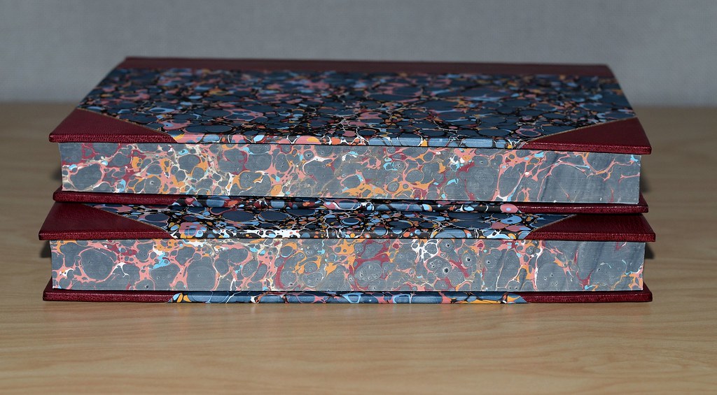
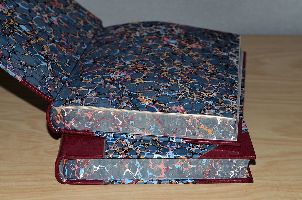


99ultrarightist
>98 BuzzBuzzard: Gorgeous! I love the marbling and how it extends to the text blocks. Was that a Don custom rebind?
101BuzzBuzzard
>99 ultrarightist: Yes. I thought you might have his Don Quixote.
102ultrarightist
>101 BuzzBuzzard: I do not, but I have others of his rebinds.
104SDB2012
>101 BuzzBuzzard: I have Don's Don Quixote and a few others. The pictures are in my gallery but the photography is poor. I'll retake the photos later to give a better idea of the beauty of the work. Don had a passion for rebinding LEC books. The internal condition of these rebinds is flawless. The LECs that I've been fortunate to acquire from the 1930s are fantastic and have held up well.
This collection is also a cautionary tale for those who may want to gift our books to an institution. Make sure your heirs know your intentions and the institution wants the collection. The previous owner of these books spoke many times about wanting to leave his nearly complete LEC collection to his university. I don't know if any of them got there but certainly many of the most desirable editions went to Ebay.
This collection is also a cautionary tale for those who may want to gift our books to an institution. Make sure your heirs know your intentions and the institution wants the collection. The previous owner of these books spoke many times about wanting to leave his nearly complete LEC collection to his university. I don't know if any of them got there but certainly many of the most desirable editions went to Ebay.
105SDB2012
>103 punkzip: the username of the person that did the rebinds was leccol. If you search his posts you may find the actual cost because he spoke about it many times. It's been a few (4-5??) years ago. I can't remember what he said he spent but I think he said $500 - $1000 per book depending on all the variables. That seems pretty cheap for the quality.
I have an LEC Moby Dick that needs a rebind but haven't done it because I'm hoping that one day I'll get one without all the offsetting my copy has.
I have an LEC Moby Dick that needs a rebind but haven't done it because I'm hoping that one day I'll get one without all the offsetting my copy has.
106abysswalker
>93 ultrarightist: that's the one! I posted some pictures of my particular copy a while back:
https://www.librarything.com/topic/327310
Envious of your rebound edition, though I do also like the original buckram with printed paper sides binding.
Also, relevant to the other recent discussion of trimming text blocks when rebinding:
https://www.librarything.com/topic/327310#7346463
https://www.librarything.com/topic/327310
Envious of your rebound edition, though I do also like the original buckram with printed paper sides binding.
Also, relevant to the other recent discussion of trimming text blocks when rebinding:
https://www.librarything.com/topic/327310#7346463
107AMindForeverVoyaging
>105 SDB2012: The following might be of interest to those who want to learn more about Don's (and others') rebinding:
https://www.librarything.com/topic/226333
https://www.librarything.com/topic/181052
https://www.librarything.com/topic/226333
https://www.librarything.com/topic/181052
108jroger1
>104 SDB2012: “This collection is also a cautionary tale for those who may want to gift our books to an institution. Make sure your heirs know your intentions and the institution wants the collection.”
The eBay ads may have been placed by the institution. Universities receive many bequests of books they have no use or space for. Unless the collection would be of significant interest to researchers, they usually sell them to raise funds.
The eBay ads may have been placed by the institution. Universities receive many bequests of books they have no use or space for. Unless the collection would be of significant interest to researchers, they usually sell them to raise funds.
109grifgon
>104 SDB2012: >108 jroger1: A cautionary tale indeed! I know of one collection which was bequeathed to a university without a prior arrangement having been worked out, and the institution declined receiving them. Certainly important to be in touch to determine interest beforehand!
110BuzzBuzzard
>108 jroger1: No. It was a book dealer in Ohio.
111DWPress
Just to clarify, the Cockerall papers used on Heart of Darkness are indeed genuine. When I placed the order we got bumped back in their production schedule because they were on a project for the royal family which delayed our publishing by nearly a month!
Regarding various means of making a letterpress impression:
a) In my opinion handset type rules but in the 21st century there are precious few of us left that actually own quantities of foundry type to set a page or four.
b) Monotype composition comes in next especially if the founder paid close attention to fitment.
c) Polymer or other platemaking material.
d) Linotype because of the inherent limitations of what you can do with a slug line.
I've created books with all methods, most of my early books are all hand set as it was before polymer was even a thing, and the kind of freedom you have with hand setting is pretty liberating - if not slow. With the proper tools in the shop setting type on a curve or mortising a drop cap is trivial and this carries on to monotype. Digital composition can be made to look like anything (and I've done it) letting the characters wander off the base line occasionally and digitally "nicking" the typeface to imply wear. Don't worry, it wasn't for a book any of you might own.
On the topic of binding and materials. Leather is certainly a more difficult and expensive (time costs more than product) material to be used. A good vellum binding is even more difficult. Paper and cloth are great alternatives if they suit the book. I used Tim Barrett's Iowa PC4 for my little book "There Be Monsters" in a limp binding and it suits this sort of thing beautifully as Tim recreated (and was awarded a MacArthur fellows for his efforts) a 13th century flax paper that has outlasted leather bindings from its time.
Bottom line, in my humble opinion, is that the binding should suite the book and set the tone for the contents within. Also, the binding structure should be durable enough to last the ages. Though I've made exposed spine bindings I don't think they are appropriate for fine press offerings.
112ultrarightist
>111 DWPress: Thank you very much for the clarification regarding the Cockerell papers, and for your input into the discussion about type and binding. Is the Cockerell company still in business? I thought it closed and its equipment and remaining stock sold in 1990. Did another company buy it all and continue its legacy?
113SDB2012
>107 AMindForeverVoyaging: Thanks! I couldn't find the threads when I searched. The first one has photos of many of Don's rebinds including better pictures of the books I was lucky enough to purchase. Barring some sort of physical disaster I suspect they will long outlive me.
In the other post he said he got the Moby Dick cheaper than the $800-$1200 for less than fine copies he'd seen for sale. That means he only spent around $600 for the binding. Doesn't that seem awfully low for the quality? Given the number of books he sent to the binder, maybe he got a discount.
In the other post he said he got the Moby Dick cheaper than the $800-$1200 for less than fine copies he'd seen for sale. That means he only spent around $600 for the binding. Doesn't that seem awfully low for the quality? Given the number of books he sent to the binder, maybe he got a discount.
114BuzzBuzzard
>113 SDB2012: Don actually wrote that he paid $175 for the original LEC Moby Dick.
115kdweber
Don looked for copies with perfect text blocks and really bad bindings and it's not difficult to find a copy of the LEC Moby Dick with a terrible binding. I tried to buy a copy from Oak Knoll for $150 a few years ago but it turned out to have already been sold. Instead, I finally found a copy in VG+ condition at a good price.
116DWPress
>112 ultrarightist: The Cockerell's were still active when we did HOD and that was 2008 but operations ceased shortly after as I recall. Nobody took over the operation. I still have all the samples of sheets they had available back then, those peacock patterns were wonderful and easily spotted on nicer books.
117Lukas1990
Hello! Is pigskin binding generally greatly preffered over half vellum binding? I need to choose between two variants of the same 100 year old book. The half vellum version looks really good. Another bookseller hasn't answered to my inquiry and sent the photos of the pigskin binding yet, not sure if the book is still available and in a good condition. The half vellum version looks more and more tempting.
118kdweber
>117 Lukas1990: Why wouldn't you buy your preference? I personally prefer vellum; limp velum, full hardcover vellum, half vellum, vellum pages ...

