Questions for the Resident LEC and HP Experts-continued 06/24/2014
ConversazioniGeorge Macy devotees
Iscriviti a LibraryThing per pubblicare un messaggio.
1Django6924
featherwate: "I have noticed from them that the Club issued a two-in-one Edgar Rice Burroughs volume, At the Earth’s Core/A Princess of Mars (1996) - didn't know that before. And also that the HP issued a bound volume of the fifty-eight Sandglasses from Series A-E June 1937 to May 1942 (Bound in green cloth 6” by 8⅞”)"
Jack, this was one of the last issues of the Heritage Club before it folded, unhappily but perhaps mercifully, as MBI saw there was more to be made by repackaging older editions in leather as The Easton Press.
I was a member of the HC until the end, and I have the Burroughs volume, a small octavo bound in green linen with a so-so gilt design of a torch on the cover and repeated on the spine. The texts are printed somewhat unimaginatively (no pricy tete-beche here), offset on archival paper (alpha-cellulose), with an introduction by L. Sprague de Camp, and two lurid full color illustrations used as frontispieces for each novel with a few B&W drawings scattered throughout. The artist is Ron Miller, quite a name in the field of speculative fiction, and I have to say I find his color illustrations as first-rate as the B&W drawings seem perfunctory. He may have made preliminary sketches for equally spectacular color illustrations, but was never commissioned to finalize these, and MBI used them as they were. (This is pure guesswork on my part, but I can't see how the difference in quality could be accounted for otherwise.)
If an Easton Press edition of this is available, it is probably identical to this on the interior.
2BuzzBuzzard
Hawthorne's Tanglewood Tales were published by the HC in 2001. Although an imaginative choice of illustrator (Maxfield Parrish) the overall production is rather uninspiring. A selection of Poe poems was also issued around the same time (I believe but have to double check). I do not find anything fascinating about it either.
3SteveJohnson
I've become a fan of illustrator N.C. Wyeth, mainly after a visit to the Brandywine River Museum of Art, which features a large collection of his work as well as that of his son Andrew Wyeth and grandson Jamie Wyeth.
Did Macy ever use any of his work in LEC editions? I bought a copy of his collected letters this weekend but there is no mention of Macy or the LEC in the index.
Prior to the Brandywine visit, I had not appreciated Wyeth, because the quality of the reproductions in the books he illustrated did not hold up well over time. Seeing the original, large (6 foot by 4 foot) paintings for Treasure Island were revelatory.
Anyone know if he ever did any fine press editions? Or was anyone doing that when he was in his prime, in the early 1900s?
I also bought a copy of Wyeth mentor Howard Pyle's The Story of King Arthur and His Knights this weekend and it has the same problem as Wyeth's popular works -- the quality of the reproductions is just not that great. My copy is a 1920 Scribner's edition of TSOKAAHK, which was originally published in 1903, and it is a lovely work but the black ink has faded somewhat over time and the illustrations are not very sharp.
Seems a shame that such great illustrations never got premium treatment... or did they?
4Django6924
>3 SteveJohnson:
Yes, although Macy never used Wyeth (probably because he was too expensive and had a contract with Scribners), Wyeth had a few premium treatments, including my all-time favorite, as mentioned elsewhere, The Odyssey in the George Palmer translation for the Riverside Press (Cambridge) in an edition limited to 550 copies and signed by Palmer and Wyeth, and with an extra suite of reproductions for framing. Though perhaps not to everyone's taste, I find these perfect for The Odyssey, and perhaps Wyeth's most satisfying work:


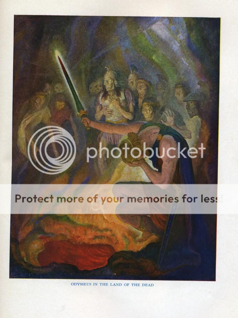
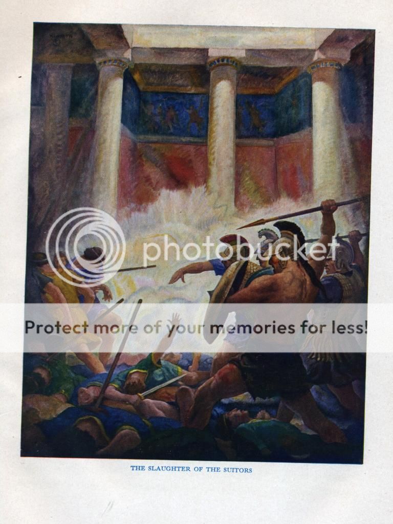
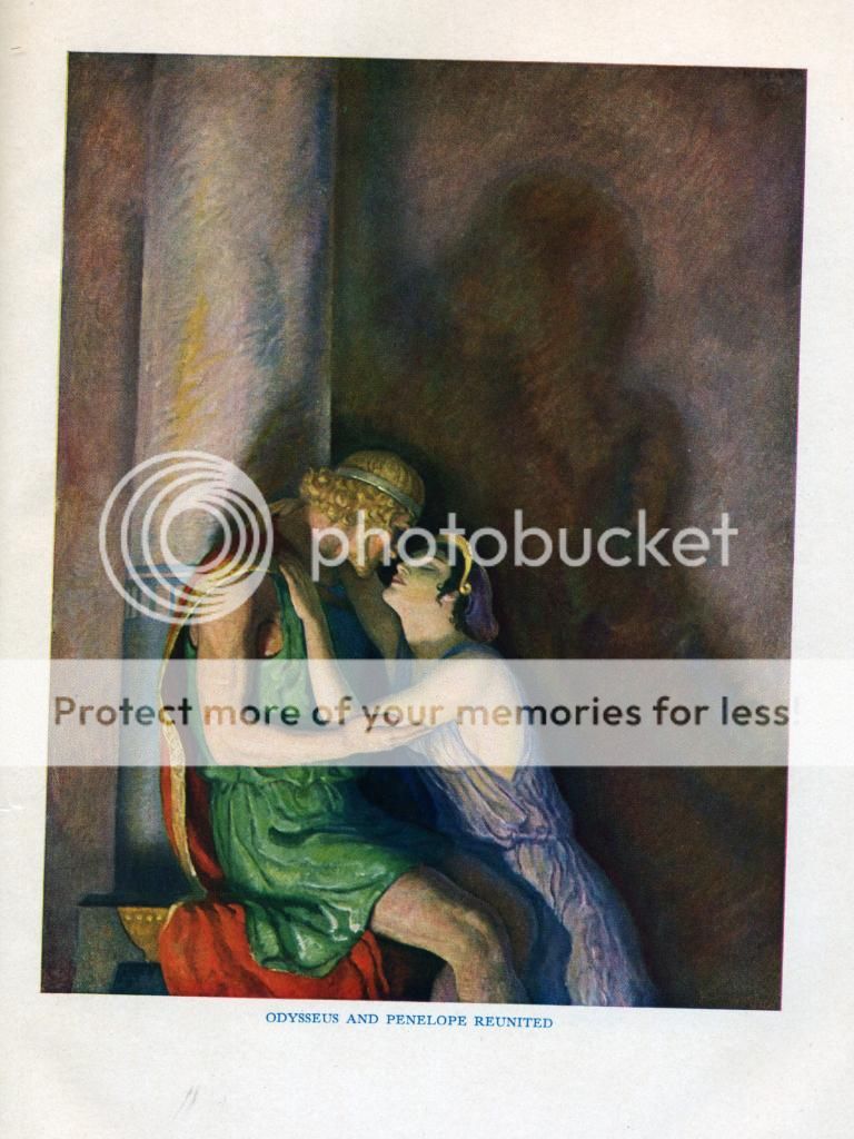
Yes, although Macy never used Wyeth (probably because he was too expensive and had a contract with Scribners), Wyeth had a few premium treatments, including my all-time favorite, as mentioned elsewhere, The Odyssey in the George Palmer translation for the Riverside Press (Cambridge) in an edition limited to 550 copies and signed by Palmer and Wyeth, and with an extra suite of reproductions for framing. Though perhaps not to everyone's taste, I find these perfect for The Odyssey, and perhaps Wyeth's most satisfying work:


6featherwate
>3 SteveJohnson:
>4 Django6924:
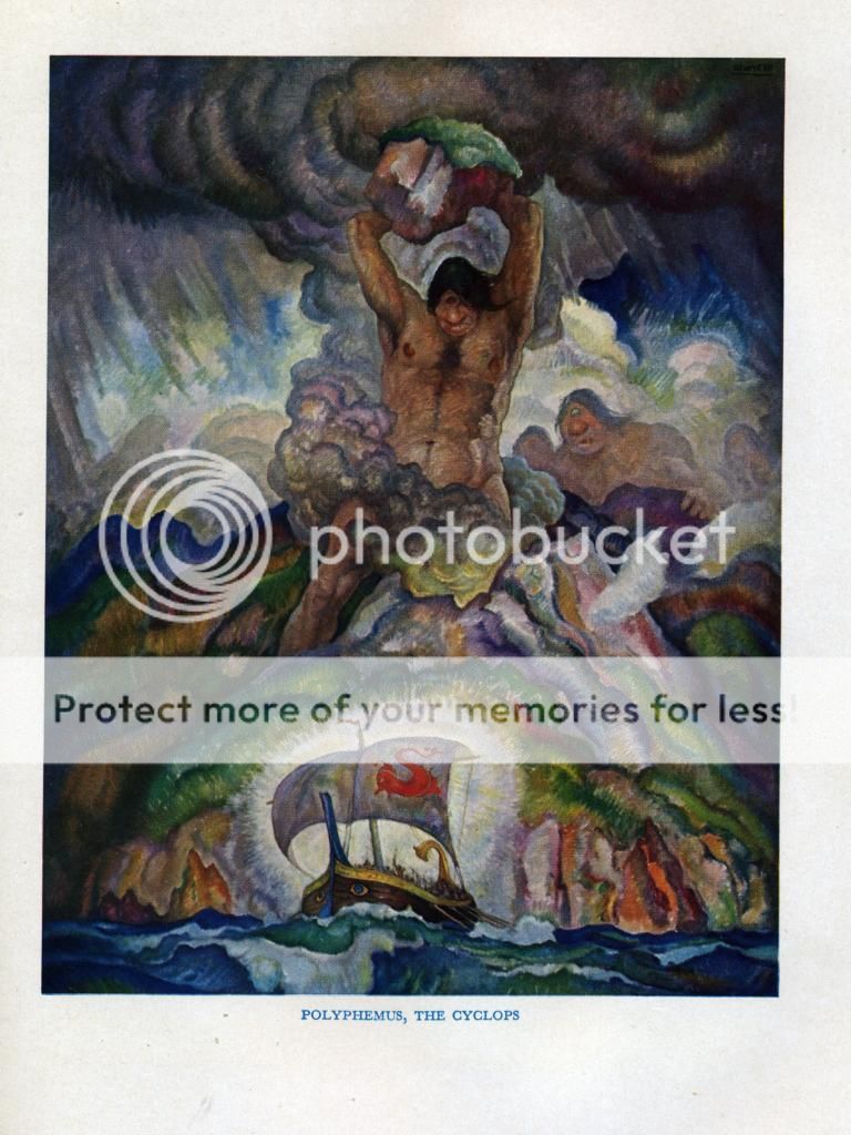
Robert, no wonder you prize this edition! Are any of the Odyssey originals at the Brandywine? Coming face to face with a six-foot high version of that Polyphemus would be quite something.
I was working in Cambridge (England) in 1988 when the Fitzwilliam Museum hosted the British leg of an AT&T-sponsored world-touring exhibition called something like Three Generations of Wyeths. The artists had equal representation, about 40 paintings each (tho' N.C. as the Godfather was allowed one extra). I went primarily to see the Andrew Wyeths (James I knew nothing about), but like you Steve I was knocked out by the huge originals of N.C.'s illustrations. As a result I have no memory of what Andrew and James were showing, except there was a Helga portrait (the 'scandal' had broken a year or two before and apparently nearly scuppered the AT&T show).
(I've no idea why Cambridge was chosen as the sole UK venue; a local newspaper mischievously suggested it was at the instigation of the tour's most influential non-American participant: the Kremlin, using it as a way of rewarding the city for nurturing the Cambridge Five, one of the USSR's most successful spy rings...)
When I first read Treasure Island it never crossed my mind that N. C. Wyeth was an American. Even now I can't think of any British or other artist who has come close to matching his meticulous bravado (not even E. A. Wilson for the LEC), though I like the brutality of Mervyn Peake's illustrations, which firmly de-romanticize the story; and, at the other end of the scale, there is Dulac's delicate, distanced approach in which almost every scene is observed from high above (a seagull's eye view, which is not inappropriate).
>4 Django6924:
Robert, no wonder you prize this edition! Are any of the Odyssey originals at the Brandywine? Coming face to face with a six-foot high version of that Polyphemus would be quite something.
I was working in Cambridge (England) in 1988 when the Fitzwilliam Museum hosted the British leg of an AT&T-sponsored world-touring exhibition called something like Three Generations of Wyeths. The artists had equal representation, about 40 paintings each (tho' N.C. as the Godfather was allowed one extra). I went primarily to see the Andrew Wyeths (James I knew nothing about), but like you Steve I was knocked out by the huge originals of N.C.'s illustrations. As a result I have no memory of what Andrew and James were showing, except there was a Helga portrait (the 'scandal' had broken a year or two before and apparently nearly scuppered the AT&T show).
(I've no idea why Cambridge was chosen as the sole UK venue; a local newspaper mischievously suggested it was at the instigation of the tour's most influential non-American participant: the Kremlin, using it as a way of rewarding the city for nurturing the Cambridge Five, one of the USSR's most successful spy rings...)
When I first read Treasure Island it never crossed my mind that N. C. Wyeth was an American. Even now I can't think of any British or other artist who has come close to matching his meticulous bravado (not even E. A. Wilson for the LEC), though I like the brutality of Mervyn Peake's illustrations, which firmly de-romanticize the story; and, at the other end of the scale, there is Dulac's delicate, distanced approach in which almost every scene is observed from high above (a seagull's eye view, which is not inappropriate).
7leccol
The books printed from Wyeth's original oils were published when printing was in its infancy, and to my knowledge he (Wyath) never produced multi-colored lithographs or woodcuts. His oils would have to have been photographically reproduced, then separated on camera.
Easton Press did a fairly nice set of books about 15 yars ago, titled Classics of Adventure. there were in total 14 books with Wyeth illustrations. I had a set, but sold them long ago. Easton received permission to photograph the original Wyeth oils. They produced an 8X10 or a 4X5 color transparency from the photogrphy. The transparencies were them scanned to produce the CMYK printed illustrations.
Of course, this would have been impossible to do in N C Wyeth's lifetime since laser scanning of color transpapencies was not available then. The Easton book production may have been limited by Wyeth heirs since this set has never been reproduced. While the Easton set is not Fine printing, it has maintained its value fairly well in the secondary market. I should have held on to my set since the value has now increased to be greater than what the originals sold for.
9Jan7Smith
I would like to purchase a Heritage Press Robinson Crusoe. Which of the several editions available is the most desirable?
10Django6924
>8 JeromeJ:
Good point! I think that the Greeks would have approved of Wyeth's work.
>9 Jan7Smith:
My own preference is always for the first edition, as it usually, especially in the years before WW II, is produced at the highest level of quality. It is the only Heritage edition of this work which has the figure of Crusoe in bas relief discovering Friday's footprint almost filling the entire front cover. Later editions feature this image within a small blue frame. Here is a link to a copy on eBay (which would have been desirable had not a previous owner stuck a bookplate right on top of Wilson's fine map of the island!):
http://www.ebay.com/itm/VINTAGE-ROBINSON-CRUSOE-BY-DANIEL-DEFORE-HERITAGE-PRESS-...
12featherwate
I have the first two editions from 1945 (Sandglass 2J) and 1948 (Sandglass 1MM), and find it quite hard to decide between them. The first certainly scores with its wonderful cover, as Django mentions, in which the figure of Crusoe, the tops of the waves in the sea beyond him and even the footprint itself are in relief. The 1948 cover is bound in a more attractive cloth, a flecked pale sand linen, but also has the less striking small embossed picture. But things get more complicated inside the books...
Both are the same size (roughly 6"x9.5"), but the 1948 edition is thicker and heavier because of its paper, which is not only slightly thicker but whiter and more opaque than in the 1945 edition - perhaps because the latter had to be produced under wartime restrictions? This means the 1945 type shows through, but that's really only distracting, and only mildly so, when it appears in the background of an illustration.
The illustrations are generally better reproduced in the 1945 book, but some of those in the 1948 are definitely superior. And there are odd differences: for example, there's an in-text illustration on p39 (1945) which has several touches of red among the blues and browns that are the predominant colours in both books. But the same picture in 1948 has no red at all (and is on page 38). Contrariwise, there's a picture towards the end where the 1948 has red and the 1945 doesn't. And the endpaper maps are a deeper colour in 1948 than they are in 1945.
Both books have the same number of pages but as not all the illustrations are on the same pages in each edition, the 1948 was presumably re-set and not just a straight reprint. It also has an unusually ornate slipcase for a Heritage Press book: it's blue with a pasted-on reproduction of the title-page on both front and back, and the title 'Robinson Crusoe' in large lettering down the spine. Linked with its odd Sandglass number - 1MM - these differences suggest it was not part of the regular M Series of 1948/9.
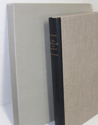
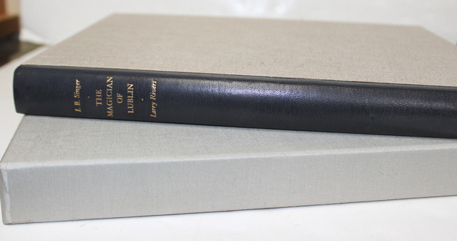
Not easy to choose between them!
Incidentally, both Sandglasses say that the book was originally intended to be bound in blue sailcloth, 5000 yards of which were ordered and delivered, only to be set aside to allow the discovery of the footprint to be the cover theme, for which of course the cloth needed to be sand-coloured.
So: what happened to the apparently bought-and-paid-for 5000 yards of 1945 blue sailcloth? Was it re-used on another HP book? Did George Macy donate it to the navy? Or did the navy requisition it before it left the mill and order Macy to make up a cover-story (the mot juste if ever there was one)? Whatever really happened, the outcome was definitely for the best for us: a choice of two decorative covers and no risk of either book falling victim to the dreaded blue dye fade that had struck Two Years Before the Mast and other wartime books.
Both are the same size (roughly 6"x9.5"), but the 1948 edition is thicker and heavier because of its paper, which is not only slightly thicker but whiter and more opaque than in the 1945 edition - perhaps because the latter had to be produced under wartime restrictions? This means the 1945 type shows through, but that's really only distracting, and only mildly so, when it appears in the background of an illustration.
The illustrations are generally better reproduced in the 1945 book, but some of those in the 1948 are definitely superior. And there are odd differences: for example, there's an in-text illustration on p39 (1945) which has several touches of red among the blues and browns that are the predominant colours in both books. But the same picture in 1948 has no red at all (and is on page 38). Contrariwise, there's a picture towards the end where the 1948 has red and the 1945 doesn't. And the endpaper maps are a deeper colour in 1948 than they are in 1945.
Both books have the same number of pages but as not all the illustrations are on the same pages in each edition, the 1948 was presumably re-set and not just a straight reprint. It also has an unusually ornate slipcase for a Heritage Press book: it's blue with a pasted-on reproduction of the title-page on both front and back, and the title 'Robinson Crusoe' in large lettering down the spine. Linked with its odd Sandglass number - 1MM - these differences suggest it was not part of the regular M Series of 1948/9.
Not easy to choose between them!
Incidentally, both Sandglasses say that the book was originally intended to be bound in blue sailcloth, 5000 yards of which were ordered and delivered, only to be set aside to allow the discovery of the footprint to be the cover theme, for which of course the cloth needed to be sand-coloured.
So: what happened to the apparently bought-and-paid-for 5000 yards of 1945 blue sailcloth? Was it re-used on another HP book? Did George Macy donate it to the navy? Or did the navy requisition it before it left the mill and order Macy to make up a cover-story (the mot juste if ever there was one)? Whatever really happened, the outcome was definitely for the best for us: a choice of two decorative covers and no risk of either book falling victim to the dreaded blue dye fade that had struck Two Years Before the Mast and other wartime books.
13Jan7Smith
I'm not sure this helps me make a choice but it sure is appreciated.
Another question where is the year of publication listed.? I see only 1930 listed in the two books.
Another question where is the year of publication listed.? I see only 1930 listed in the two books.
14Felixholt
>12 featherwate: May one idly and politely inquire, as a student of the eccentricities of life, how you came to acquire two copies of the same book? I don't buy Heritage Press titles, given the cost of shipping outside the US, so I am numbed in admiration by the fiscal insouciance of buying (and presumably importing) not one but two copies. And I dare say you have the LEC edition as well.
15leccol
I believe the 1930 date refers to the date of the copyright which would be the date the LEC was published since the earliest HP was published about 1938. Novice booksellers on ebay and elsewhere are continually listing HPs as LECs aince the copyright of the LEC is printed in the HP with the words Limited Editions Club.
16BuzzBuzzard
I believe HP started operations in 1935.
17Django6924
>16 BuzzBuzzard:
Yes, the first six books from the Heritage Press were issued in 1935, and the 4 of those I have all have that as the copyright date. Since these are all HP exclusives with no prior LEC edition, this date is correct and not, as leccol points out, the copyright date of an LEC edition of which the HP is a reprint.
>12 featherwate:
Fascinating information, Jack, and thank you for sharing. I have had the later HP edition, and have seen the first, though I never had an opportunity to compare the two. I did compare the 1948 HP with my LEC Robinson Crusoe, and noticed a difference in the illustrations themselves, slight, but noticeable. It is interesting that in the LEC, you can also see the text on the reverse page faintly through the white backgrounds of the illustrations. One thing I did notice about the illustrations in the later HP edition in comparison to the LEC is that large areas of solid color are solid in the HP, whereas in the LEC they can sometimes exhibit a patchiness caused by the texture of the laid paper used, a characteristic another member noticed in the LEC Treasure Island, which was intended to be a companion volume to Robinson Crusoe.
Macy often complained about the paper issues brought on by paper rationing during the war, so I wouldn't be surprised if the paper quality of the later HP were superior. All in all, I still find that design of the cover of the first edition so compelling and so original that I would choose it as the one to have.
18BuzzBuzzard
The cover of the LEC Great Gatsby has always reminded me of a pair of staring eyes. The ML reads that the design was conceived in a style that harmonizes with the period illustrations. I wonder if it was influenced by the dust jacket for the first edition.
19Django6924
>18 BuzzBuzzard: "I wonder if it was influenced by the dust jacket for the first edition"
I doubt it; if it was it wasn't influenced enough! I always considered that dust jacket art of the 1st edition one of the greatest illustrations ever.
I doubt it; if it was it wasn't influenced enough! I always considered that dust jacket art of the 1st edition one of the greatest illustrations ever.
20UK_History_Fan
> 19
Completely agree. I recently saw it as a screen printed t-shirt on someone. Didn't look out of place.
Completely agree. I recently saw it as a screen printed t-shirt on someone. Didn't look out of place.
21BuzzBuzzard
>19 Django6924: >20 UK_History_Fan:
You guys are not alone. Check out this video: http://www.peterharrington.co.uk/video/the-great-gatsby-dust-jacket-one-of-the-m.... For this money one could likely purchase the complete LEC run.
You guys are not alone. Check out this video: http://www.peterharrington.co.uk/video/the-great-gatsby-dust-jacket-one-of-the-m.... For this money one could likely purchase the complete LEC run.
22featherwate
>21 BuzzBuzzard:
Interesting! The longer it went on the more I began to worry that he was going to end up by saying '...but unfortunately we have no idea who the artist was'. Not that there seems to be much info about him but at least he's now remembered in his own right, not just as the brother of the more famous Xavier.
The Harrington copy seems to have been sold, presumably for the £120,000 they were asking. The purchaser got a bargain - the highest asking price on Abe now is USD300,000 (with a less good jacket).
>19 Django6924:
Robert, there's a blog posting (http://theartofilm.blogspot.co.uk/2013/10/chinatown-1974-poster-nouveau-touch-of.html) that suggests the jacket might have had an influence on at least one film poster:

Maybe. There is a connection between the works. According to wikipedia:
In 1971 producer Robert Evans offered Robert Towne $175,000 to write a screenplay for The Great Gatsby, but Towne felt he could not better the F. Scott Fitzgerald novel. Instead, Towne asked for $25,000 from Evans to write his own story, Chinatown, to which Evans agreed.
Two wise men.
Both Chinatown and the Robert Redford Gatsby came out in 1974.
23featherwate
14 Felix
I do like your description. Fiscal insouciance has a fin de siècle/Edwardian air, making me feel like Norman Douglas or a louche remittance man drifting around the Mediterranean frittering a publisher's advance or a monthly stay-out-of-England bank draft on good wine, good food, old books and other pleasures (not that I share all Douglas's pleasures).
Sadly, I think I'm more like Billy Bunter hanging about the school tuckshop desperately hoping someone will lend me half-a-crown against my forthcoming birthday postal order (pension cheque) so that I can rush in and appease my greed for cream buns, sticky cakes &c. (LECs &c.).
I don't in fact have the Crusoe LEC. The prosaic truth about the two HPs is that I wanted to have a copy of Edw. A. Wilson's Robinson Crusoe, but didn't find the original LEC appealing - dull binding* and at 400 pages (according to the Monthly Letter) too big. Either of the two HPs looked preferable but I couldn't decide between them. So I bought a copy of each. Together they cost less than an LEC in VG condition. And I think I'll keep them both, though if I had to make a choice I'd go along with Django and keep the 1945 one for its binding.
*Sorry, Huxley!
26EclecticIndulgence
Questo messaggio è stato cancellato dall'autore.
29WildcatJF
28) There are not illustrations per chapter, nor are there smaller decorative illustrations. Instead, there are deliberate breaks from the text with a introductory page explaining the artwork, and then a two page illustration, followed by a blank page, and then Gibbon. Each volume, of which there are three and combine two of the LEC volumes into one, has 16 total illustrations. I will be getting around to this wonderful set in the near future if you'd like to see it in more detail, although someone may beat me to the punch and post some now. Hope that helps!
31BuzzBuzzard
In reference to the Arion Don Quixote Don has mentioned that stacking type on the spine is a no! no! There is at least one LEC that goes against this rule and dare I say it looks lovely. The book was designed under the leadership of John Dreyfus and it is not a Chinese tale. Do you know which book I have in mind? I will post a picture of the answer later today.
32Django6924
>31 BuzzBuzzard:
Glancing at my shelves, the only one that pops out is Omoo.
Upon further search, add Batouala and Carmen.
Glancing at my shelves, the only one that pops out is Omoo.
Upon further search, add Batouala and Carmen.
35BuzzBuzzard
Omoo is what I had in mind.
These are great examples and I do think that stacked type works with short names. Perhaps only the stacked Argonautica is not to my liking.


These are great examples and I do think that stacked type works with short names. Perhaps only the stacked Argonautica is not to my liking.


36leccol
Stacked type is generally dicouraged in graphic design and advertising courses. Of course. in book design, it is not so much of a no! no! Many of the older LECs have titling which I find not worthy of the book in question. The titling of Utopia with the type running from tail to head, if my memory serves me correctly, is a case in point. In general, the Shiff books have titling much better than do many of the earlier LECs. Poe's Tales is another LEC with stacked type which is a case in point.The titling of the Scarlet Letter got compleely out of hand with the title label being out of proportion to the spine itself.
Your OMOO is splendid! Much better than mine which has a toned spine. I like the design of OMOO with its graphic waves. A graphic teatment on a book is usually better than using an illustration, This is another case where the book seller lied about the toning of the spine and wouldn't allow me to return the book.
I am not enamored with Arion books. I have let my opinion be expressed more than once concerning the book design at Arion. Hoyem needs an art director, especially when he uses photography for illustration. I am in complete agreement with Django who says the feel for books like The Big Sleep and The Maltese Falcon are not evocative of the period qbout which the books were written. At the risk of appearing homophobic, I think the model used for Philip Marlowe looks a bit of a sissy. I can imagine Bogart keeping an office bottle in a brown paper bag in his desk drawer, but not the Arion model.
37busywine
>31 BuzzBuzzard: to me the binding on Arion's Don Quixote is absolutely stunning and basically perfect.
38EclecticIndulgence
Questo messaggio è stato cancellato dall'autore.
39BuzzBuzzard
>36 leccol: Following one of your posts I dipped in the inventory of Mark Post. His books are accurately described and reasonably priced. I love my Omoo. Putting the "orderly waves" of the Pacific Ocean on the cover turned out great. The slipcase though plain was designed with care. Sadly not the case for many LECs.
>37 busywine: I am sure the binding of the Arion's Don Quixote is superb as the leather looks really nice. Just the title running down the spine could have been designed better.
>38 EclecticIndulgence: I like the spine design of Ben-Hur. One of my favorite artist too.
>37 busywine: I am sure the binding of the Arion's Don Quixote is superb as the leather looks really nice. Just the title running down the spine could have been designed better.
>38 EclecticIndulgence: I like the spine design of Ben-Hur. One of my favorite artist too.
40Django6924
More stacked-type titles: Job and Ruth.
41leccol
I have bought about four or five books from Mark Post, all of which I found reasonably priced and accurately described. He says he bought several LECs at auction from Bonhams in CA. The OMOO you have is in beautiful shape! I wish mine was as nice.
That's enough posts about stacked type. Let it rest. The titling of the Arion DQ is not all that is wrong with the book. For one thing, the price is too much. Arion will continue to produce books which some like and others do not. I stand by my statement that Arion does not have a designer in-house, and that many of their designs are inadequate. But if you have the money, go for them. Hoyem is a printer, not a book designer. As long as he has his hand in the design, Arion books will be lacking.
That's enough posts about stacked type. Let it rest. The titling of the Arion DQ is not all that is wrong with the book. For one thing, the price is too much. Arion will continue to produce books which some like and others do not. I stand by my statement that Arion does not have a designer in-house, and that many of their designs are inadequate. But if you have the money, go for them. Hoyem is a printer, not a book designer. As long as he has his hand in the design, Arion books will be lacking.
42busywine
>41 leccol: you are a broken record on this Don. Your opinion is just that, an opinion. His Moby Dick is one of the greatest books of the last 100 years. Apocalypse is certainly well up there also. These general statements just show a lack of appreciation for anything other than that which you deem acceptable. Like all publishers, there are hits and misses. I for one, am glad that everyone does not do the same thing, again and again, based on some pre-approved template that some feel all design must stay within.
43BuzzBuzzard
>41 leccol:
I am convinced that if one is just starting to collect LECs, auctions is the right thing to do. The realized prices I have seen on many LEC lots are really affordable. Yet it requires a lot more research than simply shopping on eBay.
I am convinced that if one is just starting to collect LECs, auctions is the right thing to do. The realized prices I have seen on many LEC lots are really affordable. Yet it requires a lot more research than simply shopping on eBay.
44busywine
>43 BuzzBuzzard:, I agree, some auctions have really resulted in low prices. As long as one pays attention to condition, not a bad way to go at all.
>41 leccol:, I also have bought from Mark, and agree with your thoughts.
>41 leccol:, I also have bought from Mark, and agree with your thoughts.
48BuzzBuzzard
The Song of Songs being such a success I wonder why the HP did not reprint Angelo's Rubaiyat, Kasidah nor Vathek.
49scholasticus
I have a feeling this has been addressed somewhere, but I can't find the answer on these forums.
How do you tell which HP edition of Dostoevsky's Crime and Punishment is the first? Is it the blue slipcase with the blue spine label, or is it one of the other colours, all of which seem to have come out in 1938?
Many thanks!
How do you tell which HP edition of Dostoevsky's Crime and Punishment is the first? Is it the blue slipcase with the blue spine label, or is it one of the other colours, all of which seem to have come out in 1938?
Many thanks!
50Django6924
>49 scholasticus:
I loaned my first edition HP Crime and Punishment to my sister-in-law 35 years ago and haven't seen it since, but if memory serves, it had a black spine label. The title page says it was made for the members of the Heritage Club, and all subsequent editions, I think, say Heritage Press New York.
I loaned my first edition HP Crime and Punishment to my sister-in-law 35 years ago and haven't seen it since, but if memory serves, it had a black spine label. The title page says it was made for the members of the Heritage Club, and all subsequent editions, I think, say Heritage Press New York.
51leccol
She commited the Crime so you get to name the Punishment. Thirty-five years of late fees compounded daily would be a signiicant amount.
52scholasticus
>50 Django6924:
Many thanks! Rereading my original query, I seem to have conflated the slipcase and the spine label - I blame the brutal heat wave we're six days into up here where temperatures have been around 30-36 Celsius as a day high and around 22 to 26 as a low.
The boards of the HP book of this title have been issued in, as far as I can tell, red, blue, and green. For some reason I thought the blue slipcase (which goes with the edition with blue boards, obviously) also corresponded to the label - my apologies.
The spine label is indeed black as you note, Django, as is the image of the gavel that graces the front cover.
I'm not too picky about HP in that I absolutely must have a first edition, but if I can get a first edition at a reasonable price compared to later reprints, I won't complain!!
Thanks again.
53busywine
>52 scholasticus:, 30-36 Celsius as a day high....that is it! :-)
Pretty much 45/46 Celsius here every day!!!!
Pretty much 45/46 Celsius here every day!!!!
54scholasticus
>53 busywine:
Perhaps we all need to move to the Ninth Circle of Hell a la Dante? At least it'd be nice and cool. Although the immediate neighbours would be, well, hell. ;)
Perhaps we all need to move to the Ninth Circle of Hell a la Dante? At least it'd be nice and cool. Although the immediate neighbours would be, well, hell. ;)
55featherwate
>49 scholasticus:
>50 Django6924:
Michael Bussacco confirms your memory, Robert: the first edition from November 1938 is ©1938 Heritage Club, has a linen cloth cover with an embossed golden Russian cross and axe in a black rectangle on the front cover, gold stamped title in a black rectangle on the spine, tan gilt on the top edge, and a tan slipcase. Sandglass 6B.
HOWEVER...slipcase colours aren't always absolutely consistent through a given HP edition. For example, there is a copy on ABE (from Big E's Books) which seems indubitably to be a first edition. It is inscribed with the original owner's name and the date November 20, 1938 and has Heritage Club, not Press, on the title page. But it has a black slipcase.
And another oddity: in October 1938. subscribers were told they were about to receive a magnificent edition of C&P "containing more than 600 pages". In fact, it had 486 pages.
But there WAS an edition issued in June 1951 that had ix+629 pages. It is taller book than the first edition, has a different designer, is reset in a different and larger type and and is bound in a red linen cloth and (theoretically!) has a black slipcase. Its Sandglass is No. I:16. It is ©1938 Heritage Press for GMC.
The three remaining editions identified by Mr Bussacco retain the red cloth and the black slipcase but in other respects revert back to to the first edition in height, design and number of pages (well, 485 instead of 486).
One of them is another edition ©1938 Heritage Press for GMC, and has a Sandglass numbered 6Br. Mr Bussacco places it in July 1960: the 6Br perhaps means it is direct reprint of the first edition? Wildcat has first-class pictures of this edition, including the Sandglass, on his blog.
The fourth comes from June 1974 and is ©1938 Heritage Press Avon Conn. Its Sandglass is I:39.
The fifth is ©1938, 1966 Heritage Press Norwalk, Conn., and is similar to the fourth, except that it has no axe on the cover and is possibly the only one not have its spine title stamped within a rectangle. Its Sandglass is Norwalk #307.
Of course, none of this explains how come there are also editions bound in blue and green!
C&P was also published in the Heritage Reprint series. But that's another story!
56Django6924
>52 scholasticus:
One of the most interesting things for the HP collector is the variations between different editions, and although in many cases the first edition is preferable, that's not always the case. Especially for HP books printed during the war years, a later edition sometimes has higher quality materials and better printing (Macy often complained about the fact that the war effort siphoned off many of the finest pressmen, and the materials rationing in effect often made its restrictions felt in a thinner paper than would have been ideal). In fact, one of my upcoming Heritage Press Exclusives will feature both the first and second edition of one of the most desirable (in my opinion) HP exclusives, and one that belongs in the library of every serious student of English literature--but more on that later.
If you can see the differences between the various editions, it makes the task easier, so visiting libraries and used book stores is very helpful, as are forums such as this where you can benefit from knowledgeable collectors such as featherwate!
>55 featherwate:
(how's that for a segue Jack?) Fascinating information indeed--especially about the number of pages. Of course it is well known that the LEC issued its own version of Crime and Punishment in August, 1948, in 2 volumes with a total of 660 pages. Is this where the confusion arises? Does anyone have that HP edition from 1951 with 600+ pages? Or did a bookseller not due adequate research before posting?
Incidentally, all of the illustrations in the 1st edition HP were made from electroplates made from a proof of the original wood engravings. When it came time for the LEC to issue their edition, they had to do repairs on Mr. Eichenberg's blocks, some of which had cracked in storage. Apparently some of these repairs didn't hold up, and some of the illustrations were printed from copper etchings made from the repaired blocks as a precaution.
I wish I still had my HP edition. The LEC set is very nice, but 2 big heavy volumes seem a bit excessive for this novel. I would also like to compare the quality of the illustration reproduction.
58Django6924
>57 JeromeJ: "As an example is it true that the second HP printing of Gibbon is better than the first?"
Without a doubt!
Without a doubt!
59scholasticus
55-58:
This kind of discussion is exactly why I love this group so much.
How do I tell which HP printing of Gibbon I have? The title pages of all three volumes simply note that this is for Heritage Press, New York. There's no year. I have noticed, though, that it appears that later printings of most HP titles omit the year. Is this a reasonable rule of thumb in determining if a HP edition is first or not, or am I just crazy?
And a related question: does this mean that the first edition of Sterne's Sentimental Journey is still considered superior to later printings, as well as the edition in the HP Reprints series, given that it was done in 1941?
60featherwate
>56 Django6924:
Does anyone have that HP edition from 1951 with 600+ pages?
Well, someone soon will! There's a copy up on ebay at the moment, and it's for real. It comes with the right Sandglass (Number I:16), the right physical dimensions, the right number of pages (629), pink/red speckled text edges, and a black slipcase. Admittedly it is bound not in a red but in a pink cloth, but this is not incompatible with the Sandglass description of the binding material as linen 'of a red tone'; perhaps the Sandglass author felt that pink was too sissy a word - or this being 1951, too dangerously socialistic one - to apply to so massive a work.
It's clearly based on the 1948 LEC, not on the 1938 HP original. The text uses the typographical scheme set up for the LEC by E. L. Hildreth & Company, the shop that composed and printed the LEC (the HP is printed by a different company 'by lithography from "reproduction proofs" of the pages'.) The Monthly Letter doesn't mention the LEC designer but I remember reading on Jerry's blog that it was George Macy himself. A long-time Macy collaborator, Robert L. Dothard, was given the job of redesigning the 660 page two-book LEC into a single HP volume of 629 pages. (Although the prior announcement for the HP mistakenly carries over the 660 figure from the Monthly Letter.) The subsequent HP editions retain the original 1938 design by Carl Purington Rollins.
61Django6924
>59 scholasticus:
The first printing of the HP Decline and Fall is easily distinguished by the designs on the spine, which rather than using a modified version of Clarence Hornung's deteriorating columns, has small scenes in gilt:

Another distinguishing feature is that the illustrations are reproduced in black and white, rather than the sanguine such as was used in the LEC edition, and the later HP editions.
I believe that the HP A Sentimental Journey was only issued the one time. And the LEC version was never issued as a Heritage reprint. Odd that one of the best and most delightful examples of early 19th century English literature seems relatively neglected.
Jack, I wondered if the 1951 version was a reset of the LEC rather than of the original HP--the picture of the title page tells me that this is the case--are you bidding on it?
62featherwate
>61 Django6924:
"are you bidding on it"
I did think about it, but no. I'm not deeply interested in owning it; and given that it seems fairly rare compared to the other HP editions, especially with the Sandglass intact, I'd much rather it went to a collector who would really appreciate it - especially of course if it were someone on this group!
63scholasticus
>61 Django6924:
Many thanks! So I do have the reprint, as my set has the stylised columns. Not that I mind - Gibbon was my first-ever HP purchase, and I'm quite happy with the set I have.
Many thanks! So I do have the reprint, as my set has the stylised columns. Not that I mind - Gibbon was my first-ever HP purchase, and I'm quite happy with the set I have.
64BuzzBuzzard
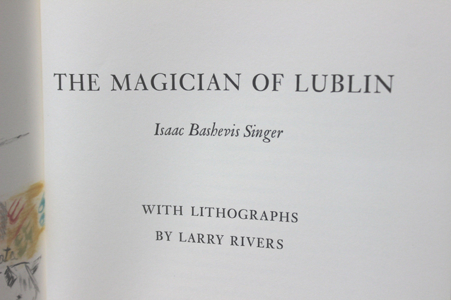
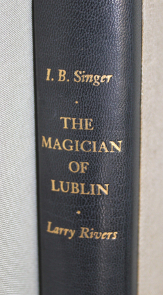
The LEC Magician of Lublin (1984) is a book that does not get mentioned very often. I found a copy with discolored but sound spine and otherwise clean boards and insides and won the bid at $30. Considering that the cheapest LEC copy on eBay, as far as I can see, at the moment is at $220 I think myself lucky. Will post some pictures when I have my camera later this week. The 220 page book is over sized, printed letterpress by The Anthoensen Press and bound in three quarter black aniline leather & imported Polish linen. According to the small Errata card (the size of a business card) tucked in the book it is bound in Nigerian Goatskin & Irish Linen. Go figure. The lithographs (all three of them) have been printed by the Water Street Press. The book is signed by both author Isaac Singer and illustrator Larry Rivers. What is your opinion of the production and/or the story?
65leccol
I haven't looked at my copy for sometime so I had to pull it out for a look. The bibliography says it is bound it 1/4 goatskin. The colophon states it is bound in black aniline leather. There is an errata card inserted in my copy, which was bought directly from The Limited Editions Card, which states that it is bound in dark blue 1/4 goatskin. I believe it is bound in goatskin. The books published by the LEC in aniline leather include Hiroshima which is a bit too soft for my taste since it marks easily and you must be careful not to set anything on the book which could leave an indentation. Also,I have had to replace the Hiroshima slipcase since it was leaving a mark on the front board.
That said, the book I believe is 1/4 bound in goatskin. It is a very nicely done up volume in the goatskin and linen. I would not have bought a copy that was sunned or faded, but that is a personal decision. In my nearly 550 LECs, I do not have a sunned book.
Singer was a Polish Jew who emegrated to the US about 1935, and is highly aclaimed as an author. the book was published in 1984 under the Shiff regime. the slipcase is paper covered which Shiff soon stopped, covering all books in cloth.
In summary, it is an attractively bound book by a respected author. These are the reasons for which I would have sought a copy not sunned. This book will go up in value, but a sunned copy probably will not.
66BuzzBuzzard
>65 leccol: The condition of the spine does not bother me too much. In this case it was more of a financial decision that anything else but inevitably one has to make compromises especially when collecting some of the earlier LECs.
Apparently a page between a blank page and the page reading PART ONE has been removed. I would appreciate if anyone can check what is on it. The colophon as well as the three lithographs are present and I can't think of the significance of the missing page.


Apparently a page between a blank page and the page reading PART ONE has been removed. I would appreciate if anyone can check what is on it. The colophon as well as the three lithographs are present and I can't think of the significance of the missing page.


69BuzzBuzzard
>67 busywine: Now I see. This is from the page with the first lithograph. Thanks for pointing this out!
70leccol
> vdanchev
The $30 you paid for the book is less than what I paid as an LEC member buying directly from the Club. I think a membership then (1984) was about $60 per book. I primarily don't want sunning since my LECs from 1965 through 1985 were all purchased from the club as new. This was one of the first Shiff era books to be bound in goatskin so that is why an errata card was placed in the book saying the book was not bound in aniline leather. Aniline leather is a vert soft leather used to make expensive sofas and to upholster exotic car seats. It didn't work out well to bind books in it since an impression was left on the book if anything was set upon it. the LEC received a lot of complaints over the tender nature of Hiroshima bound in aniline leather. the slipcase of my copy was leaving marks on the leather so I had to make a clamshell box to house the book where the box did not touch the book cover.
The $30 you paid for the book is less than what I paid as an LEC member buying directly from the Club. I think a membership then (1984) was about $60 per book. I primarily don't want sunning since my LECs from 1965 through 1985 were all purchased from the club as new. This was one of the first Shiff era books to be bound in goatskin so that is why an errata card was placed in the book saying the book was not bound in aniline leather. Aniline leather is a vert soft leather used to make expensive sofas and to upholster exotic car seats. It didn't work out well to bind books in it since an impression was left on the book if anything was set upon it. the LEC received a lot of complaints over the tender nature of Hiroshima bound in aniline leather. the slipcase of my copy was leaving marks on the leather so I had to make a clamshell box to house the book where the box did not touch the book cover.
71BuzzBuzzard
I just finished reading The Magician of Lublin. It is a thought provoking and very compelling story. The style is reminiscent of Hermann Hesse's journeys of self discovery. Don't deny yourself the five hour pleasure of immersing into the world of the unusual and mysterious, both physical and spiritual. Alas I will stop here and leave the more detailed review to the gifted in this craft likes busywine.
P.S. You might want to read the Author's Note after you finish the story.
P.S. You might want to read the Author's Note after you finish the story.
72BuzzBuzzard
Just noticed that what looks like the first printing of the HP Wind in the Willows sold for £206 ($300+) on eBay. This is really interesting.
73Django6924
Arthur Rackham's name is magic--especially with booksellers! I'm not quite so taken with his work (though I feel that he never did a better job than TWITW.
74leccol
the LEC WitW sometimes goes for $1000 or more. I paid $500 for an LEC copy which the seller said was near Fine. When it came in, it was no where near Fine, but the inside was clean so I decided to keep it and rebind.
The most overpriced in not very good condition is the 1942 Leaves of Grass. I have not seen one under a thousand dollars even in less than Good condition.
The most overpriced in not very good condition is the 1942 Leaves of Grass. I have not seen one under a thousand dollars even in less than Good condition.
75BuzzBuzzard
>73 Django6924: But why when another copy of the same first printing is offered on eBay for $100?
>74 leccol: Once a seller got mad at me because I asked for pictures. He claimed a book was in fine condition, but it had sunned spine.
>74 leccol: Once a seller got mad at me because I asked for pictures. He claimed a book was in fine condition, but it had sunned spine.
76leccol
>75 BuzzBuzzard: Vdanchev
It is best to work with known sellers, but I know that is not always possible. Long-time sellers usually want to work with you, but they still make mistakes. The worst book I ever received was Peregrine Pickle It was received with a broken spine not attached to boards.
It is best to work with known sellers, but I know that is not always possible. Long-time sellers usually want to work with you, but they still make mistakes. The worst book I ever received was Peregrine Pickle It was received with a broken spine not attached to boards.
77Django6924
>75 BuzzBuzzard:
Most usually when something like this happens, the seller is not knowledgeable and sees the combination of book title and artist, goes to ABE or some such other site, and sees the high price set for an LEC version of the book and uses that as a guide for his asking price. Sometimes it's an honest mistake; sometimes, as in the case of my $75 Pinocchio advertised as an LEC but really a Heritage Illustrated Bookshelf edition, it's simply a seller trying to gouge the buyer (and in my case, with eBay's complaisant attitude, it worked).
Most usually when something like this happens, the seller is not knowledgeable and sees the combination of book title and artist, goes to ABE or some such other site, and sees the high price set for an LEC version of the book and uses that as a guide for his asking price. Sometimes it's an honest mistake; sometimes, as in the case of my $75 Pinocchio advertised as an LEC but really a Heritage Illustrated Bookshelf edition, it's simply a seller trying to gouge the buyer (and in my case, with eBay's complaisant attitude, it worked).
78BuzzBuzzard
>76 leccol: Working with known sellers is the safest, but I love the thrill of finding bargains online...
>77 Django6924: This was an auction that started at £0.99 and the book was represented well (plenty of pictures and text). It looked in great shape (missing Sanglass) but I am really surprised at the price it fetched.
>77 Django6924: This was an auction that started at £0.99 and the book was represented well (plenty of pictures and text). It looked in great shape (missing Sanglass) but I am really surprised at the price it fetched.
79sdawson
>65 leccol:
OK, the discussion of this book intrigued me, and I saw this on Ebay so I took chance with the buy-it-now price for $39.99 (s&h included) just now. I'm going to pass on the 1941 'Looking Backward' which ends in a few hours, which I was on the fence about anyway. I thought this book looked more interesting this week.
No-where in the Ebay description did it say it is LEC, or signed. It was simply "1984 Magician of Lublin by Issac Bashevis Singer w/ Lithographs; Larry Rivers".
But judging from the photos it looks like the LEC edition to me.


80BuzzBuzzard
>79 sdawson:
Fine production and a great story! This was not issued as HP, which I am assuming is true for all Shiff era LECs. If you tried to share pictures they do not open for me.
Fine production and a great story! This was not issued as HP, which I am assuming is true for all Shiff era LECs. If you tried to share pictures they do not open for me.
81sdawson
>80 BuzzBuzzard:, thanks. I'm trying to link to drop-box photos. I can see them, but perhaps because that is because it is my account.
Can anyone tell me how to link to drop box photos?
OK, I put them in my gallery and tried to link to them --- does that work better anyone?
Can anyone tell me how to link to drop box photos?
OK, I put them in my gallery and tried to link to them --- does that work better anyone?
82WildcatJF
80) Sid Shiff never owned the Heritage Press. When the LEC was being bounced around in the early 1970s, the Heritage side of the George Macy Company was sold to MBI, the owners of the Easton Press, which powers most of their Greatest Books Ever Written selections. Most Cardevon and all Shiff LECs never saw a Heritage release because of this.

84Django6924
Nice! I love that artwork; as Don pointed out in another thread, the cover artwork on the LEC Gatsby pales in comparison.
85leccol
I think a first edition with this art on the dust cover sold for $10,000. Nice design, but not worth that much money. Any one who pays this much for a book should have his taxes raised. As Thorstein Veblen said, "conspicuous consumption" or something like that.
Poor Scott Fitzgerald had to pound out stories for the Saturday Evening Post to keep his wife in an asylum; then, after he is dead, some rich sob comes along and pays 10 K for just one of his books. It's enough to make you a socaialist.
Poor Scott Fitzgerald had to pound out stories for the Saturday Evening Post to keep his wife in an asylum; then, after he is dead, some rich sob comes along and pays 10 K for just one of his books. It's enough to make you a socaialist.
86BuzzBuzzard
>85 leccol:
Add one zero (to the price) and it will still be a bargain. Peter Harrington had a copy at £120,000, which is no longer available.
Add one zero (to the price) and it will still be a bargain. Peter Harrington had a copy at £120,000, which is no longer available.
87Django6924
>86 BuzzBuzzard: "Peter Harrington had a copy at £120,000"
I would only pay that much if Zelda delivered it in person.
I would only pay that much if Zelda delivered it in person.
88UK_History_Fan
> 85, 86, 87
For that price they would have to throw in the Rolls Royce too!
For that price they would have to throw in the Rolls Royce too!
89leccol
There should be at least a 100% tax on high ticket books and art. I imagine the VAT was charged if it was bought by a Britisher.
90featherwate
I haven't had much direct involvement in the arcane world of VAT for some years now (thank goodness), but my understanding of its application to books is as follows:
Transactions involving books are liable to VAT but in the United Kingdom the current rate is zero percent. That's not the case everywhere in the EU; the Republic of Ireland is the only other state to apply a zero rate.
So if Peter Harrington's customer bought The Great Gatsby in person in the UK, the sale would have been VAT-free, whatever the customer's nationality. The same sale in, say, Belgium would have been taxed at 6%, and in Denmark at an eye-watering 25%, as Faisel (ironjaw) knows only too well. (This suggests that if he had decided to buy the Gatsby it would have paid him to fly to London, thereby saving himself £30,000 - unless he declared its value to the Danish customs in which case he might have had to pay import duty).
For VAT purposes, books are:
"items that normally consist of text or illustrations, bound in a cover stiffer than their pages. They may be printed in any language or characters (including Braille or shorthand), photocopied, typed or hand-written, so long as they are found in book or booklet form."
.
91Django6924
>89 leccol:, >90 featherwate: "For VAT purposes, books are:
'items that normally consist of text or illustrations, bound in a cover stiffer than their pages.'"
Hmmm, then it would make sense to have removed the hard covers, shipped the book, then had a binder do a fine rebinding a la Don's technique for LECs which can't be found in Fine condition. You'd have saved enough after rebinding for a bottle of Krug "Clos des Mesnil" to celebrate!
92featherwate
>91 Django6924:
An ingenious idea, Robert! but torpedoed I think by "normally". Being bound is the norm for most published books and that remains so even if one copy of a particular book is temporarily or even permanently stripped of its binding. So I fear the old get-out cry beloved of silent film intertitles
An ingenious idea, Robert! but torpedoed I think by "normally". Being bound is the norm for most published books and that remains so even if one copy of a particular book is temporarily or even permanently stripped of its binding. So I fear the old get-out cry beloved of silent film intertitles
"With un bound he was free!"no longer applies. The excisemen will still get you! (Unless of course you're Doctor Syn).
93BuzzBuzzard
Well George Macy himself tried this with Notre-Dame de Paris. I am afraid it did not go so well...
Yet, when they (members) got the book, hundreds of them insisted that they were cheated because the two volumes were paper bound. We had to bind in hard cases, American fashion, most of the copies. I (G.M.) spent several days and nights trying to scheme out a way of conducting The Limited Editions Club without the need to have members at all, since members can be so irritating.
Yet, when they (members) got the book, hundreds of them insisted that they were cheated because the two volumes were paper bound. We had to bind in hard cases, American fashion, most of the copies. I (G.M.) spent several days and nights trying to scheme out a way of conducting The Limited Editions Club without the need to have members at all, since members can be so irritating.
94leccol
In the early 80s when I was making more money than now, Jermyn Street shirtmakers wanted to charge the VAT and then refund after you paid for it. The internet was in its infancy, and I imagine London shirtmakers and cobblers have learned to work with the VAT and US customs. It's funny, since Jermyn street shirtmakers became as we in the US did with TVs. That is, they would advertise their shirts as crafted by British tailors, but when you got the shirt it was labelled made in Roumania or some such place. Also, London clothiers were selling cashmere sweaters made in China, not Scottish cashmere where the finest cashmere is made. Chinese cashmere sucks and American buyers soon got onto the trick of London clothiers selling Chinese cashmere instead of Scottish cashmere.
Another funny thing was concerning English shoes. Crockett & Jones is a fine English shoe, not custom made or fitted personally, but better than any shoe made in the US or imported by a US shoe maker. A custom shoe from John Lobb would run over $2000. So these were out of the question.
C & J sold for about $750 per pair in New York where they had a shoe store in the Turnbull & Asser shirt shop. However, an enterprising shoe salesman in Indonesia figured out that he could buy C&J shoes directly from London, then resell them to US customers for about $450 and still make a nice profit. I bought a couple from him, and they are fine shoes which I still have. This was soon on all the clothing blogs which are much like the Library Thing. For awhile, C&J shoes were available for this price which was much less than the NY price. But customers in the NY store couldn't keep their mouth shut, and they were bragging about the cheap prices they got from the Indonesian guy. C&J shut down the Indonesian shoe salesman so there went fine English shoes at a discount price.
If the Indonesian could buy English shoes and import them from England, then turn around and ship them to the US, making a profit, just think of the mark up at the NY store. That's capitalism in action.
95Django6924
>94 leccol: "just think of the mark up at the NY store"
Don, just think of what the rents are like at 50 East 57th Street in New York!
I use to get my C & J shoes from Ben Silver in Charleston, which were still expensive, but less than from the T & A New York store. I actually only bought two pairs of C & J, because because most of my shoes were from Alden, a shoemaking firm in the US which, in their best lines, made very fine shoes (and perhaps still do, though with outsourcing being what it is today, who knows where they are being made any more; since I no longer interface with the public, these days I wear only New Balance walking shoes--style be damned!)
To keep this related to books, I wish a fine press would bring out a copy of a book built around literary works related somehow to "shoes. " It would have to include Anderson's "The Red Shoes," Wilbur Daniel Steele's "How Beautiful with Shoes," and, as the first selection, what Hemingway claimed as his best work never published, a work which, in its entirety is:
For Sale: Baby shoes, never worn.
Any other suggestions for shoe-related fiction?
96leccol
I bought a lot of accessories at Ben Silver, but they were the same price for C&J as in NY Turnbull and Asser at the time I bought from them. I had a run in with Silver over size. A 9 M in US is an 8-1/2 British. I bought a pair from Silver and they were sized in British, although Silver denied it. They were much too big, and Silver would exchange them but wouldn't pay for shipping. So I never bought anything else from them. I finally found an English firm on the west coast of England who gave me a price break with free shipping to the US. Then I found out Brooks Bros. shoes were made by C & J so I switched to them. Although they were of less quality than regular C & J.
Turnbull & Asser store was featured in the British spy movie when the British spy for the Russians went to their London store in the movie.
How about the tale called "Seven-League Boots". Or "Shoe Boat" by Jerome Kern.
Turnbull & Asser store was featured in the British spy movie when the British spy for the Russians went to their London store in the movie.
How about the tale called "Seven-League Boots". Or "Shoe Boat" by Jerome Kern.
97featherwate
While obviously not the sole contender, Evelyn Waugh's Scoop should be a shoe-in for the first publication of any footwear-related Fine Press. It has at least three pairs of boots (one of whom's a bit of a heel).
98Django6924
Ah yes, "Boot of The Beast."
99BuzzBuzzard
Do you keep a log of the limitation numbers of your LECs? In case they walk away and you want to keep an eye on the web market places.
100kdweber
>99 BuzzBuzzard: Yes, I always note the limitation number (e.g. 123 of 1500) of my limited editions in the comment field of LT.
101featherwate
>100 kdweber:
Ditto. But I also keep an offline back up list just in case.
Ditto. But I also keep an offline back up list just in case.
102kdweber
>101 featherwate: Coming from the software field I have already learned this lesson the hard way. I also keep my data on an excel spreadsheet that resides on my hard drive, network back-up drive and cloud back-up.
104Jan7Smith
What are the differences between the LEC & Heritage Press editions of The Life of Samuel Johnson.
105Django6924
The LEC has a paper that is thicker, an all-rag paper made by John Dickinson & Company in England (alas, no longer extant) which has no laid chains nor deckled edges, and bound in an olive-toned linen buckram made by Winterbottom in England, which unfortunately is not colorfast and is notoriously prone to fading or darkening. The page ends are untinted and have no gilt. The letterpress work is very sharp and clear.
I can't say with certainty whether the HP version is offset or letterpress (though I suspect it is the former), but it's nothing to sneeze at--very sharp, clear and dense black. The paper is also first rate, and the brown buckram binding is colorfast and sturdy. The 3 LEC volumes come in a single slipcase (hard to find intact) and the three HP volumes comes in individual slipcases. The frontispiece illustrations (the only illustrations) are reproduced in B&W in the LEC volumes, but in color in the HP.
I would have to say the HP is my preferred version, if for no other reason than the touchy binding fabric on the LEC. They are very comparable quality-wise.
107leccol
I have ttried to buy an LEC, but to no avail. They all seem to be severly faded, and I don't want to rebind three volumes. On the other hand, my HP volumes I have had from the 1960s, and they still look as new, although they are now over 50 years old.
108BuzzBuzzard
I am reading Back to Metuselah and it is quite entertaining. How does it compare to Two Plays for Puritans?
109Django6924
The two plays in Plays for Puritans are much more theatrical and a lot of fun. Back to Methuselah is virtually unstageable (it would make a better movie than a stage play), and is one of Shaw's most fascinating, ambitious works. Farleigh's illustrations for BtM are some of the best LEC illustrations ever. Of all three, the most fun and the best theater piece is The Devil's Disciple.
110BuzzBuzzard
The Monthly Letters often rave about different aspect of the LEC production. One reads thus: It (the paper) is made completely out of rags and made completely by hand.... Never, in any of the books which we have published, has a finer paper been used. Can you guess which book is this and do you agree? Which LEC is your favourite in terms of used paper?
Hint: The book is from the first 25 years of the club and is also remarkable for its illustrations/decorations.
Hint: The book is from the first 25 years of the club and is also remarkable for its illustrations/decorations.
111leccol
The best paper was from the first 20 years of the club, but the hand made paper was often, in the early years, mould made paper whuch was not of a length very satisfyling in that there is usually 1/4 inch difference in length between sheets. I don't know what book you are referring to, but in rebinding many of the LECs (to date 38 vols),
those which were trimmed, regilded, or ends marbled and came out as new include the following: Uncle Tom's Cabin, Typee, Red Badge of Courage, Ballad of Reading Gaol, Baron Mucnhausen, The Narrative of Arthur Gordon Pym, Snow-Bound, Confessions of an English Opium Eater, Grimm's FairyTales, both Alice books, Ricart Don Quixote, A Christmas Carol, House of Seven Gables, and Browning Sonnets. There may have been more, but I am recalling these from memory. What I am saying is that all of the above, after trimming 1/8 inch, looked as new. Trimming did the following: got rid of old gilding, separated uncut pages without using a knife, and got rid of dirt or foxing accumulation on deckle edges. I just rebound the 1929 Baron Munchausen and now this more than 80-year old book looks as new.
The ones I remember which could not be trimmed, at least satisfactorily, were Aesop's Fables and School for Scandal. there are probably more if I would consult the bibliography. Saying which paper was the best would be difficult, but the unequal page lengths are obvious, especially when trying to rebind.
There are some purists who are against trimming pages, but I am obviously not one of those. On second thought, since you mention decorations, the book you are refering to might be Sonnets from the Portugeuse.
112BuzzBuzzard
It is neither Sonnets from the Portuguese nor it is illustrated by Valenti Angelo.
Untrimmed pages when like new are quite attractive. Not so much when dusty.
Untrimmed pages when like new are quite attractive. Not so much when dusty.
113leccol
Yes, but finding untimmed pages with no dirt or foxing in first 20 years of LEC is well nigh impossible.
114Django6924
I don't know what the Monthly Letter thinks, but of all the books I've seen from the LEC, the finest is without question the paper in the Ricart-illustrated Don Quixote. I don't know if I've ever seen a finer paper.
115leccol
I would agree that all the production of the Ricart was excellent. The heavy ink coverage did not offset too much, although the copy I bought was slip sheeted. Another LEC with excellent paper is Baron Munchausen. Published in 1929 as the third LEC, you would think that age would be a factor, but I recently rebound it and after trimming to remove old gild, this one came out as new. A remarkable feat for a book this old.
116BuzzBuzzard
The claim is that Zadig has the finest paper.
117leccol
The Zadig is indeed a fine production except for the Label at the top of the spine. It is a little rubbed at the top since it is probably sheepskin. Printed in France using a special paper, The heavy paper is more like a cover weigh than a text weight.
118featherwate
>116 BuzzBuzzard:
Interesting! My mental shortlist included Tartuffe, Lyrics of Francois Villon and The School for Scandal, all from the 1930s, and the Officina Bodoni's Georgics of 1952 (orgasmically luxurious paper and just within your timescale). I must dig out Zadig again.
Interesting! My mental shortlist included Tartuffe, Lyrics of Francois Villon and The School for Scandal, all from the 1930s, and the Officina Bodoni's Georgics of 1952 (orgasmically luxurious paper and just within your timescale). I must dig out Zadig again.
119leccol
Many of the older LECs have Fine paper made to be imprinted letterpress. The School for Scandal has hand made paper, but it is one of those with pages of unequal length which is not attractive to many modern collectors. The first Villon, I can't find without offsetting of illustrations onto a text page. Not that this is a fault of the paper, but it diminishes the pleasure the book could fullfill without offsetting. A Christmas Carol is printed on Hurlburl paper, whatever that is, but the handcolored illustrations came out looking great on this paper. Many of the early LECs were imprinted on what is called Worthy special paper. Walden is one of these. You can't really tell how wonderful some of these are until you trim off old gild and dirt/foxing on deckle edges. The Steichen photos printed by colotype are amazing. My copy had uncut pages so these photos were hidden for about 80 years. Whatever paper was used for Main street, the Grant Wood color drawings were reproduced amazingly clear and vibrant for this era of printing.
120BuzzBuzzard
Some early LECs with uneven pages seem to have retained their freshnesh better than others. For example I have The Song of Roland in mint conditiond and have seen other such copies. On the other hand I have not seen a copy of The Innocent Voyage with fresh deckle edges.
121UK_History_Fan
I recently added the LEC Connecticut Yankee In King Arthur's Court to my collection. I bought one with a few imperfections, at a reasonable price, but nothing that would detract from my reading or ownership enjoyment. I must say, this is now one of my favorite LECs. I absolutely love the capital illustrations/designs and the other understated line drawings (?). Interestingly, the gold foil used for the capitals seems to have picked up a bit of the letterpress printing from the opposite page. Looked at carefully in the right light, you can see the writing in reverse (as if in a mirror) on part of the gold. But despite this, one of my favorite LEC designs that greatly appeals to my love of medieval manuscripts.
122leccol
This was my first LEC in the early sixties. It was in fine condition and still is. Next to Huckleberry Finn, it is my favorite Twain. Too bad the movie with Bing Crosby was such a flop. William Bendix as Clarence with a Brooklyn accent was hugely miscast.
Comparing this LEC to a medieval manuscript does not seem appropos. First of all, Twain's book is a stinging satire on Le Mort de Artur which Twain considered as foolish tripe. If you are comparing the silk screening of the cap initials to an illuminated manuscript, you are a little off base. This doesn't mean I don't like the design and production, but that your comparison is a little off.
The offsetting is not there on many copies. Mine does not exhibit any offsetting, and it was never slipsheeted.
The big problems wit this book are the slipcase and cover. The gold foil slipcase certainly wan't designed to last. The foil front cover has lasted with the blue overpint, but the blue spine has faded over the years. Not enough fading to rebind though. And I like thebook too much to rebind since the foil cover could not be replicated. There are plenty of these around so perhaps you can find one which hasn't offset.
I am glad for your post since I haven't read the book in more than fifty years so a reread is in store.
123kdweber
>120 BuzzBuzzard: I found that the chemise for Innocent Voyage protected the deckled edge quite well.
>122 leccol: I think gold foil bindings and slipcases tend to be problematic in most cases. However, my LEC copy of Connecticut Yankee has held up perfectly. I'd definitely rate it "Don" quality.
>122 leccol: I think gold foil bindings and slipcases tend to be problematic in most cases. However, my LEC copy of Connecticut Yankee has held up perfectly. I'd definitely rate it "Don" quality.
124leccol
The foil covering the boards is in Fine condition; hwever, the blue spine has faded, not beause of sunning which it has never seen, but fading over time as some LECs tend to do.
125BuzzBuzzard
Why is the LEC Chimes so much more expensive than the Christmas Carol? Has to be because of the general craziness around Arthur Rackham.
126aaronpepperdine
I imagine this is related to why Agvent thinks the Rackham-illustrated Midsummer Night's Dream, alone, is worth $937.50.
127leccol
The LEC published three of Dickens' Christmas stories. I paid more for The Chimes than the other two. Probably because of the Rackham illusttrations. I rebound all three in 1/2 scarlet Nigerian goatskin with the boards covered in a dark green Iris book cloth. The end pages are a dark green and red marbled whirl. A Cristmas Carol with its Christmas tree front board was the least attractive of the three, but more well known than the others. The Chimes, at the time, ran about $200. The other two about $100 each. This was about three years ago. They may be less expensive now.
Personally, I didn't think any of these LECs were very attractive or Christmassy, and should have been bound as a series from the beginning. The paper and illustrations of all three were of the highest quality so they were worth rebinding.
Personally, I didn't think any of these LECs were very attractive or Christmassy, and should have been bound as a series from the beginning. The paper and illustrations of all three were of the highest quality so they were worth rebinding.
128aaronpepperdine
> 127
A claimed Fine copy of The Chimes is already at $405 on eBay, with more than a day left. I guess some people really want it.
A claimed Fine copy of The Chimes is already at $405 on eBay, with more than a day left. I guess some people really want it.
129UK_History_Fan
> 128
Well that is just silliness! But I suppose if your pockets are deep enough, you don't care...
Well that is just silliness! But I suppose if your pockets are deep enough, you don't care...
130BuzzBuzzard
>127 leccol: To me the binding of Christmas Carol is right on target. Comes to say how varied people's preferences are.
>128 aaronpepperdine: Agvent is not alone in this madness. All fine press books illustrated by Rackham that I have seen were pricey.
>128 aaronpepperdine: Agvent is not alone in this madness. All fine press books illustrated by Rackham that I have seen were pricey.
131leccol
I'm glad you like A Christmas Carol binding. I didn't like any of the three Dickens' Christmas books. As I said, I thought they should have been designed as a continuing project. The Christmas tree was imported from Germany, but I'm not sure when. It may be that it was not used much about the time Dickens wrote A Christmas Carol. None the less, I think my rebindings are much more Christmassy than those of the original LECs.
132BuzzBuzzard
This is slightly off topic but what do you think of the 1930 Two Years Before The Mast by the Lakeside Press? I found a copy for a few peanuts and could not resist ordering it, especially since I don't have either the LEC or the exclusive HP edition.
133kdweber
>132 BuzzBuzzard: Good find, a very nice edition of Two Years Before the Mast particularly if you like Edward Wilson's illustrations. I actually chose to read this copy when my book club recently discussed the book. My favorite copy is the two volume 1964 Ward Ritchie edition with outstanding vintage photos. I also like the HP edition which can be picked up fairly cheaply. I've never seen the LEC edition.
134Django6924
>132 BuzzBuzzard:
I haven't seen the Lakeside Press edition, but I will have to seek it out now as I think Wilson is at his best when illustrating seafaring books and because this book is one of my very favorite tales. I'm with kdweber in giving pre-eminence to the Ward Ritchie 2-volume edition--Ward had his press in my hometown, Pasadena, and in addition to this kind of predisposal to favor him, the books are really wonderfully designed and printed with superb supplemental material. I have long ago stated my fondness for the exclusive HP edition, which comes in a close second, and the LEC is another first-rate edition with Mueller's characteristically fine multi-color wood engravings and real sailcloth binding for the book and slipcase.
It's great that there are so many fine editions of this work, which is almost required reading here in California for its picture of the early days of the Golden State, and because it is an almost unmatched portrait of life in 19th century sailing ships. I just finished reading Eric Newby's The Last Grain Race, which is a record of the last days of commercial sailing ships, just as WW II was breaking out, and I was often struck by similarities between Newby and Dana, but Dana's being much the superior achievement. When you read these works, you can't help but wonder why men ever went into this trade.
135BuzzBuzzard
What do you think of the story of Zadig? Clever and easy read but it felt like lacking depth. I can't help but compare it to Vathek, which is far more engaging. On the other hand the LEC production is fantastic.
136Django6924
>135 BuzzBuzzard:
Zadig would be considered a minor masterpiece if Voltaire hadn't also written Candide. therefore, I consider it somewhat of a trifle.
Zadig would be considered a minor masterpiece if Voltaire hadn't also written Candide. therefore, I consider it somewhat of a trifle.
137BuzzBuzzard
On the Fine Press LT forum folks were discussing the Faerie Queen Folio Society LE ($995) vs. Easton Press ($390). I cannot imagine the paper, printing and illustrations to be superior to the LEC Faerie Queen. One can get the LEC in fine condition for less than $150. Why FS or EP instead?
138jroger1
>137 BuzzBuzzard:
I haven't seen the LEC version, but I've wondered about the difference between FS and EP. I have owned the EP edition since it became available and it is beautiful. The two editions both have the same Walter Crane illustrations. FS might claim to have a higher quality leather and better paper in addition to the limitation (the EP edition isn't limited), but even if true it is hard to see why there should be a $600 difference.
I haven't seen the LEC version, but I've wondered about the difference between FS and EP. I have owned the EP edition since it became available and it is beautiful. The two editions both have the same Walter Crane illustrations. FS might claim to have a higher quality leather and better paper in addition to the limitation (the EP edition isn't limited), but even if true it is hard to see why there should be a $600 difference.
139BuzzBuzzard
>138 jroger1: The LEC Faerie Queen is beautiful with a rather fascinating story behind the production. The two big volumes were designed by John Johnson who was the Printer of the University of Oxford at the time and John Austen as the illustrator. Austen had a plan in his mind for the book to be done with a whole series of decorations that he would draw, and with illustrations that would be executed as engravings in wood. Mr. Austen proceeded to put together a series of sample pages, and to draw a long series of decorations as headings and borders and ornamental initials. Then he began to work on the engravings to serve as illustrations and suddenly passed away. With WWII underway the correspondence between the LEC and Oxford was interrupted. In the mean time Oxford got a new head Printer - Charles Batey. Talking to him almost ten years after the work on the Faerie Queen has started the LEC directors lamented that this grand project has never ripened into a complete book. Long story short Mr. Batey persuaded Miss Agnes Miller Parker, who has been a friend of John Austen, to produce the engravings. The result is that this edition of the Faerie Queen is built around the typographic plans of John Austen and John Johnson before WWII, and contains the long series of decorations drawn by John Austen before the war - and includes a truly remarkable series of wood engravings done by Agnes Miller Parker after the war. The book is 7.5 by 11 inches and was the biggest and heaviest book issued by the club by that time (1953). The paper is made completely out of rags by the paper mill of William Nash of Oxfordshire. The two volumes are bound into a heavy English buckram of a pale green shade and wrapped in paper jacket decorated with designs by Agnes Parker. The title and an ornamental design are stamped on the cover in gold leaf. Lastly the two books are put in a heavy slip-case which is also covered in ornamental design by Agnes Parker.
Now please either FS or EP beat this!
Now please either FS or EP beat this!
140jroger1
>139 BuzzBuzzard:
Thanks for the background. The LEC edition certainly has history on its side.
Thanks for the background. The LEC edition certainly has history on its side.
141WildcatJF
135) Jumping in a little late, but I quite liked Zadig. It wasn't the greatest thing I read, but the masterwork of Sauvage made the story pop far more than I imagined it would. What a wonderful little book.
142BuzzBuzzard
>141 WildcatJF: The LEC Zadig is a fantastic production from artistic prospective. I am not sure if I agree that it has the best paper ever used in an LEC up to this point, but Sauvage work is first rate. In terms of decorations he probably even surpased V. Angelo. There are close to 90 different designs (if I remember correctly)!! Though I do not think that the decorations follow the story, they are delightful. Just the story is not first rate. I have to read Candid.
143sdawson
>137 BuzzBuzzard:
said "One can get the LEC in fine condition for less than $150. Why FS or EP instead?".
This is indeed a question of mine as well.
Speaking of my personal book collecting journey, the order that I discovered these publishers was 1) EP , 2) FS and lastly 3) LEC.
This was over a few decades, so I have (and enjoy) 300+ EP editions. 150+ FS editions and 50+LEC editions.
The quantity reflects my knowledge of the existence of the publisher.
Today, now that I prefer LEC over the other two publishers, I would definitely seek out an LEC production rather than an FS or EP of the same title. Given the large increase in FS prices this publishing year, I too wonder that anyone would purchase an FS production over a far cheaper, and equal or better quality LEC book.
But there are many collectors who want books in pristine, unhandled condition. So I expect that either EP or FS appeals to these collectors.
Now I still purchase FS and EP books, as they produce works within genres that are not to be found in the other collections. EP does much more science fiction and current authors than the other two. FS does more children's or juvenile literature (which I enjoy) than the other two. But if comparing traditional Western Lit, LEC is my preferred choice for both price, quality, art, and shelf-appeal.
-Shawn
144kdweber
>143 sdawson: "Why FS or EP instead?"
The LEC published less than 600 books. The FS often uses more recent translations. I don't like the mangled translation used in the Twenty Thousand Leagues under the Sea LEC edition. The FS has recently published a nice edition with a much better translation. I bought the FS Travels in Arabia Deserta LE even though I already owned the LEC edition because the FS edition is unabridged and comes with great period photographs. The FS The Toilers of the Sea LE comes with Hugo's illustrations. Though I love the gorgeous binding of the LEC The Rime of the Ancient Mariner, I'm not thrilled with Wilson's illustrations. Indeed, there are many reasons for choosing an alternative publisher even though an LEC edition exists.
The LEC published less than 600 books. The FS often uses more recent translations. I don't like the mangled translation used in the Twenty Thousand Leagues under the Sea LEC edition. The FS has recently published a nice edition with a much better translation. I bought the FS Travels in Arabia Deserta LE even though I already owned the LEC edition because the FS edition is unabridged and comes with great period photographs. The FS The Toilers of the Sea LE comes with Hugo's illustrations. Though I love the gorgeous binding of the LEC The Rime of the Ancient Mariner, I'm not thrilled with Wilson's illustrations. Indeed, there are many reasons for choosing an alternative publisher even though an LEC edition exists.
145BuzzBuzzard
>144 kdweber: Though I tend to generalize, this time I was strictly speaking about The Faerie Queen.
146ironjaw
>144 kdweber: Ken I definitely agree with your points. I too opted for the FS Travels in Arabia Deserta being unabridged when I already had the LEC edition. Sometimes it's just illustrations that I fall for or production but I do mix and match from publishers. I think Folio have come out with interesting books and I buy from both LEC and Folio but have deliberately avoided EP unless it's something signed.
147kdweber
>145 BuzzBuzzard: With regards to The Faerie Queen, I bought the EP edition before I knew about the LEC and before the FS edition was released. I'm quite satisfied with this edition and I'm not interested in owning multiple copies of the title.
148jroger1
>145 BuzzBuzzard:
Agreed. It will take me the rest of the decade to read the three large volumes of 16th century English, and the Walter Crane illustrations are quite nice.
Agreed. It will take me the rest of the decade to read the three large volumes of 16th century English, and the Walter Crane illustrations are quite nice.
149UK_History_Fan
I bought the Folio Society Limited Edition of the Faerie Queene over the Easton Press one (which features identical illustration and page layout) despite the much higher Folio price. I am a sucker for cream leather bindings with lots of gaudy gilding (commence collective groans) and as soon as I saw a picture of the Folio edition, it was a must have, despite the price. It is still one of my favorite books.
But vdanchev is onto something in reminding us of (or introducing some to) the beauty of the Limited Editions Club edition of Faerie Queene and I bought this edition as well to supplement the Folio Walter Crane illustration version. I am a huge fan of Agnes Miller Parker and think the FQ illustrations arguably her best work. The whole story behind this edition that vdanchev shared with the group makes this a wonderful version to own. Plus, I rather like that it was published to coincide with the Accession of Queen Elizabeth II in 1953 (in fact, I believe it is labeled as a "coronation edition").
So in this case, I can make a strong argument for owning both the Folio Society and the Limited Editions Club versions. Once Folio came out with their Walter Crane illustrated set, Easton Press didn't stand a chance (though I had been previously contemplating it prior to the Folio announcement). The illustrations may be identical but from my experience the Folio paper and illustration quality are far superior always to Easton Press.
150ironjaw
>140 jroger1: I know how you feel. I really want the FS Faerie Queene. I have the Easton Press version and not happy with it. I would love to sell it but you see the problem no one would buy it from me from Denmark. The shipping costs are just terrible!
151Django6924
Hmm, I have a pristine LEC Faerie Queene, but even if I hadn't, I damned sure wouldn't spend close to a thousand $ for any copy of it--I read big chunks of it when I was assigned the first three cantos in a Renaissance Lit class; that was 45 years ago and I haven't read any since. Too many beautiful books to buy, too much more interesting literature to read. Spenser can be a very tough go.
Of course, this is my own opinion, and, viewed in the context of Spenser's reputation as the greatest English poet between Chaucer and Shakespeare, probably not worth much. The FS edition itself seems very beautiful from the pictures I've seen, though I agree with UK_History_Fan that Ms. Parker's illustrations are extraordinary. (Incidentally, the FS Shropshire Lad illustrated by AMP is also much worth having.)
Of course, this is my own opinion, and, viewed in the context of Spenser's reputation as the greatest English poet between Chaucer and Shakespeare, probably not worth much. The FS edition itself seems very beautiful from the pictures I've seen, though I agree with UK_History_Fan that Ms. Parker's illustrations are extraordinary. (Incidentally, the FS Shropshire Lad illustrated by AMP is also much worth having.)
152jroger1
For what it's worth and perhaps an indication of rarity, popularity, or simply age - abe.com currently lists 15 copies of the LEC Faerie Queene, 5 of the FS edition, and 4 Eastons. Most of the LEC listings note that the spines are fading or toning. One of the listings is for Macy's personal copy.
153BuzzBuzzard
A couple of days ago I picked up my second copy of the first HP Gulliver's Travels. The condition is as good as it gets and it sold for $8! The Sandglass (10C) is printed on a paper similar (possibly identical) to the paper for the MLs. It is watermarked - wide circle with the initials 'H' and 'C' split by a stylized sandglass. Has anyone seen this watermark elsewhere?
154WildcatJF
153) I have, but I do not recall in what books of mine it's in. I'll try to take a quick look through them in the next couple of days to see if we can build a timeframe for its use.
155BuzzBuzzard
This kind of art can make you read Shakespeare.


157UK_History_Fan
If I had to guess, I would say that is the Fritz Eichenberg illustrated Richard III from the LEC Complete Shakespeare set.
158Django6924
Good guess!
At the risk of sounding like a broken record (do most people still understand that allusion?), for me there is no doubt that the LEC Shakespeare is the supreme achievement of the Club. Chris featured many of the plays on his Books and Vines website, and it's a treat to peruse them:
http://booksandvines.com/2012/09/28/the-comedies-histories-and-tragedies-of-will...
If you love the Eichenberg illustrations for Richard III, check out Agnes Miller Parker's wood engravings for Richard II!
159UK_History_Fan
Does anyone know if the Limited Editions Club production of Livy's History of Early Rome was originally issued with the plain dustjacket typical of other works designed by Giovanni Mardersteig such as the Plato, Seutonius, and Petrarch tomes? I have never seen one for sale that still has this dustjacket, which is very plain, but in the interest of completeness, I am wondering whether it was even produced?
160Django6924
>159 UK_History_Fan:
My copy doesn't have the wrapper either, though I feel pretty certain it came with one. Three copies listed on line mention "acetate," "glassine," and "wrinkled dust jacket." Almost all my other Mardersteig-produced LECs have plain paper wrappers, so the use of glassine seems unusual.
My copy doesn't have the wrapper either, though I feel pretty certain it came with one. Three copies listed on line mention "acetate," "glassine," and "wrinkled dust jacket." Almost all my other Mardersteig-produced LECs have plain paper wrappers, so the use of glassine seems unusual.
161-parchment-
>159 UK_History_Fan: My copy is in mint condition and I am 99,9% certain that it came in an ordinary glassine. I usually discard glassines, but always keep dustjackets. Even my Cellini has a dustjacket.
162leccol
My copy directly from the LEC came with no dustjacket. I also keep dust jackets, but discard glassine.
163Django6924
Thanks Don--that's as authoritative answer as we could hope for!
It is odd that Mardersteig departed from their plain paper wrappers for this one, and I wonder if 1960 marked a change for Mardersteig? My 1959 Quo Vadis has the paper wrapper with the title and author printed on it, but the later Livy, Toilers of the Sea, and Raw Youth do not. I don't have the LEC editions of Petrarch's Sonnets, nor The Leopard nor Pater's The Renaissance, nor Ovid's Metamorphoses so I don't know about those--but my Vasari's Lives, from 1966, does on both volumes. Don probably got all these as an LEC member, so perhaps he can shed some light on this.
It is odd that Mardersteig departed from their plain paper wrappers for this one, and I wonder if 1960 marked a change for Mardersteig? My 1959 Quo Vadis has the paper wrapper with the title and author printed on it, but the later Livy, Toilers of the Sea, and Raw Youth do not. I don't have the LEC editions of Petrarch's Sonnets, nor The Leopard nor Pater's The Renaissance, nor Ovid's Metamorphoses so I don't know about those--but my Vasari's Lives, from 1966, does on both volumes. Don probably got all these as an LEC member, so perhaps he can shed some light on this.
164featherwate
My copy of The Georgics (1952) has a paper dust-wrapper and a nice baize-lined slipcase.
165ironjaw
I've ben also undecided about whether to keep the glassine on my LEC volumes or to discard them? They are a pain but they do keep the books from fading. Any recommendation on where to buy new glassine?
166UK_History_Fan
> 160-164
Thank you everyone for the clarification. I too, like Robert, will take Don's "direct from the LEC" response as the definitive answer.
I have not yet thrown out the glassines that came with a handful of my second-hand LEC volumes, but I agree they are both unsightly and a pain when removing the book in or out of the slipcase. Whenever possible (because a spine label exists on the slipcase), I turn my LEC books spine inward so only the back of the slipcase is visible. That should eliminate the need for glassines since these books are additionally stored in a dark room with UV film on the windows (which are nearly always covered by blinds anyway).
167BuzzBuzzard
>165 ironjaw: Looks like I am a minority but I prefer my books to have glassine. As a glassine replacement I am using Canson tracing paper, which works just fine.
168Django6924
>165 ironjaw:
Faisel, I have purchased glassine from the following source and found it to be a good replacement:
http://www.archivalmethods.com/Product.cfm?categoryid=7&Productid=543&gc...
If the glassine is present and not too bad, I try to keep the original; however some older LECs do not have the title on the slipcase (and I have a few without slipcase, and I purchase new glassine for these.
169booksforreading
I also keep the original glassine but remove it when I read the books. I have not had experience with a new glassine - is it strong enough to stay on a book while the book is being read?
170-parchment-
>163 Django6924: Ovid has a dustjacket. Could anyone with the Bibliography perhaps check out whether the earlier titles were bound in Italy and the later in the USA?
171Django6924
>169 booksforreading:
Glassine is definitely not intended to stay on the book while you are reading it. If you want some kind of protective jacket while reading, the Brodart or similar mylar book jackets are a better bet. This link has these kind of jackets (the only problem being they usually tend to sell these things in volume quantities to libraries and it may be difficult to purchase just a few):
http://www.archival.com/productcatalog/nonglarebookcover.shtml
Another caveat is that some of these permanent covers increase the size of the book to where it may no longer fit in the slipcase. I just take the glassine off while reading the book; I have learned over time to not get too obsessive about keeping the book in New condition.

173BuzzBuzzard
Re: Crime & Punishment (HP)
This is one of those rare cases where the HP came first and the LEC later reused the art of Eichenberg for their own edition. So some people, rightfully curious to know, are asking: which is the firtst HP printing of C&P. Now featherwate explained this already. He also gave an account of later HP reprints as well as other HP editions of the same title. What he seems to have missed is the second printing (Oct 1940) of the original (Nov 1938), which comes in the same tan cloth as the original and has Sandglass 6B2. This reprint has The Heritage Press instead of For The Members of The Heritage Club on the colophon. In all other aspects both printings seem identical. Currently there is a copy of the reprint on eBay that seems tempting.
I hope this information helps someone.
174busywine
Question -- hopefully one of you know....
LEC Poems of Whittier, I have a nice edition in black...seems some look orange/brown. Did they have two bindings?
Chris
LEC Poems of Whittier, I have a nice edition in black...seems some look orange/brown. Did they have two bindings?
Chris
175EclecticIndulgence
Questo messaggio è stato cancellato dall'autore.
177BuzzBuzzard
Coming back to an old discussion about stacked type. I really like the stacked Undine on the slipcase. As if the designer was not quite sure which is better and decided to be on the safe side and run the title up the book spine. This is sure unusual.
178Django6924
>174 busywine:
This is like the thread on the pink Madame Bovary. A lot of LEC and HP volumes from this period bound in what was originally black fabric now appear brownish due to fading. I have a first HP Poe Tales with a spine which looks brownish-orange. In fact true black is a very difficult dye to manage in fabric, and when I was photographing visual effects elements, had to specify "German Black Velvet" when ordering fabric for a project, as the normal "black" velvet you'd find in fabric stores photographed brown under the intense tungsten lighting. Not too long ago, I saw a demonstration of how the new digital cameras, when photographing a black crew jacket in bright sunlight, would render the jacket a cardinal red when you put 6 stops of neutral density filtration in front of the lens.
This is like the thread on the pink Madame Bovary. A lot of LEC and HP volumes from this period bound in what was originally black fabric now appear brownish due to fading. I have a first HP Poe Tales with a spine which looks brownish-orange. In fact true black is a very difficult dye to manage in fabric, and when I was photographing visual effects elements, had to specify "German Black Velvet" when ordering fabric for a project, as the normal "black" velvet you'd find in fabric stores photographed brown under the intense tungsten lighting. Not too long ago, I saw a demonstration of how the new digital cameras, when photographing a black crew jacket in bright sunlight, would render the jacket a cardinal red when you put 6 stops of neutral density filtration in front of the lens.
179BuzzBuzzard
Interestingly there is a 1994 HP House of the Dead. What is even more interesting is that it claims that the 1982 copyright is help by the Heritage Press. And I thought Shiff's LECs were not reprinted as HP editions.
180leccol
The LEC was published in 1982 by arrangement with Macmillan Company, Inc. Macmillan first published it in 1919.
The special contents were copyrighted by The Limited Editions Club in 1982.
This book was published by Shiff, but this title was previously selected by the Directors of the LEC so Shiff probably had nothing to do with the HP edition.
The special contents were copyrighted by The Limited Editions Club in 1982.
This book was published by Shiff, but this title was previously selected by the Directors of the LEC so Shiff probably had nothing to do with the HP edition.
182BuzzBuzzard
>180 leccol: Then why is this later HP claiming that the copyright is held by the Heritage Press 1982 I do not know.
>181 WildcatJF: I came across this HP on the internet. However I will strongly recommend that nobody buys these later days HPs as they do not have anything in common with the early days HPs.
>181 WildcatJF: I came across this HP on the internet. However I will strongly recommend that nobody buys these later days HPs as they do not have anything in common with the early days HPs.
184Django6924
I'm not sure of the existence of a book of essays, but one of the classic essays in the field is Matthew Arnold's "On Translating Homer" in which he surveys the merits and shortcomings of the three major English translations--Chapman's, Pope's, and Cowper's--and has some very cogent ideas on what characterizes the Homeric style. The other major essays that come to mind are Samuel Butler's "The Authoress of the Odyssey,” and Simone Weil's "The Iliad: or the Poem of Force."
185-parchment-
>183 JeromeJ: wrote "I find modern literary criticism dull."
You might find interest in: https://global.oup.com/academic/product/essay-on-the-life-and-poetry-of-homer-97...;
You might find interest in: https://global.oup.com/academic/product/essay-on-the-life-and-poetry-of-homer-97...;
187Django6924
>116 BuzzBuzzard: " reticence to make specific judgments founded on translations."
You bring up a point which has been a bone of contention often at this website as well as the Folio website: what can be determined about an author's style from a translation? Arnold knew his Greek very well--but still, what can you tell about the style of someone from 6 centuries or so BCE, written in a language no one has actively spoken in at least 2 millennia? For that matter, what can we tell about the style of something written in Middle English, except by comparison with other existing Middle English works? Besides, a literary production is written in a style which is consciously an artifice; how can one make judgments such as "simple," "noble," "direct" (as Arnold does about Homer's style) without some sort of context to the living language as spoken by contemporaries of the author?
You might also be fascinated, as I was, by the correspondence between Bruce Rogers and T.E. Lawrence about translating "The Odyssey." Lawrence, who was what scholars today would as an amateur when it came to his knowledge of classical Greek, probably less learned than his friend Robert Graves who was also an amateur in the field compared with lifelong students such as G.H. Palmer or Benjamin Jowett, was still capable of making amazingly self-assured judgments when it came to describing Homer's style.
http://www.telstudies.org/discussion/writings_and_criticism/wilson_t_e_lawrence_...
190Django6924
Well, if money is no object, the Doves Press did a very limited edition in soft cover in their inimitable style which I saw at the Heritage Bookshop in LA many years ago for about $3000. Very recently, there was a limited, illustrated edition produced by the Wordsworth Trust. I don't even know if it is letterpress or a photocopy of the 1805 holograph, never having seen a copy on this side of the pond. I still have my trusty 1930s Oxford University Press edition, which has the text of the 1805 version which wasn't discovered until the first part of the 20th century, which is the version most admired for its simplicity (and brevity) of expression. The more Wordsworth worked on the poem, the more he over-qualified his statements, losing a lot of the poem's forcefulness. The OUP book is not fine press on a par of the work they did for the LEC, but is sturdy and serviceable.
191BuzzBuzzard
According to the ML Kasidah is bound in a leather of Persian blue. I wonder if the description is amiss since all the copies I have seen are lavender.
192kdweber
>191 BuzzBuzzard: Chalk up another lavender copy here. Maybe it was one of those dyes that fade/change color over time.
193BuzzBuzzard
>192 kdweber: Vathek's ML refers to the binding of Kasidah as purplish-blue. After all it might have been closer to lavender than Persian blue.
195jroger1
>194 JeromeJ:
Easton is currently offering a very nice limited edition Crusoe with the Grandville illustrations.
http://www.eastonpress.com/prod/5EE/Daniel-Defoe-s-ROBINSON-CRUSOE_2918.aspx
Easton is currently offering a very nice limited edition Crusoe with the Grandville illustrations.
http://www.eastonpress.com/prod/5EE/Daniel-Defoe-s-ROBINSON-CRUSOE_2918.aspx
197Django6924
>194 JeromeJ:
It would be unfair for me to comment on the Easton version of Robinson Crusoe, as I have not seen the book itself. I suspect it is very much like most of the Easton reprints in that it has good archival, though not rag, paper, and the illustrations are printed color offset, perhaps with the dot screen method. The earlier HP edition which I favor because of the cover, may not appeal to everyone because the paper upon which it is printed is very thin and I suspect it is alpha cellulose (it certainly doesn't appear to have any rag content). I think featherweight mentioned elsewhere it is "wartime rationed" paper, and it makes for a very slim volume--probably a third the thickness of the later HP edition of this work. The font is 12 point Granjon and not expansively leaded, which makes the text seem cramped on the page compared to the later version. The illustrations, to offset these somewhat negative aspects, are beautifully reproduced. Other than saying Wilson used electroplates from his B&W drawing for the LEC edition and made new color sketches in four colors, the process wherein the colors were applied is not mentioned, but it is not dot screen--the colors are solid as if stencil-applied, or perhaps with rubber plates. In the LEC, the use of a heavily-textured paper resulted in areas of color and especially blacks which were somewhat splotchy looking, the blacks here are impenetrable. I had read Wilson and Macy were not pleased with the Grabhorn's reproduction of his illustrations in the LEC, but I believe they were eminently satisfied with those in the HP edition.
As I mentioned in another thread, I grew up with the Scribner's edition of this work with N.C. Wyeth's illustrations, which for me are still the gold standard for Robinson Crusoe.
199BuzzBuzzard
>198 JeromeJ: I have the same issue with the HP Arabian Nights illustrated by Arthur Szyk. Some of the illustrations look blurred.
201BuzzBuzzard
>200 JeromeJ: I can't quite explain it but Zhyk's style is not a favorite of mine. As a result I do not have any of his other HP/LEC books. The LEC Rubayiat is so much more attractive than the HP.
203Django6924
I have both the HP and the LEC Arabian Nights Entertainments and though the HP seems to have the different colors in registration, there is more contamination of colors which creates that apparent lack of crispness and contrast. I have two different copies of the HP Rubaiyat, and although the first (leather-bound) edition is impeccable in the reproduction of the illustrations, my 1947 edition has the second illustration drastically out of registration, creating the anaglyphic 3D look. I don't have (sadly) the Szyk LEC Canterbury Tales, but in my HP edition the illustrations are very well reproduced. The LEC may have more brilliance and contrast, but that will have to wait, alas, until I can find an affordable copy to determine. Szyk was born about 50 years too early to have his illustrations shown off to best advantage. His microscopic detail and riotous color needs the modern technique of giclée to do them justice.
Incidentally, thinking of the reactions to the LEC MLK volume busywine posted, it again shows that when it comes to art, there's no disputing about taste. I think Szyk's Rubaiyat and especially his Chaucer are perfect in their visual representation of the works they illustrate. His Arabian Nights illustrations are almost as fine, though perhaps they lack the earthy quality of some of the tales. I am less enthusiastic about his Job and Ruth; in Job most particularly, he comes off a distant runner-up to Blake's engravings. Again, my taste.
Incidentally, thinking of the reactions to the LEC MLK volume busywine posted, it again shows that when it comes to art, there's no disputing about taste. I think Szyk's Rubaiyat and especially his Chaucer are perfect in their visual representation of the works they illustrate. His Arabian Nights illustrations are almost as fine, though perhaps they lack the earthy quality of some of the tales. I am less enthusiastic about his Job and Ruth; in Job most particularly, he comes off a distant runner-up to Blake's engravings. Again, my taste.
204BuzzBuzzard
>203 Django6924: when it comes to art, there's no disputing about taste.
I might add that when it comes to book design there is no disputing about taste either... The ML for Green Mansions predicts that this edition of the book will some day rank among the most popular of the books the club has issues. Well either that time has not yet come or the club was wrong in its prediction.
I might add that when it comes to book design there is no disputing about taste either... The ML for Green Mansions predicts that this edition of the book will some day rank among the most popular of the books the club has issues. Well either that time has not yet come or the club was wrong in its prediction.
205Django6924
>204 BuzzBuzzard:
The time never will come, I believe. But to qualify things, the ML says the book will "some day rank among the most popular of the Club's books" --not that it will be regarded as one of the finest achievements in bookmaking. In fact, at the time the book was issued, Green Mansions was riding a tidal wave of fine press popularity, with virtually every press producing an illustrated edition. Unfortunately, the book slipped out of popularity, as did the author himself--to the point where Clifton Fadiman, in a commentary in a 1965 retrospective of the Knopf publishing company, could write "I suppose...there is no great interest in Hudson today." Fadiman does except Green Mansions from this general neglect, but it was never a book that was required reading in any literature class I took in my 7 years as a lit major. When the title came up at all it was referring to the unhappy film version with Audrey Hepburm as Rima. As was the case with Anthony Adverse the flame of the book's popularity burnt out, and I can't imagine any fine press edition today. It's still a beautifully written story.
And incidentally, vdanchev, I wonder how much conviction was in that statement in the ML considering the author of it also said "we don't care much for it the typographic design either."
206BuzzBuzzard
>205 Django6924:
The ML expands quite a bit on the subject of the type and the printing. Some have found fault with the impression of the letters on the paper being to delicate, but it looks alright to me. And while I find Covarrubias illustrations for the HP edition to be more successful this is still a handsome book.
The ML expands quite a bit on the subject of the type and the printing. Some have found fault with the impression of the letters on the paper being to delicate, but it looks alright to me. And while I find Covarrubias illustrations for the HP edition to be more successful this is still a handsome book.
207BuzzBuzzard
How do you feel about the LEC An Iceland Fisherman? I do not see it mentioned here often. Is it one of these stories that did not withstand the test of time? How about the production value of this early LEC?
208Django6924
>207 BuzzBuzzard:
I blush to admit I haven't as yet read it (I've put it off for over 10 years so I suspect I better take it off the shelf and move it to the pile on my dresser). As one should expect from a book from the first few years of the LEC, it is a top-notch production. The handmade linen rag paper is exquisite. The Cochin letterpress looks sturdy rather than elegant on the page, but this may be appropriate for the story (I'll know better after I read it). The binding, half cream-colored linen with lithographed paper sides, is in the restrained yet elegant style which I personally admire most. The illustrations, lithographs by Yngve Berg, are rather misty and impressionistic. These may also be appropriate, but they don't call out to me the way, say, Lynd Ward's lithographs do.
I really don't know why I have neglected this book. It is the only book from the LEC's first year I haven't read. I can only surmise that I am an inveterate lover of the tropics and hate being where it's cold and wet. (Also, the book is in absolutely As New condition and I may look for another copy to read to preserve the pristine state of what was the ninth book issued by the LEC.)
209kdweber
>208 Django6924: Robert, I think you mean the 21st book issued by the LEC (2nd series).
210parchment.redux
>207 BuzzBuzzard:
>208 Django6924:
Léontine Lippmann (1844–1910), better known by her married name of Madame Arman or Madame Arman de Caillavet was the muse of Anatole France and the hostess of a highly fashionable literary salon during the French Third Republic. She is the model of Madame Verdurin in Proust's Remembrance of Things Past. (Wiki quote.)
I recently obtained an auction catalogue from when her ”number ones on Japan paper” of Anatole France’s works were sold, and in photograph three below, you can see that Pierre Loti was among those persons who used to frequent her salon.
Perhaps he has met the same fate as Anatole France, but that doesn’t mean that his novel still wouldn’t be a good read. I am also ashamed to admit that I still haven’t read this work, but the introduction makes me expect that I will be rewarded when I do so - whenever I will find the time. (I am currently almost half-way through War and Peace, that I have read once before, in my mid twenties. How different it is today, when I’m fifty plus!)


211BuzzBuzzard
>209 kdweber: I think you are right.
>208 Django6924: >210 parchment.redux:
Pierre Loti (which is his pen name) was a naval officer and a writer by inspiration. His stories (though not the Iceland Fisherman) are drawn from his extensive travels with the French Navy. In the introduction to the Iceland Fisherman Jules Cambon says: A strange writer assuredly is this, at once logical and illusive, who makes us feel at the same time the sensation of things and that of their nothingness. During his reception into the French Academy Loti allegedly said that he had never read. A curious character he was!
The LEC does not pop up for sale very often. Yet I was able to grab a copy from Mark Post in reportedly Fine condition. It is always very exciting to obtain early LECs in fine condition!
212kdweber
I haven't read my copy either. I accidentally bought the CF Braun edition of 1957 illustrated by Mugnaini which was mislabeled in Abe since it is a reprint of the LEC translation; However, I kept it since it is a nice private press edition with marbled boards and leather spine.
>208 Django6924: This may be a good reading copy for you Robert since it uses the same translation as the LEC and only costs ~$10.
>208 Django6924: This may be a good reading copy for you Robert since it uses the same translation as the LEC and only costs ~$10.
213BuzzBuzzard
>212 kdweber: I have wondered about these illustrations. Can you post some pictures? His Age of Fable is superb I think!
214aaronpepperdine
If you search the sold listing on eBay, you can find an auction with some pictures.
They are my least-favorite of all of Mugnaini's illustrations for the LEC, but it is still a nice volume.
They are my least-favorite of all of Mugnaini's illustrations for the LEC, but it is still a nice volume.
215kdweber
Turns out to be a very quick read. Reminds me of Hugo's Toiler's of the Sea.
216BuzzBuzzard
>215 kdweber: How was it?
217kdweber
>216 BuzzBuzzard: I enjoyed it. I'd recommend it if you like reading Hugo and Zola.
218kdweber
I have a new question for the experts, who was Bill Thursday? I just picked up a nice copy of A Sentimental Journey which included the Monthly Letter (88) but as an added treat it also included an extra Monthly Letter (89) for Gargantua and Pantagruel which I didn't previously own. Inside this Monthly Letter was a 3 page handwritten note from Bill Thursday to George Macy discussing the design of the Rabelais work. I've posted a PDF of the letter on our DropBox site under the LEC Promotional Materials & Letters folder. Since Dwiggens was the designer for this edition, any insight into Bill Thursday would be appreciated.
219BuzzBuzzard
...of course there is no guarantee but I think that the damage is not permanent. According to the seller The residue seems to flake off pretty easily with a light scratch without damaging the book. According to my research this is sodium based residue from crystallized fats resulting from a past leather dressing application. To cut to the chase - does anyone have suggestions (short of going to a specialized shop) on how to approach this? Also does anyone have experience with saddle soap?
...and to answer the question why: because it was dramatically cheaper than the other available copies, and also because the inside is like new.

...and to answer the question why: because it was dramatically cheaper than the other available copies, and also because the inside is like new.

220kdweber
>219 BuzzBuzzard: The binding looks like it is in great shape if you can remove the stains. Sorry, no treatment suggestions but it does look like it should be removable.
221Django6924
Do not use saddle soap! This adds a residue to what is there.
222featherwate
>218 kdweber:
Fascinating letter! Reading it I suspected that "Bill Thursday" might actually be W A Dwiggins himself, partly because he was a jovial man

as well as a great joker famous for using pseudonyms, of which he had at least five, and partly because who but the book's designer would be writing in such detail to Macy?
Several things in the letter supported this idea, among them:
1. The address. From 1904 to his death on Christmas Day 1956, Hingham Center was the area where WAD lived (at 30 Leavitt Street), ran his first famous marionette theatre (5 Irving Street) and had his studio and second theatre (45 Irving Street). He and his wife are buried in the nearby Higham Center Cemetery.
2. The references to "Electra", one of WAD's most famous typefaces, which according to the Monthly Letter he had designed specifically for the Rabelais book - although the translator took so long that Electra appeared elsewhere first.
3. The sly dig at Macy's liking for "huge formats in the approved LEC style - ingens*, horrendous". {*Latin for huge, vast, enormous, immoderate, exorbitant, extraordinary and unnatural - WAD really hated large books!}.
4. The sketch - very Dwiggins.
However, re-reading the letter I realised I was wrong. Bill Thursday wasn't a pseudonym. The pseudonyms Dwiggins used tended to be fanciful, such as Dr Hermann Puterschein and Thedam Piiterschein. Bill Thursday didn't fit the pattern.
At which point I realised that if Mr William A Dwiggins had written his letter one day earlier, the sign-off would have been
(Memo to myself: research is self-indulgent when you haven't first ruled out the bleedin' obvious!)
Fascinating letter! Reading it I suspected that "Bill Thursday" might actually be W A Dwiggins himself, partly because he was a jovial man

as well as a great joker famous for using pseudonyms, of which he had at least five, and partly because who but the book's designer would be writing in such detail to Macy?
Several things in the letter supported this idea, among them:
1. The address. From 1904 to his death on Christmas Day 1956, Hingham Center was the area where WAD lived (at 30 Leavitt Street), ran his first famous marionette theatre (5 Irving Street) and had his studio and second theatre (45 Irving Street). He and his wife are buried in the nearby Higham Center Cemetery.
2. The references to "Electra", one of WAD's most famous typefaces, which according to the Monthly Letter he had designed specifically for the Rabelais book - although the translator took so long that Electra appeared elsewhere first.
3. The sly dig at Macy's liking for "huge formats in the approved LEC style - ingens*, horrendous". {*Latin for huge, vast, enormous, immoderate, exorbitant, extraordinary and unnatural - WAD really hated large books!}.
4. The sketch - very Dwiggins.
However, re-reading the letter I realised I was wrong. Bill Thursday wasn't a pseudonym. The pseudonyms Dwiggins used tended to be fanciful, such as Dr Hermann Puterschein and Thedam Piiterschein. Bill Thursday didn't fit the pattern.
At which point I realised that if Mr William A Dwiggins had written his letter one day earlier, the sign-off would have been
Bill
Wednesday
(Memo to myself: research is self-indulgent when you haven't first ruled out the bleedin' obvious!)
223kdweber
>22 featherwate: Wow, thanks for all the keen insights!
224BuzzBuzzard
There is a listing on eBay reading: The Song of Songs Which Is Solomon's (Heritage Club Edition) with Uncut Pages. I think that is funny.
225BuzzBuzzard
I have wondered for some time now what makes the LEC Oregon Trail so expensive. I have not seen a copy for sale for under $175.
226busywine
>225 BuzzBuzzard:, one is that it is a nicely done book! But, I suppose it could be perhaps because of Maynard Dixon, the illustrator. He was a great twentieth century American artist, whose work often depicted the American West. At least here in Arizona, his stuff often goes for a premium.
227Django6924
The artist. Maynard Dixon was probably the most famous 20th century artist who depicted the American Southwest and the cowboy culture. His signed works bring premium prices at the art galleries. I had a friend who paid $1500 for a rather perfunctory pencil sketch and thought it was a bargain. His paintings sell in the mid- to high six figure ranges. Bonham's recently sold the painting "High Hills of Tehachipi" (1936) for $997,000.
He was an interesting figure--a friend of Ansel Adams, and for a time married to Dorothea Lange. I love his covers for Arizona Highways and Westways magazines. It depicted the West when it was still Golden.
EDITED: Chris, I posted my response to vdanchev before I saw yours, which you had posted just before. I wanted to comment on your description of it as a "nicely done book" because I found myself somewhat disappointed in it. The design is splendid, and Dixon's illustrations--the sanguine-colored drawings even more than the full-color paintings--are wonderful and another example of choosing the best artist for the job. Because I love the book itself, and because I love Dixon's art, I was a bit disappointed in the size, which to my mind would have been a landscape-oriented folio size. This would have precluded having to print Dixon's "large paintings" spread across two pages with a gutter breaking the composition (the ML doesn't say how large, but Dixon often painted in the 16" x 20" format). The "saddle leather" on my copy didn't hold up well on the top and bottom of the spine and flaked off, though it is in excellent shape elsewhere. The previous owner must have thrown away the "solander box"--which as described in the ML really sounds like a chemise and slipcase. I would really like to have them as the ML tantalizes me with the description of the chemise lining being printed with a design by Dixon which he intended for the endpapers.
228BuzzBuzzard
Thanks. I suspected this.
229busywine
>227 Django6924:, Hi Robert, I would certainly agree that this would have been a more extraordinary book if it had been extra large folio in format! I can only dream!
230BuzzBuzzard
My LEC copy of Fathers and Sons uses different paper for Eichenberg's woodcuts compared to the paper used for the text. It is thin and somewhat see through. Reminds me of a rice paper. I have seen other copies online for which this does not seem to be the case. Can someone examine his/hers copy and please let me know.
231Django6924
>230 BuzzBuzzard:
vdanchev, mine is exactly as you describe. The woodcuts are on a thinner paper (with a slightly darker shade of beige) than the text paper. There is noticeable see-through on the back of the illustrations. It is interesting to compare them in this regard to the HP original Fathers and Sons edition, for which they were made. The paper in the HP (from the Worthy Paper Company) is completely opaque, and the very heavily-inked engravings (which are identical to those in the later LEC) exhibit no show-through at all. The HP was printed by A. Colish and the LEC by Joseph Blumenthal at the Spiral Press.
vdanchev, mine is exactly as you describe. The woodcuts are on a thinner paper (with a slightly darker shade of beige) than the text paper. There is noticeable see-through on the back of the illustrations. It is interesting to compare them in this regard to the HP original Fathers and Sons edition, for which they were made. The paper in the HP (from the Worthy Paper Company) is completely opaque, and the very heavily-inked engravings (which are identical to those in the later LEC) exhibit no show-through at all. The HP was printed by A. Colish and the LEC by Joseph Blumenthal at the Spiral Press.
232BuzzBuzzard
What do you think of Tennessee Williams as a short story writer?
233Django6924
If I ever read one of his short stories, I have absolutely no recollection of it, so I suppose that implies a judgement of sorts. I am not an avid short story reader, however, and tend to miss these unless they are anthologized by the author. Perhaps Williams did not write enough short stories to be anthologized.
Excellent playwright. Though his subject matter is somewhat specialized, he really is a master of stagecraft.
Excellent playwright. Though his subject matter is somewhat specialized, he really is a master of stagecraft.
234BuzzBuzzard
>233 Django6924: Me on the other hand love short fiction. Currently I am reading Wilkie Collins short stories in the Story Classics edition. Though I enjoy the style I am not that excited about the narrative. His longer prose must be better!
235Django6924
>234 BuzzBuzzard:
Indeed it is--at least The Moonstone and The Woman in White. T.S. Eliot called The Moonstone the best detective novel ever written, and being a mystery fan myself, I have to agree with his verdict (though after I saw the recent miniseries based on TWIW, I feel that I should go back and reread that one).
Indeed it is--at least The Moonstone and The Woman in White. T.S. Eliot called The Moonstone the best detective novel ever written, and being a mystery fan myself, I have to agree with his verdict (though after I saw the recent miniseries based on TWIW, I feel that I should go back and reread that one).
236leccol
I had a chance to buy the LECs The Woman in White and The Moonstone in as new condition a few years back. I probably paid too much for them, but I didn't want to rebind them so I opted for the high priced editions on an antiquarian book sellers listing. When they came in, they were as new, but even as new they are not among the best LECs
I had read both as HP editions so I read both again. The Moonstone is definitely the better book. The Woman in White starts off with suspense galore, but quickly bogs down. The technique in The Moonstone used by Collins in recapitulating the story from the eyes of the different main characters is interesting. I especially liked the character of the butler ( I think) who refers to Robinson Crusoe as a sort of scripture which he consults periodically as a help in his thinking.
I've sold my HP Moonstone, but I have The Woman in White in excellent condition for $5.00 plus media mail shipping.
237BuzzBuzzard
I have meant to ask for some time now what do you think of the illustrations for One Hundred Years of Solitute? The story is phenomenal but Ferrer's art just does not work for me.
238kdweber
>237 BuzzBuzzard: I have to agree.
239Django6924
>237 BuzzBuzzard:
Once again, as art they may be quite interesting; as illustrations, I find them to be rank failures.
I don't expect illustrations to be on-the-nose literal. Joe Mugnaini's illustrations for Bradbury--and especially for Bullfinch--are some of my very favorite illustrations and some of them are very abstract, but I understand how they relate to the text. When I can't see the relation to the words, I don't consider them illustrations, and when they occupy an entire page I can't buy them as decorations (as so many of the books designed by Dwiggins feature).
240leccol
Django - I thought you were enamored of the Shiff Heart of Darkness book.
While the above is the worst illustrated LEC, the one I dislike is the frontispiece for The Leopard. I bought the book because it's size and typography were exceptional. The new Arion edition looks very nice, but not buying anything but LECs puts it out of my range.
While the above is the worst illustrated LEC, the one I dislike is the frontispiece for The Leopard. I bought the book because it's size and typography were exceptional. The new Arion edition looks very nice, but not buying anything but LECs puts it out of my range.
241leccol
the literary style of Marquez, termed magical realism, is not the easiest to illustrate. I have an as new copy of the book direct from the LEC, but have never read the book. I will try to get into it in the near future.
Magical realism as a style is not exactly my forte, but I like to be subjected to new things. When Picasso drew women with three breasts and eyes not in the right places, it took a while for people to assimilate his art into something they could relate to. This may be true in this case.
Magical realism as a style is not exactly my forte, but I like to be subjected to new things. When Picasso drew women with three breasts and eyes not in the right places, it took a while for people to assimilate his art into something they could relate to. This may be true in this case.
242BuzzBuzzard
>241 leccol: I read it in my twenties and absolutely loved it. Not the easiest Marquez to start with. I would recommend trying his short stories or even Love in Times of Cholera. Harper & Row issued a nice collection of his short stories in 1984.
243leccol
I saw the movie of Love in the Time of Cholera. A lot of soft porn, but not a lot of plot. You tube has an audio book of One Hundred Years of Solitude. I'm hoping it is the same translation as used in the LEC so I can follow along while perusing the book. With over 550 LECs, I very seldom read anything other than LECs.
Speaking of audio books, I'm about 50 pages into the second volume of Tom Jones of the LibriVox down load. There is no question that listening to an audio book accelerates my reading speed. At my age, I need the audio book speed to get through the many LECs I desire to finish. LibriVox uses volunteer readers, but many of them are quite good. I just listened to several chapters read by a young girl from Mississippi. I could understand her southern drawl quite clearly. She is probably a college student. She did ok except for a few words she mispronounced. I actually enjoyed her as she pronounced the biblical Job as in I got a new Job. You should here her pronounce Jones' travel to Gloucester. Oh well, I thought she sounded sexy, and she has a lot of years to learn better pronunciation.
Speaking of audio books, I'm about 50 pages into the second volume of Tom Jones of the LibriVox down load. There is no question that listening to an audio book accelerates my reading speed. At my age, I need the audio book speed to get through the many LECs I desire to finish. LibriVox uses volunteer readers, but many of them are quite good. I just listened to several chapters read by a young girl from Mississippi. I could understand her southern drawl quite clearly. She is probably a college student. She did ok except for a few words she mispronounced. I actually enjoyed her as she pronounced the biblical Job as in I got a new Job. You should here her pronounce Jones' travel to Gloucester. Oh well, I thought she sounded sexy, and she has a lot of years to learn better pronunciation.
244BuzzBuzzard
>243 leccol: Give a brilliant script to Hollywood and watch what happens...
245Django6924
>244 BuzzBuzzard: "Give a brilliant script to Hollywood and watch what happens..."
Nothing.
I like One Hundred Years of Solitude and Love in the Time of Cholera, but for me the most entertaining work of Marquez was his venture into the realm of journalistic fiction, Chronicle of a Death Foretold. Were my Spanish adequate to reading the originals, that opinion might change, but the shorter work sustained my interest totally from beginning to end, whereas i read the others in fits and starts.
246BuzzBuzzard
>245 Django6924:
Over the weekend the vultures got into the presidential palace by pecking through the screens on the balcony windows and the flapping of their wings stirred up the stagnant time inside, and at dawn on Monday the city awoke out of its lethargy of centuries with the warm, soft breeze of a great man dead and rotting grandeour.
This is the opening for the Autumn of the Patriarch. Striking introduction to a striking book! What I like about Marquez is his ability to paint extraordinary images out of seemingly ordinary situations. In contrast to John Updike for example, who would retell the most ordinary situation in the plainest language and be extremely effective as well. Both sides of the literary spectrum for me. Updike's A&P short story is definitely in my top 5 for short fiction.
247featherwate
>243 leccol:
Yes, Gloucester is one of the shibboleths that litter the English landscape, although not such a trap for the unwary as Happisburgh. If British children (or children with British nannies) are still taught nursery rhymes they will have no problem with the city's pronunciation:
"Doctor Foster/Went to Gloucester"
Although that's a fairly gentrified way of saying the name. On YouTube there's a video of a young man from Gloucester who about 30 seconds in gives a local's rendition of the names of his home county and town - probably much as Tom Jones would have heard it:
YouTube
248leccol
Pronoucing Gloucester isn't as bad as the next reader who called simile, samelay. She must have not went to Sunday School where she would have learned how to pronounce Job as in the patience of.
But when I was ten years old I had a big problem with Dartagnan. Finally after seeing Gene Kelly in the 1948 movie I learned how to say it. No problem with Athos, Porthos. and Aramis.
But when I was ten years old I had a big problem with Dartagnan. Finally after seeing Gene Kelly in the 1948 movie I learned how to say it. No problem with Athos, Porthos. and Aramis.
249ironjaw
Yes I'm one them who's guilty of pronouncing Gloucester wrongly. I was in London and the ticket conductor/seller remarked sharply back correcting me.
250sdawson
>247 featherwate:,
Thank you for adding a new word to my vocabulary: shibboleths. I had to look it up; it's a marvelous word.
Also, thank you for teaching me how to pronounce Gloucester.
Thank you for adding a new word to my vocabulary: shibboleths. I had to look it up; it's a marvelous word.
Also, thank you for teaching me how to pronounce Gloucester.
251featherwate
>249 ironjaw:
>250 sdawson:
I'm relieved in my brief stay in Denmark I never had to ask for a ticket to Hvidovre! But I would have no problems with the village of Gurre if it sounds like it looks: among the farm-workers I grew up among gurrrr was a word that could be inflected to meet any occasion: sawing off one's thumb, speeding up (or slowing down) a plough horse, seeing the farmer's wife running through a summer downpour in a thin cotton dress.
If the US Immigration Service employed the shibboleth they could keep me out for ever by asking me to pronounce Adirondacks.
Shibboleth is such a satisfactory word in the mouth it's a pity its intent has so often been so grim:
"They had a Shibboleth to discover them, he who pronounced Brot and Cawse for Bread and Cheese had his head lopt off."
252leccol
Some of the words we have for towns in Ohio have eliminated pronunciation problems with their Anglicization.
Russia is pronounced Roosha. Versailes is pronounced Versales. Lima is pronounced as in the beans, not Leema as in Peru.
Russia is pronounced Roosha. Versailes is pronounced Versales. Lima is pronounced as in the beans, not Leema as in Peru.
254Django6924
I don't know about the Taschen publications, but I will verify that there is virtually no difference between the HP reproductions and those in my LEC edition. The HP has a very slight additional contrast, but the resolution is identical, even when viewed through my 16x loupe.
256BuzzBuzzard
What is your stand on purchasing MLs only? Today I bought my first one but this went against my principle. Not that it broke the bank but I hate when booksellers sell them separately.
257WildcatJF
I'm not buying MLs. There's an ample source of them on our Dropbox, and there's other ways of gathering that information. If a book comes with a ML, I'd definitely purchase it over one that doesn't, though.
258BuzzBuzzard
>257 WildcatJF: It is more about owning the physical object and having your LEC complete rather than having the information.
259ironjaw
>256 BuzzBuzzard:
It's very difficult so I know what you're talking about. When I started collecting LEC I used to buy ML whenever they popped up and have used years to accumulate them. I think I've probably gone mad in acquiring them and have duplicates somewhere. I used to have this disease that I had to have them and it's irritating and unforgiving that sellers have found out that they can charge a lot for them.
Today I don't fall for that anymore. I've become more relaxed and buy my books with or without them. Dropbox is amazing and I'm still helping out. I would love to scan all the ones that I have that are missing but just don't have the time. It will come.
So I would recommend that you don't fret to much about them. I think your collection is complete even without the physical letters, if you have them digitally. Concern more about the volume being in better and finer condition - these letters will eventually come. And as I'm more and more going over to cataloguing my LEC to librarything, I'm also specifically adding the links to the ML and Announcement Cards from Dropbox to my catalogues for easier access.
260parchment.redux
I too have a few duplicates. We ought to start a thread with duplicates for trade and wants.
261BuzzBuzzard
Is anyone into LEC Prospectuses? I just ordered my first one (5th series) out of curiousity.
262UK_History_Fan
> 261
I bought a bunch from the 50s a few years back for around $50 (probably overpaid!) and when they arrived I was not impressed enough to buy any more. They are nice but not nearly as informative as the Monthly Letters and I would rather spend my money on the books. Probably more for the completist....even with all my OCD I didn't feel compelled to track any others down and have passed on ones that have come up.
I bought a bunch from the 50s a few years back for around $50 (probably overpaid!) and when they arrived I was not impressed enough to buy any more. They are nice but not nearly as informative as the Monthly Letters and I would rather spend my money on the books. Probably more for the completist....even with all my OCD I didn't feel compelled to track any others down and have passed on ones that have come up.
263kdweber
>261 BuzzBuzzard: I bought the first one but not really interested in getting any more.
264Django6924
The most interesting Prospectuses are the ones announcing a book that in the final result didn't make it to publication (at least in that series). Likewise, to see when an original artist was changed, for some reason or another. Back when I was contemplating writing a history of the George Macy Companies, I collected a bunch of these, but when I found I had been forestalled by the oft-announced book about the LEC, I stopped trying to collect them. As UK_History_Fan says, better to spend the money on the books.
265featherwate
"The most interesting Prospectuses are the ones announcing a book that in the final result didn't make it to publication (at least in that series)"
Such as Pan-Americana & The Lucky Thirteenth!, the prospectus announcing the books for the thirteenth LEC series. One - W. H. Hudson's Far Away and Long Ago - ended up as the last book in the fourteenth series, and another - Hans Staden's best-selling Life among the Cannibals of Brazil - never appeared at all, a victim of severe artistic differences between George Macy and his chosen illustrator, Candido Portinari. Unfortunately, Portinari was Brazil's most admired artist; national resentment at Macy's rejection of his work meant there was no point in the LEC's offering the commission to any of his fellow-countrymen.
Still. considering that the thirteenth series was that for 1941/2 it could have been disrupted by a lot worse than the loss of two books!
266BuzzBuzzard
The fifth series has some of my favorite LECs. I hope the Prospectus has info that is not in the MLs.
In a similar vein has anyone seen the 1941 LEC A Book of Preafaces?
Lastly, what I believe to be a very good copy of the 1932 Three Musketeers did not sell on eBay for $40!
In a similar vein has anyone seen the 1941 LEC A Book of Preafaces?
Lastly, what I believe to be a very good copy of the 1932 Three Musketeers did not sell on eBay for $40!
268Django6924
>267 JeromeJ:
It's a great edition--not long ago I saw a set that had the original printed paper dustjackets that were used for the trade edition that I was tempted to get--but couldn't justify buying a second copy. The combination of the Verestchagin paintings with the Eichenberg drawings works quite well together. If you can find a set with the Sandglass, the list of major characters on the back makes it a very useful bookmark.
It's a great edition--not long ago I saw a set that had the original printed paper dustjackets that were used for the trade edition that I was tempted to get--but couldn't justify buying a second copy. The combination of the Verestchagin paintings with the Eichenberg drawings works quite well together. If you can find a set with the Sandglass, the list of major characters on the back makes it a very useful bookmark.
271Django6924
>270 Jan7Smith:
Mine's a little worn, but I will scan it tomorrow and hopefully someone will volunteer to upload it.
Mine's a little worn, but I will scan it tomorrow and hopefully someone will volunteer to upload it.
274Django6924
I have a scan of the Sandglass for the HP War and Peace. Please PM me if you can upload this to the GMD Dropbox and I will email the scan to you.
275BuzzBuzzard
I bet you all know the feeling of somebody stealing a book under your nose. Though I have not been into the Arabian Nights Entertainment (because of Szyk) the other day a great looking copy stirred my interest. While I contemplated if I should pay $130 somebody got it for $160. I hope someone from here. On top of this my bid for the LEC Beggar's Opera lost. A bad day! So when the opportunity to get the 1930 Shakedpeare Head Press School for Scandal presented itself I did not think twice. This one is decorated by Thomas Lewinsky (an interesting character) and is printed on Batchelor's hand-made paper (475 copies). A very handome production in my opinion. Now seven copies were printed on Roman Vellum paper. Knowing the quallity of the Batchelor's paper I wonder how this vellum is supposedly superior? I don't expect that in the 1930's someone would print on animal hides but I have been wrong on other occasions. Does anyone know more about the qualities of the vellum papers used by fine pressed of the early 20th century?
279parchment-redux
And that is why, in my humble opinion, books printed on hand-made paper that often is somewhat rough and "buckled" from start, age more gracefully than books printed on perfectly flat machine-made paper and having cut edges.
282BuzzBuzzard
>276 JeromeJ: Which edition of the HP Gulliver's Travels you have? I have two copies of the 1940 (thus first) and the paper is thick and soft. I suppose different papers react to the elements differently.
285BuzzBuzzard
>284 JeromeJ:
1940 is the copyright date. I have never seen an actual printing date in a HP. With one exception - Wind In The Willows. The charm of this edition is the unusual paper: mellow and antique with color threads scattered throughout the paper. A first rate production.


1940 is the copyright date. I have never seen an actual printing date in a HP. With one exception - Wind In The Willows. The charm of this edition is the unusual paper: mellow and antique with color threads scattered throughout the paper. A first rate production.


286BuzzBuzzard
I suppose we know now who won the auction for the 500+ MLs. If I remember correctly the price was a little over $500.
287UK_History_Fan
>286 BuzzBuzzard:
Your post puzzles me. Who domyoumthink won and why and what in this thread were you referring to?
Your post puzzles me. Who domyoumthink won and why and what in this thread were you referring to?
288starkimarki
If nobody bought the MLs separately, then perhaps they would not be removed from the books which is a real annoyance. Let's not encourage this low money grubbing practise.
289aaronpepperdine
Not to mention that it just makes browsing for LECs on eBay obnoxious, as you have to scroll past dozens and dozens of letter listings. We should all send the seller angry messages.
290scholasticus
>286 BuzzBuzzard:, >289 aaronpepperdine:
Which seller(s) are you referring to? I'm not quite sure which listing started this mini-discussion, same as >287 UK_History_Fan:.
Which seller(s) are you referring to? I'm not quite sure which listing started this mini-discussion, same as >287 UK_History_Fan:.
291aaronpepperdine
This seller just listed dozens of monthly letters.
http://www.ebay.com/sch/moonfax/m.html?_nkw=&_armrs=1&_ipg=&_from=
vdanchev is suggesting that he/she is probably the one who won the lot of letters from a few months back.
Interestingly, the seller has written "Edition" singular in the title, and only the correct "Editions" plural in the body of the listing, so they don't show up as a match for "Limited Editions Club" unless you check the "search in description" box.
292scholasticus
>291 aaronpepperdine:
Ahh, thank you! So that's why I couldn't find these letters; I had been looking for Limited EditionS Club.
Just terrible morally speaking, but it's brilliant capitalism(!)
Ahh, thank you! So that's why I couldn't find these letters; I had been looking for Limited EditionS Club.
Just terrible morally speaking, but it's brilliant capitalism(!)
293featherwate
I reel at the shipping cost for these orphaned letters: $48.50 apiece???? Each of my last two transatlantic LEC purchases shipped at less than half that price!
294UK_History_Fan
Actually I believe Moonfax was also the seller of the last batch of MLs that vdanchev refers to. So I don't think this was the lucky buyer but rather the unlucky seller. I assume Moonfax merely obtained another large supply of them inexplicably.
295aaronpepperdine
The plot thickens. I am imagining Moonfax sneakily browsing bookstores and slipping all the MLs under his/her coat.
296featherwate
S/he is also selling an impressionist painting. Of a squirrel.
297BuzzBuzzard
>294 UK_History_Fan: Moonfax was indeed the seller for the batch of MLs (offered at $2,560) last December. I could swear that they sold for around $500 (best offer). Unless I am wrong this is very interesting. This seller has also sold quite a few MLs in the past. Some could say at a bargain price too.
298BuzzBuzzard
Slightly off topic: Has anyone read the story of Ulick and Soracha by George Moore? Apparently quite obscure because I can't even find a synopsis online. The Nonesuch press has an attractive copy from 1926.
299BuzzBuzzard
What is a fair price for a monthly letter? $5 - $10 seems reasonable to me. The most I have paid for one is $15.
300kdweber
>299 BuzzBuzzard: I'm willing to pay up to $10 more for an LEC of a given quality if it includes the monthly letter.
301sdawson
>293 featherwate:
In what country do you live? I see shipping at $2 each.
The squirrel i not so bad. I'd rather have a painting of a squirrel in a tree than a bowl of fruit on a table.
In what country do you live? I see shipping at $2 each.
The squirrel i not so bad. I'd rather have a painting of a squirrel in a tree than a bowl of fruit on a table.
302featherwate
>301 sdawson:
England. $2 seems the standard shipping for all USA destinations (contiguous and detached) but your nearest neighbours don't fare much better than us transatlantic folk:
Bahamas: $45.25
Mexico: $42.50
Canada: $35.75
Russian Federation: $51.50
Cuba: (tba)
The UK rate seems to have risen to $52.00 (from $48.50)! I now begin to feel like an Australian member of the Folio Society....:(
Edited to add: yes, I've seen a lot worse squirrel pictures, but it wasn't a very impressionistic sort of a squirrel.
303BuzzBuzzard
One thing that throws me off about Monthly Letters is their numbering. The first LEC came with ML #5. The ML for the 217 book (The Betrothed) is #225...
304HuxleyTheCat
Of my recent acquisitions, a couple are out of sequence and were presentation copies. Rather than numbers, one is lettered C.B. and the other C.B.B. Any ideas who this CB may be?
305Django6924
>304 HuxleyTheCat:
Hmmm, that's a puzzler. Which books are thus lettered?
The only LEC contributors with the initials CB that come to mind are Charlize Brakely, whose studio did hand coloring, and Cyril Bailey, who translated the Epicurus volume. (Of course there is the designer C.B. Falls, but that doesn't seem likely.)
306HuxleyTheCat
>305 Django6924:
The prince is C.B.B and Kwaidan is C.B., so 22 years apart and I suppose they may not be one and the same.
The prince is C.B.B and Kwaidan is C.B., so 22 years apart and I suppose they may not be one and the same.
307featherwate
>304 HuxleyTheCat:
>305 Django6924:
If they're Kwaidan (1932) and The Prince (1954) it suggests a someone (or a somewhere: a university library?) in a long-term relationship with the LEC - or of course two separate somethings!
Cincinnati Bell Inc. used to be known as CB; it's now quoted on the NYSE as CBB. But it's hard to see a connection (if you'll excuse the pun - it's a telephone company) unless it was a silent partner in the financing of the LEC.
Posted before I saw 306.
308HuxleyTheCat
>307 featherwate:
That wouldn't be the most romantic of associations. One likes to think of one's books having formerly been in the hands of someone worthy (and preferably artistically creative) rather than the CEO of Orange or Virgin Mobile.
That wouldn't be the most romantic of associations. One likes to think of one's books having formerly been in the hands of someone worthy (and preferably artistically creative) rather than the CEO of Orange or Virgin Mobile.
309BuzzBuzzard
Looks like LEC Le Morte D'Arthur has mixed reviews. Ranging from it is not using the most authoritative text and I don't care about Gibbins decorations to just the opposite side of the spectrum. I simply love LECs printed in England and when the opportunity to snatch King Arthur presented itself I did not think twice. I hope I won't be disappointed.
310busywine
> 309, I think you will be happy. I find it a charming, handsome and largely apropos in design. I look forward to hearing your thoughts.
311BuzzBuzzard
>310 busywine: Will do. I was reading through old GMD threads and it sounded like you were preparing a review of this edition for books & vines but it never happened, did it? Like so many others I have bought quite a few books following your excellent reviews! Keep it up.
312leccol
I have read all three volumes of Le Morte d'Arthur, and I didn't find it objectionable. Objections to the text are because the printer, Caxton by name, served not only as printer, but also as editor of Malory's work. Malory had gotten out of jail, dropped off the book to Caxton, and then died. For some time, the dividing of the book into Chapters by Caxton had been criticized, but what was he to do? There was no manuscript copy except that left by Malory. But a few years after the LEC was published, a Malory edited version was found. I forget where, but it was at some University in England. Now with this finding of an edited copy by the author, Caxton's publishing came into disrepute. But from what I have read, Caxton's editing is only criticized by scholars. The book is exciting and can be enjoyed, even if Malory's editing probably cleared up a few of the problem's of Caxton's editing.
The page decorations (there are no illustrations) have been criticized because there is some redundancy in these decorations. This didn't bother me since the book is so exciting that I was more involved in reading the text than in bothering with the multitude of page decorations.
The LEC has survived the rages of time, and a copy can be found in Fine condition. My three volumes are like new and it cost only $250 for the thee volume work. The only reworking I had to do was to remake the slipcase.
313Django6924
I suppose I am the major detractor of the LEC Malory, and while I have no issues with the text--as Don says it makes for a good read--I am the one who finds the page decorations somewhat irrelevant and repetitious. Purely a matter of personal taste, as I am also not a fan of the Arts & Crafts type of page decorations typical of the followers of William Morris. Since this includes the Kelmscott Chaucer, and many of the Golden Cockerel productions--their Chaucer, Four Gospels, and this work--which are considered highly desirable by people whose opinion I respect, all I can say is, I don't like bananas either.
314Virion
>310 busywine: >311 BuzzBuzzard:
Busywine should still have the pictures i took of my copy in his email. I took them just before his hiatus, which would explain the absence of the review.
Busywine should still have the pictures i took of my copy in his email. I took them just before his hiatus, which would explain the absence of the review.
315BuzzBuzzard
>314 Virion: Soon enough I will see the books live. How do you feel about this edition?
316Virion
I really enjoyed the books. The border decorations are repeated but not ubtrusively. There are chapter heading illustrations that look very nice. Reading the books took me some getting used to as it uses old style grammatics. But this should get you in the mood of the middle ages.
318BuzzBuzzard
How do you like Landor's Imaginary Conversations? Do you have a favorite conversation? I have read just the first one in the LEC selection and I must say I was not blown away. But it was late at night and I was tired. So hopefully these conversations can grow on me. I wonder if getting some context before reading a conversation would be helpful. The book on the other hand is lovely. Fine paper (two types of watermarks) and the new (then) type is very readable. Deservedly not illustrated.
321Maretzo
Folio society has a very nice limited editions in 2 volumes, with a facsimile map. Normal sized bank account should do the trick!
322scholasticus
>321 Maretzo:
Is this the full, unabridged edition; does anyone know? If not, I'll email FS and ask, as I am quite curious.
Is this the full, unabridged edition; does anyone know? If not, I'll email FS and ask, as I am quite curious.
323Django6924
>319 JeromeJ:
It doesn't say on the website nor in the flyer I received when the Limited Edition was announced. I was intrigued, not because I felt I needed a more complete text, but because of the contemporary photos from the Bonfils family. The FS production looks splendid, and one would think 1328 pages would encompass the entire text--but one never knows.
Anyway, over $800 US (including shipping) is more than I could justify, when I still am hoping to find an LEC Complete Robert Frost.
Edited to correct auto-correct's mistakes.
324leccol
django - the two volume Robert Frost is hard to find. Some book sellers want over $3000 for a set. This is so aggravating when they go months without selling them. I finally found one for around $1000.
I offered $800, and it was accepted. Binding is a little shoddy, but rebinding will fix that, plus a new slipcase. It will look as new. So don't despair, keep looking.
I offered $800, and it was accepted. Binding is a little shoddy, but rebinding will fix that, plus a new slipcase. It will look as new. So don't despair, keep looking.
325kdweber
>322 scholasticus: Travels in Arabia Deserta was originally published by Cambridge University Press in 1888. New editions were published by Jonathan Cape and the Medici Society/Philip Lee Warner in 1921, 1923 and 1926, and by Jonathan Cape in 1930 and 1936. The text for the Folio Society edition follows that of the 1936 'new and definitive' edition.
Sounds unabridged to me. I like both editions. I prefer reading the smaller abridged LEC but I really like the classic look and feel of the FS LE and the vintage photos are a fabulous addition.
Sounds unabridged to me. I like both editions. I prefer reading the smaller abridged LEC but I really like the classic look and feel of the FS LE and the vintage photos are a fabulous addition.
326RickFlair
>12 featherwate: I messaged a seller about the first Robinson Crusoe edition from Heritage Press New York. The seller says there is no mention of war time paper rationing. Is there any mention of using less or lower quality paper in your edition? I thought Heritage always mentioned it but maybe they don't. I bought the second edition because you mentioned that it is heavier than the first. However, my copy isn't in the best condition. I found a fine quality first edition but I'm hesitant to buy it because you mentioned that the paper is thinner and the book is lighter. Does anyone have more information or thoughts on the first edition of Robinson Crusoe with the big picture on the front cover?
327Django6924
>326 RickFlair:
The first edition is my favorite thanks to the cover design, one of Heritage's best. Definitely thinner paper though, and the book is a third the thickness of the 2nd edition. Illustrations are well-produced.
The first edition is my favorite thanks to the cover design, one of Heritage's best. Definitely thinner paper though, and the book is a third the thickness of the 2nd edition. Illustrations are well-produced.
328GusLogan
>4 Django6924:
I am belatedly enabled by this post and have purchased a VG+ copy of the limited edition (sans extra prints and box) for some 300 USD incl. shipping, which seems reasonable considering some of the prices I’ve seen...
Thank you, Django (Robert? It is Robert, isn’t it?).
I am belatedly enabled by this post and have purchased a VG+ copy of the limited edition (sans extra prints and box) for some 300 USD incl. shipping, which seems reasonable considering some of the prices I’ve seen...
Thank you, Django (Robert? It is Robert, isn’t it?).
329Django6924
>328 GusLogan:
Yes, and you are welcome! The book is one of my all-time favorites and the only edition of my all-time favorite story with illustrations which match Homer's genius.
I have always wished I could get a copy of the limited edition of this, but when I had the funds it wasn't available in a condition I wanted, and now it's out of my purchasing ability; congratulations on getting it!
330maisiedotes
Does anyone have the Petrarch Sonnets (HP)? Do you recommend the book? How many illustrations are there? How is the paper?
I bought Sonnets from the Portuguese (HP) recently and am thrilled with the illuminations. They are gold, but correct me if they aren't called illuminations. Oddly, Sonnets 17-24 have lost their sheen, and look brownish.
I bought Sonnets from the Portuguese (HP) recently and am thrilled with the illuminations. They are gold, but correct me if they aren't called illuminations. Oddly, Sonnets 17-24 have lost their sheen, and look brownish.
331Django6924
>330 maisiedotes:
I highly recommend it! A beautiful book, another designed by Mardersteig, which should be enough to tell you of the excellence of design. The binding, indeed the entire book, looks as it did when I got it in 1966 as a Heritage Club member. It's interesting how many of the HP books have held up better than many LECs over time.
Hard to say how many illustrations; there are many, but some sonnets have 2 illustrations while some have only one and several have none. The illustrations are quite nice but nothing extraordinary--they aren't obtrusive and are integrated rather well with the text. They tend to fall more into the category of decorations than illustrations, and I personally feel this is the way it should be done for most poetry.
Letterpress is excellent and the laid paper (from the Mead paper company) is excellent.
The real plus for me is the way the Italian original text is incorporated following the English translation rather than the usual practice of being printed en face.
In short, I like it so much that I never felt the need to replace it with the Limited Editions Club version.
332maisiedotes
>331 Django6924: Thank you, Robert—you've made another sale!
Just wondering—why do you prefer the English and Italian sequential as opposed to side-by-side?
Just wondering—why do you prefer the English and Italian sequential as opposed to side-by-side?
333Django6924
>332 maisiedotes:
Well, many times the English translation is longer than the original; it's not usually an issue with shorter works such as the Sonnets, but in the LEC volume of Horace's Odes and Epodes, the Latin ends on one page, but the en face translation will run over to the next page. The way the illustrations are integrated in the Petrarch at the beginning of the sonnet and another at the end of the translation would not have been possible with side-by-side.
Let me say that my preference for sequential layout is not a deal breaker. However the translations are laid out is far preferable for lyric poetry to not having the original. A big disappointment for me was that the LEC Poems of Heinrich Heine didn't have the German originals.
334maisiedotes
>333 Django6924: Ah—that explanation makes sense.
Thanks for bringing up that the Heine volume doesn't come with the original German. I would have been miffed.
I was pleasantly surprised, upon opening a recent acquisition of Goethe's Wilhelm Meister to read many familiar names and events. I had totally blanked on its connection to Schubert.
How do you type italics on LT?
336BuzzBuzzard
I just acquired the Heritage Press Book of Ruth and discovered that the pages are "French fold". Surprisingly this is not expanded upon in the sandglass (6L). It is a nice book. Very good quality for the money.
337maisiedotes
>335 Django6924: It took me a couple of tries, but I finally understood it!
Showing off: Book of Ruth
>336 BuzzBuzzard: Ruth is a great story. I'd love to get it, but my bookshelves . . . (need I say more?). The French fold in my Book of Proverbs makes turning the pages a sensory event!
Showing off: Book of Ruth
>336 BuzzBuzzard: Ruth is a great story. I'd love to get it, but my bookshelves . . . (need I say more?). The French fold in my Book of Proverbs makes turning the pages a sensory event!
338Django6924
>336 BuzzBuzzard:
Excellent book! As is Job. It was, I confess, a disappointment when the LEC Psalms was not French-fold.
>337 maisiedotes:
Yes, it's maddening that I can't show by typing it, but of course when I type the combination of formatting marks with a word between, the formatting marks disappear!
Excellent book! As is Job. It was, I confess, a disappointment when the LEC Psalms was not French-fold.
>337 maisiedotes:
Yes, it's maddening that I can't show by typing it, but of course when I type the combination of formatting marks with a word between, the formatting marks disappear!
340kdweber
>339 maisiedotes: Luckily touchstones are described to the right of the Add a message box. Thus it's easy to show that The Hobbit was written by J. R. R. Tolkien who also wrote The Lord of the Rings.
341maisiedotes
>340 kdweber: What's the difference between one bracket and two and three? Title/author/series?
342kdweber
>341 maisiedotes: Touch the links and see: 1 bracket = book, 2 brackets = author, and 3 brackets = series.
343maisiedotes
>342 kdweber: Ah, thanks! The things I'm learning on LT!
344JedediahG
I have a question for the experts here. Is the LEC version of Tolstoy's Resurrection much better than the Heritage Press version? I feel like there are some LEC books that are separated by quite a distance from their Heritage versions but there are some that are much closer. Is the paper much nicer? It looks like the illustrations are woodcuts so there wouldn't be any differences in the color reproduction which also seems to suffer sometimes in the Heritage Press remakes. (I have about $50 to spend on a book and I've been looking at Resurrection, Simplicissimus, Toilers of the Sea...kind of a random selection of books, I know, but those all just looked like they might be interesting reads and I haven't read any of them yet. I like to get the nicest version of a book I can afford but I'm happy for it to be a Heritage Press version if it's close enough.)
345Django6924
I no longer have the Heritage Resurrection which I got as a member of the Heritage Club, which I gave to a friend a few years ago after I got a pristine copy of the Limited Editions Club edition at a very low price. The Heritage editions of the late 1950 and early 1960s were superbly made, and although the Limited Editions Club features a special paper made by the Abbey Mills company in Wales, I remember the paper in the HP edition was also very nice and the printing and wood engravings were just as well done. The main difference was the binding: a 2-piece blue/black and olive (described as "tan" in the ML) on the LEC and Eichenberg's signature, of course, and an overall red on the HP. I think you would be very satisfied with the HP, and I believe a Fine copy of it with Sandglass is getting very expensive from the online sellers.
Just to add a personal opinion, I prefer the binding on the HP; this was often the case when Helen Macy was in charge. I think the Around the World in 8o Days and the Notes From Underground/The Gambler HP bindings were much better designs than the LEC versions.
Just to add a personal opinion, I prefer the binding on the HP; this was often the case when Helen Macy was in charge. I think the Around the World in 8o Days and the Notes From Underground/The Gambler HP bindings were much better designs than the LEC versions.
346JedediahG
>345 Django6924: You are, as usual, a gentleman and a scholar. I lurk on the forum more often than I post but I've read quite a few of the threads and you are always so helpful. Thank you!
Could I ask you one other question? I've been looking at the LEC Crock of Gold as well. I haven't been able to find many pictures or much information about it. I noticed on another thread that you thought that the series it belonged to was one of the best series the LEC produced. Is the production of Crock of Gold in particular very nice?
Thanks again for your help.
347Django6924
>346 JedediahG:
In all honesty, while it is the nicest edition of Stephens' work you are likely to find, it is not one of the high points of that troubled wartime series which produced (belatedly) Far Away and Long Ago and Bernal Diaz's True History of the Conquest of New Spain, two of my all-time favorites. That series was also going to include the book that was never published by the Limited Editions Club (I wish Jack were here to jog my failing memory on the title of that Brazilian book which featured a very bizzare set of illustrations Macy could not stand). But I digress.
The Crock of Gold is somewhat plain, bound in a green Irish linen that is attractive enough, but certainly not luxurious, and looks pretty uninspired next to the Diaz and Hudson books. The printing, which though letterpress has NO indentation and feels no different than if it were printed offset. A "kiss" impression to be sure, but more like a Beverly Hills "air-kiss" than a French kiss. Part of the lack in impression may be due to the paper, which the Monthly Letter calls "a fine rag paper" made by the Curtis paper Company "with an elegant sensual feel in the fingers"--my fingers felt a smooth surface not unlike the surface in my Norton Anthologies of Literature I studied back in the 1960s. There is something odd about the way the paper in the signatures was cropped or about the way the signatures were bound, because the textblock side edge feels somewhat uneven.
That being said, the story is great fun and Lawson's illustrations--one on every page and full page illustrations for the chapter headings--are just plain delightful. I would not recommend the book to anyone who has no appreciation for Irish wit and whimsy and who wants a sample of the best LEC production values.
348AMindForeverVoyaging
>347 Django6924: The Brazil book in question was Hans Staden's True History: An Account of Cannibal Captivity in Brazil and was featured on this forum here: https://www.librarything.com/topic/172266#4627203. More information can be found here: https://blog.bbm.usp.br/2017/portinari-devora-hans-staden/ (you should see an option to translate the page into English), along with a sample of the controversial illustrations. And you can google for even more illustrations if you're interested. This is a fascinating bit of LEC history that I had never known about before, so thanks for bringing it up!
350JedediahG
>347 Django6924:
Thanks! French kiss printing is always greatly to be desired. Hmm...it definitely sounds like a mixed bag. I'll have to think about it. Thanks again for your help.
Thanks! French kiss printing is always greatly to be desired. Hmm...it definitely sounds like a mixed bag. I'll have to think about it. Thanks again for your help.
351JedediahG
I've noticed that a few sellers describe their copies of The Leopard as having a page neatly excised from the beginning of the book. I was wondering if anyone who owns a copy can confirm whether theirs has one too (i.e., if it's a common feature of the book or if it's a flaw specific to the copy that is being sold). I noticed that my copy of Diary of a Country Priest has a few pages that have been excised, which is what made me wonder if Shiff-era books sometimes have a problem with that. Incidentally, it's interesting to me that Diary of a Country Priest has those pages excised and also an upside-down letter which both seem like fairly obvious printing/binding errors. (I'm assuming here that the pages were cut out because the registers were constructed improperly.) It's strange because on the one hand, the Diary of a Country Priest is a really amazing production—the linen binding, the paper, the typesetting (other than the upside-down letter) and the illustrations are really beautiful. On the other hand, it seems like pretty poor quality control to let those flaws creep in, and it's the kind of flaw that I haven't noticed in any of my LEC books printed earlier. Does anyone know if that sort of thing is more common in Shiff-era books and if so, why it happened?
352Django6924
>351 JedediahG:
The upside letter "r" is a well-known feature common to all copies and is possible only with handset type. Since virtually all Schiff-era books are letterpress, this kind of era may appear in others, but not having that many, I can't allege this on account of the scanty evidence at hand.
Are the excised pages the Eichenberg illustrations? These apparently are collectible in themselves, sometimes fetching higher prices than the book itself.
353JedediahG
>352 Django6924: Oh no, my copy of the Diary of a Country Priest is intact and has all of the great illustrations. (That's terrible that people cut the book up and sell the illustrations.) I was just looking at a listing for The Leopard that mentioned an excised page (and that it didn't include a signature). I also had seen a listing on AbeBooks that mentioned an excised page so I was wondering if that was just how the book is. The Leopard listing is on Amazon so I don't think there's a way to contact the seller for more details but it's also quite a bit cheaper than any other listing I've seen so I'm kind of tempted to roll the dice on it.
354affle
>351 JedediahG:
I think nothing has been excised, despite the opinion of some booksellers - I have seen those descriptions, too. The illustrations are affixed to single sheets of paper, a little larger than the page size of the book so that they can be sewn into the signatures. The stub is what gives rise to the idea that something has been excised. I have The Leopard, the Country Priest, Dubliners and perhaps others from this era of production with these stubs apparent.
I think nothing has been excised, despite the opinion of some booksellers - I have seen those descriptions, too. The illustrations are affixed to single sheets of paper, a little larger than the page size of the book so that they can be sewn into the signatures. The stub is what gives rise to the idea that something has been excised. I have The Leopard, the Country Priest, Dubliners and perhaps others from this era of production with these stubs apparent.
355Django6924
>354 affle:
You are absolutely correct:I have seen this as well and it is caused by the larger sheet of paper for the illustrations printed separately and bound in with the printed pages of text.
Of course there are definitely cases where the illustrations have been removed for sale, and >353 JedediahG: is right: it's a terrible example of greed.
356JedediahG
>354 affle:
>355 Django6924:
Ohhh, that makes sense. I actually thought that when they put together the signatures for Diary of a Country Priest that they had gotten them wrong and had to cut out some pages to make them fit! That seemed like a pretty big error and I'm glad that it's actually just the way they inserted the illustrations (which are very, very nice). I feel pretty silly for not having understood that before. And Robert, my wife's view on the upside-down r was similar to yours: she suggested that I consider it a charming reminder that the book was typeset by hand.
I think I might give the Amazon Leopard listing a go. There's no picture and the description is pretty sparse but it's quite a bit cheaper than I've seen elsewhere. And I can always return it.
357Django6924
>356 JedediahG:
I don't have the Limited Editions Club Leopard myself; I have the Folio Society edition, which is OK. I was tempted a while by the Arion Press version, but alas, like the Limited Editions Club, it is too rich for my blood. I hope if you get the one at Amazon it turns out to be a good buy. It's a great story.
I don't have the Limited Editions Club Leopard myself; I have the Folio Society edition, which is OK. I was tempted a while by the Arion Press version, but alas, like the Limited Editions Club, it is too rich for my blood. I hope if you get the one at Amazon it turns out to be a good buy. It's a great story.
358abysswalker
>356 JedediahG: if this is the Pendragon seller listing, I believe that is Pegasus Books in the Bay Area. They’ve been around since at least the 70s. I’ve been in the physical store many times when I was younger.
359JedediahG
>357 Django6924: I really like the look of the Arion Press edition but at $750 it's too rich for my blood! Those illustrations are really fun. I'd love to afford an Arion production someday but one of the things I like about the LEC/Heritage Press is that they're cheap. (Well for the most part.) I've got kids and a mortgage so I can't be too crazy in my spending although I've probably spent too much. Also, I definitely buy my books to read and I like to find a book in "very good" condition that is structurally sound and has clean pages but that I don't feel bad reading in the bathroom occasionally. The Folio Society versions actually look really nice for reading—nice typography and illustrations. The only reason I'm going for this one is that I got an Amazon gift card for hitting my ten year anniversary at work and so I can be a little more frivolous.
>358 abysswalker: No, that one looks like a good and sensible listing. I'm looking at one that's a lot more squirrelly—I'm really counting on the fact that the seller has free returns. Here's the listing:
The Leopard LIMITED EDITIONS CLUB ( Signed )
Hardcover
NO SIGNATURE! It looks like an flyleaf page has been excised. Book and slipcase are VERY GOOD.
Ships from Monkeyflower Books
$95
And no picture. Soooo...I mean, I could see it going many different ways. I could see it being a completely different book, I could see it arriving but missing the single illustration from the beginning, or I could see it just being the book with no signature which I would be totally fine with. There's no Heritage Press version so it can't be the ol' calling-a-Heritage-Press-book-a-Limited-Editions-Club-book trick. Who knows? I can let you know in a week what happens.
360kdweber
>359 JedediahG: Don't worry about the excised flyleaf page, as others have mentioned, that's just the back of the sole print so that it can be sewn into the binding. The etching itself is unsigned. The signature is at the back of the book on the colophon page with the limitation number. This book was issued during the transition period to livre d'artiste era of the LEC so it has a fairly high limitation of 750 copies. I think there's a high likelihood it's a regular edition, in which case, the price is great. I bought my copy (Fine in a Fine slipcase with the monthly letter) for $200 five years ago. As with many later era LECs, it's a large book.
361JedediahG
>360 kdweber:: I hope you're right! I'll be really excited to get a decent copy for less than $100. The more descriptive and sensible listing that abysswalker mentioned was Fine/Fine with the monthly letter for $200 so if this one turns out to be a bust that one will be tempting.
362BuzzBuzzard
For me there is no reason to get the Arion Leopard. The LEC Leopard is a beautiful book (although not illustrated) and a fraction of the price of the Arion version. I bought my fine and complete copy for $125 in 2015.
363Django6924
>362 BuzzBuzzard:
I believe the Limited Editions Club Leopard is a better-produced (paper, printing, binding) in all respects. The one compelling feature of the Arion version were the stills from Visconti's movie, which I really liked, but in the end decided that I would untimately grow as disstisfied with it as I was with the LECs Henry V which used still from the Olivier film as the basis. I think stills from movies are a bad idea when it comes to illustrating a fine press book; original art or none at all is my preference.
I believe the Limited Editions Club Leopard is a better-produced (paper, printing, binding) in all respects. The one compelling feature of the Arion version were the stills from Visconti's movie, which I really liked, but in the end decided that I would untimately grow as disstisfied with it as I was with the LECs Henry V which used still from the Olivier film as the basis. I think stills from movies are a bad idea when it comes to illustrating a fine press book; original art or none at all is my preference.
364BuzzBuzzard
>363 Django6924: I follow discussions on the Fine Press forum about contemporary fine/private press books. What amazes me is that books such as the LEC Leopard, Dairy of a Country Priest, One Hundred Years of Solitude, etc. can still be found for under $200. The Leopard is a great story just like the other two mentioned above!
365abysswalker
>362 BuzzBuzzard: the Arion edition is octavo while the LEC is quarto (and large quarto if I am recalling correctly), so if you prefer a smaller size that is one reason. Maybe not worth the price differential, but could matter to someone.
I also personally prefer the book design of the Arion. The LEC is too austere to represent the decline of splendor. However, though I love the aesthetics of the Visconti film, I’m not a fan of using these particular movie stills as book illustrations.
The “illustration” of the LEC is also absurd. I appreciate abstract art, but this is a single smear on one page with no relation to the text and no interesting visual texture. It’s such a bland nothing that it’s little more than a printer’s ornament. (I have a strong opinion here!) Which is fine at some level, because you can just consider the book purely typographically.
The Leopard is a strange case: many fine press choices available with excellent press work, good or excellent bindings, good layouts, but misses on all the illustration choices, at least for me.
366BuzzBuzzard
>365 abysswalker: Well I can't justify hundreds of dollars in price difference based on book size alone. The LEC Leopard is large and can't be held comfortably while in bed. I am with you on the front piece! However, I was absolutely satisficed with the whole package while reading the story. What other fine press options are out there?
367abysswalker
>366 BuzzBuzzard: I can't justify (at least I haven't so far) hundreds of dollars for either of them!
I guess "many" is the wrong word, but even having a choice of two is not that common for a lesser known classic in translation.
There are also two versions from Folio Society, and some of the English language first trade edition seem to have been bound in leather. That was around 1960, so even chances whether the printing and paper was decent (I haven't seen one of these leather-bound trade editions in person, but I have gone searching for info about editions of this title a few times, as I'd like to replace my Vintage paperback at some point).
368wcarter
A review of the Folio Society editions of The Leopard can be found here - http://www.librarything.com/topic/275942
369Django6924
>368 wcarter:
I agree it's definitely worth a look: the type is Monotype Bembo, which may lead you to think it's letterpress, but the printing date of 2000 makes it unlikely. Nevertheless, the typography is as crisp and dense as any letterpress I've seen, and far better than some. The paper is Balmoral Wove and is excellent. The binding is not as luxurious as the book merits, but is not offensive (as I find some of the recent FS productions to be) and the cover features a good rendition of the Prince's coat of arms.
The one less-than-excellent feature is the work of the illustrator, John Holder; seriously lacking in the gravitas which Visconti's film caught so well, the illustrations make me wish the FS had not illustrated this book.
I just read your excellent comparison of the earlier printing from 1988 and my copy. I do prefer the earlier binding, but again, the illustrations miss the mark for me (not quite sure even of what is being illustrated). Now back in 1988, the Folio Society was still printing some of their regular issues (not limited editions) with letterpress--can you tell if your 1988 is letterpress?
370wcarter
>369 Django6924:
I do not think it is letterpress, as the typography in both editions is identical.
I do not think it is letterpress, as the typography in both editions is identical.
371laotzu225
I wrote this in 2017 in the W. Carter review of the books:
" I also have the 1988 edition in a 1991 third impression. It must have been a popular publication. I definitely prefer the binding (with Italian paper sides). The later edition's illustrations are more conventional and, I would say, more representative of the time the story was set in.
It would be interesting to know the thought processes that led the FS to produce the new edition since the translation and introduction are the same and I assume the typeface and layout as well.
It does appear the earlier edition was letterpress and I suspect the later was not.
Thanks to Dr. Carter for your Folio scholarship."
My finger feel leads me to think the '88 version is letterpress but I could be wrong.
372AMindForeverVoyaging
If someone already has the Quarto-Millenary, would you say Ten Years and William Shakespeare is too redundant to be worthwhile?
373BionicJim
>372 AMindForeverVoyaging: If you like John T Winterich’s essay, The Books as Literature, the 12 page version in “10 Years” is different and includes photos. Also, the 5 pages devoted to the history of the Shakespeare project by Philip Van Doren Stern is excellent. Otherwise, the rest has been reprinted in the QM as you imply.
374kdweber
>372 AMindForeverVoyaging: If you own the LEC Shakespeare set, the $13 I paid for Ten Years is well worth it.
375AMindForeverVoyaging
Thank you both for your input. I do own the LEC set and also the Shakespeare Review and Preview, which should suit me adequately. But if the 10 Years ever comes along for a song, I probably won't be able to resist :)
Iscriviti per commentare

